
![[VIP] Talkative Brand Book & Style Guide](https://design.rip/uploads/cover/blog/talkative-brand-book--style-guide.webp)
![[VIP] UX Stack Guru](https://design.rip/uploads/cover/blog/uxstackguru-bwikur.webp)
![[VIP] The Professional Style Guide Kit](https://design.rip/uploads/cover/blog/the-professional-style-guide-kit--indesign-format.webp)


![[VIP] DesignCode: Build Beautiful Apps with GPT-4 and Midjourney](https://design.rip/uploads/cover/blog/designcode-gpt4.webp)
![[VIP] AppCoda: Mastering SwiftUI - Professional Packet (Updated 04.2023)](https://design.rip/uploads/cover/blog/appcoda-mastering-swiftui-professional-packet-worth.webp)
![[VIP] AppCoda: Beginning iOS Programming with Swift (Updated 04.2023)](https://design.rip/uploads/cover/blog/appcoda-beginning-ios-programming-with-swift.webp)


![[VIP] Whoooa! 156 vector Lottie animations](https://design.rip/uploads/cover/blog/whoooa-156-vector-animations.webp)


![[VIP] Motion Sound Vol. 1](https://design.rip/uploads/cover/blog/designrip-svx.webp)
10 rules for good apps & websites
How can we leverage insights from psychology to make software, apps and websites easier to use and give people a valuable experience when using digital tools?
How can we leverage insights from psychology to make software, apps and websites easier to use and give people a valuable experience when using digital tools?
UX designer Jon Yablonski investigated this question. He summarized the results of his research in his highly recommended book "Laws of UX: 10 practical principles for intuitive, human-centered UX design", which caused quite a stir and has since been translated into numerous languages, including German.
In this article, we will give you a brief overview of the ten rules for good apps and websites identified by Yablonski - and the psychological phenomena and laws behind them.
1. What looks good is rated better.
User tests have shown that the design of user interfaces can influence how useful a digital product is perceived to be: The more appealing the design is, the more positive the test subjects' judgments are in terms of usefulness and the more likely they are to forgive minor UX weaknesses.
This correlation was discovered by Japanese researchers Masaaki Kurosu and Kaori Kashimura in a study conducted in 1995 with over 250 participants. Two lessons can be drawn from this for us in product development:
- If we want to test the functionality of a concept or prototype, it can make sense to initially forgo an appealing design in order to better uncover UX weaknesses.
- In the final product, on the other hand, we should understand and use high-quality UI design as an elementary component of the user experience.
2. Every millisecond counts.
In 1982, US researchers Walter Doherty and Ahrvind Thadani discovered that people find it pleasant to interact with computers if they react to an action (e.g. clicking a button) in less than 400 milliseconds. If it takes even a little longer, this is already perceived as annoying. Since then, this phenomenon has been known as the "Doherty threshold".
The Doherty threshold is an appeal to us to design and develop apps and websites in a lean and resource-saving way - and to think about, design and create expected waiting times (e.g. when uploading images and videos), for example through helpful and appealing animations.

3. What stands out remains in the memory.
In a memory study, the German psychologist Hedwig von Restorff observed that test subjects who were shown several similar-looking objects were best able to remember the object that was most different from the others afterwards.
We can use this finding for UX design by visually highlighting important or particularly frequently used UI elements. It is important that these visual highlights are barrier-free, i.e. that they also work for people with visual impairments.
4. The closer the goal, the faster the step.
Admittedly: The study on which this is based was carried out with rats, not humans. Behaviorist Clark Hull wanted to prove the goal-gradient effect, which states that a desired goal creates a pull effect that increases the closer you get to the goal. In the experiment with the rats, they actually ran faster the shorter the distance to their goal (a bowl of food).
The relevance of this result for humans has not been scientifically proven watertight - however, Hull's hypothesis is supported by studies from the field of gamification, which show that we humans are also more motivated to achieve goals when they are within reach.
This insight is already being used in web and software design in a variety of ways, for example with progress bars that show 20% progress after the first step of a longer process, making the distance to the goal appear much shorter. Some apps, such as "Duolingo", use several such elements at the same time to keep users motivated.
5. The agony of choice takes time.
The phrase "agony of choice" perfectly describes the phenomenon that psychologists William Edmund Hick and Ray Hyman were able to prove: they found that the time it takes to decide between several options increases with both the number and the complexity of the choices.
As a result, Hick gave his name to Hick's Law - and this plays a major role in the design of digital products, as important recommendations can be derived from it:
- Fewer choices promote faster decisions.
- Highlighting recommended options helps with orientation.
- Complex tasks are easier to manage if they are broken down into smaller units.
An example of the last point is the onboarding route: when users open your software or app for the first time and you show them the most important functions, it is advisable firstly to do this step by step and secondly not to show too many functions the first time so that newcomers do not feel overwhelmed.
6. the magic 7 of short-term memory.
The psychologist George Miller discovered that people can only store seven things in their short-term memory at the same time (with individual variations of two things more or less). As this limitation is genetic, it cannot be increased through memory training.
Miller's number is often quoted in UI design, for example, when deciding how many entries the main navigation may have: The rule of thumb here is to place no more than seven entries. In more general terms, Miller's insight is that it helps people when information is presented in smaller, structured units.

7. high points, low points and the end.
How we evaluate something we have experienced is not determined by the average value of all emotional states during this experience, but instead by the most intense experiences (i.e. high and / or low points) and the end. This was discovered by a group of researchers in an experiment in 1993.
For the design of digital products, this insight means that we can increase user satisfaction if we celebrate their successes, prevent or at least mitigate their failures and give them a satisfying conclusion.
8. flexible systems are more robust.
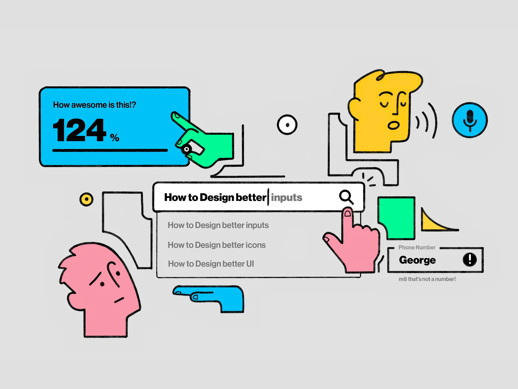
This rule can be easily understood using the example of a form field for a telephone number: If this field is programmed to only accept digits, i.e. no hyphens, brackets etc., the probability of incorrect entries is higher than if the field also accepts special characters - and subsequently displays the telephone number intelligently according to a defined scheme.
This is based on the robustness principle of Internet pioneer Jonathan Postel, which states that systems are particularly robust if they process the receipt of data as flexibly and tolerantly as possible, but strictly comply with the rules or expectations of the recipient when sending data.
9. large and close targets are easier to hit.
With a target, it is obvious: the closer we are to it and the larger it is, the easier it is for us to hit it. However, this obvious correlation between the size and distance of a target and the probability of hitting or reaching it also applies to user interfaces.
The phenomenon was first described by Paul Fitts and is therefore known as Fitts' Law. It is important for UI design because for mobile apps, for example, it means that elements such as buttons must be large enough to be touched easily and safely with a finger and far enough away from other elements to prevent accidental inputs.
However, the term "target" can be defined even more broadly here: If, for example, you expect a success message after an action and this is the next target, it should firstly be large enough to be noticed - and also be placed as close as possible to the last action performed.
10. familiar things are preferred.
The father of this rule is the Danish UX luminary Jakob Nielsen, who has repeatedly proven in numerous user tests that learned standards help users to quickly find their way around new environments.
In other words, it's about making use of people's prior knowledge to make your own digital products as user-friendly as possible. If common elements such as buttons, drop-down menus and tabs look and behave in the same way as elsewhere, interfaces can be understood quickly. The same applies to terms and symbols: The magnifying glass for searching, the cogwheel for settings, etc.
At the same time, this rule also suggests that comprehensive design changes should be made in such a way that users have the chance to get used to the new environment and learn it - either by making changes gradually or by having a transition phase in which they can switch back and forth between the old and new design.
So much for our brief overview of the UX rules that Jon Yablonski has drawn up based on psychological findings. They are a good guideline for designing user interfaces that are easy and pleasant to use.
You can find more information, examples and a few additional rules on the Laws of UX website - take a look there if you want to deepen your knowledge.
By the way: If you would like to learn how to find out what your users think about your software, app or website and what they want from it, you are welcome to join our online training for user research: All information about online training
What's Your Reaction?