![[PRO] Company Starter Kit](https://design.rip/uploads/cover/blog/company-starter-kit.webp)
![[VIP] Uicon V1.0 / Animated Icons](https://design.rip/uploads/cover/blog/uicon.webp)

![[VIP] Talkative Brand Book & Style Guide](https://design.rip/uploads/cover/blog/talkative-brand-book--style-guide.webp)
![[VIP] UX Stack Guru](https://design.rip/uploads/cover/blog/uxstackguru-bwikur.webp)
![[VIP] The Professional Style Guide Kit](https://design.rip/uploads/cover/blog/the-professional-style-guide-kit--indesign-format.webp)
![[LS] iPhone 14 Pro Longscroll Mockups](https://design.rip/uploads/cover/blog/iphone-14-pro-longscroll-mockups.webp)
![[LS] Acryl Abstractions](https://design.rip/uploads/cover/blog/acryl-abstractions.webp)


![[VIP] PАТАТА SCHООL: 2D to 3D Grease Pencil in Blender](https://design.rip/uploads/cover/blog/patataschool-blender-grease-pencil.webp)
![[VIP] The curious craft of demo reel titles](https://design.rip/uploads/cover/blog/the-curious-craft-of-demo-reel-titles.webp)
![[VIP] DesignCode: Build Beautiful Apps with GPT-4 and Midjourney](https://design.rip/uploads/cover/blog/designcode-gpt4.webp)
![[VIP] AppCoda: Mastering SwiftUI - Professional Packet (Updated 04.2023)](https://design.rip/uploads/cover/blog/appcoda-mastering-swiftui-professional-packet-worth.webp)
![[VIP] AppCoda: Beginning iOS Programming with Swift (Updated 04.2023)](https://design.rip/uploads/cover/blog/appcoda-beginning-ios-programming-with-swift.webp)


![[VIP] Whoooa! 156 vector Lottie animations](https://design.rip/uploads/cover/blog/whoooa-156-vector-animations.webp)
![[VIP] Design+Code: Learn to design and code React and Swift apps [2017-2023, ENG + Sub]](https://design.rip/uploads/images/202312/image_430x256_658ccc86afe53.webp)


![[VIP] Motion Sound Vol. 1](https://design.rip/uploads/cover/blog/designrip-svx.webp)
How to design better inputs
A comprehensive guide for UX and UI designers.
Introduction
The internet has revolutionized the media. I’ve found that the most influential change is the ability to communicate in two directions. In the past, we had television and radio, where only you could change the channel or turn it off. You had no influence on the content (unless you worked for a television or radio company) and no ability to respond. It was simple, one direct message.
So, how do we communicate with electronic devices today? I can distinguish voice dialling, keyboard, e.g. physical or touchscreen and pointer, e.g. mouse or finger. Going deeper, we have a user interface with interactive elements and buttons and input fields for gathering more detailed information. In this blog post, I try to answer how to design the best inputs.
Without inputs, the internet would work in one direction only.
Some say that the graphic user interface is over and in the future we’re only going to interact with devices using our voice. It’s easy to say and hard to implement everywhere immediately (assuming we want that). We have had voice dialling in our cell phones for 20 years, and I don’t think people ever got used to it. Now we have Siri or Google Assistant, but it doesn’t change much. Especially in public places where people care about their privacy.
However, providing input by keyboard has still an enormous impact, whether it’s through the use of a touch screen or a physical keyboard. I would like to share the current state of the topic. What should you, as a designer, take into consideration?
We have a few points to remember, such as:
- accessibility
- privacy
- usability
- feedback and error handling
All of these points are crucial to designing a great app or service experience.
General requirements
The data we can provide using input fields is diverse. Regardless as to whether it’s text, number, date, file or audio. There are a few general requirements that every input field should comply with.
Text inputs should be as accessible as possible

You can find the most structured document about achieving an accessible user interface on WCAG (Web Content Accessibility Guidelines).
For this article, the elements we are most interested in are font size and colour contrast. The best tool for checking colour accessibility is https://color.review, which says the contrast ratio between text and background must be at least on AA level. More precisely, the required contrast for text is 4.5 with font size 14 pt in bold weight or 18 pt in regular.
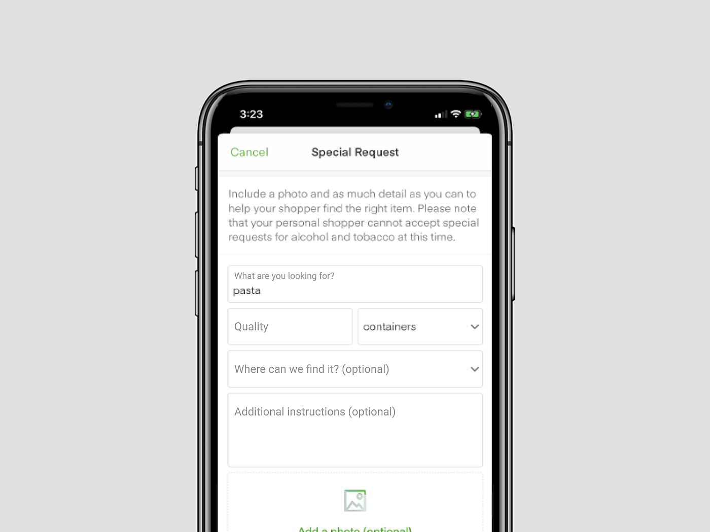
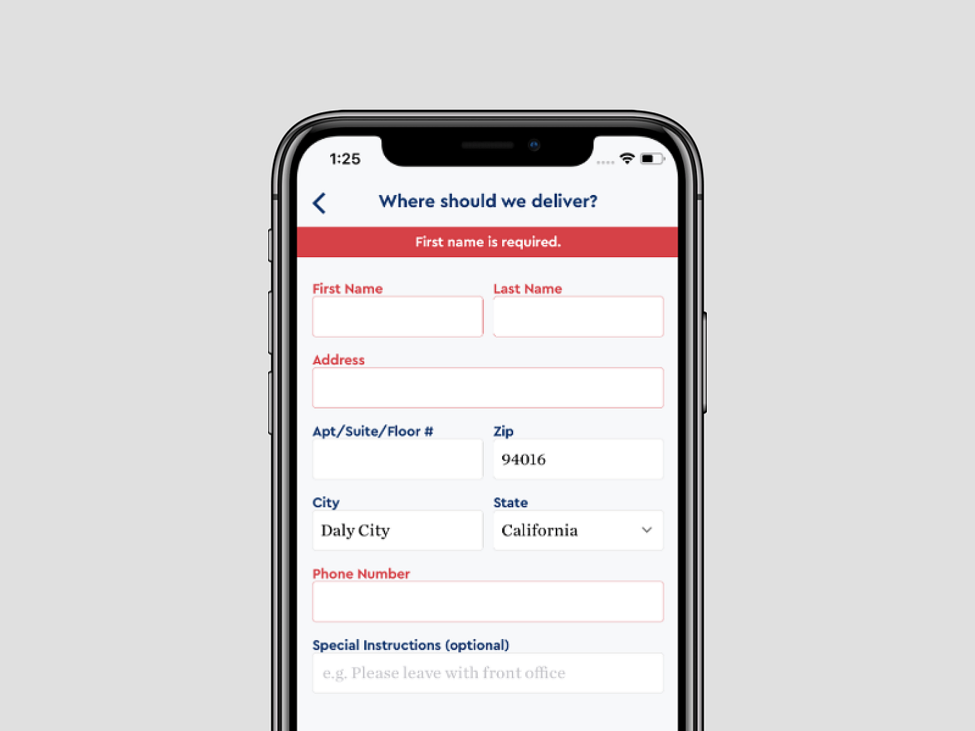
Clear input description is obligatory
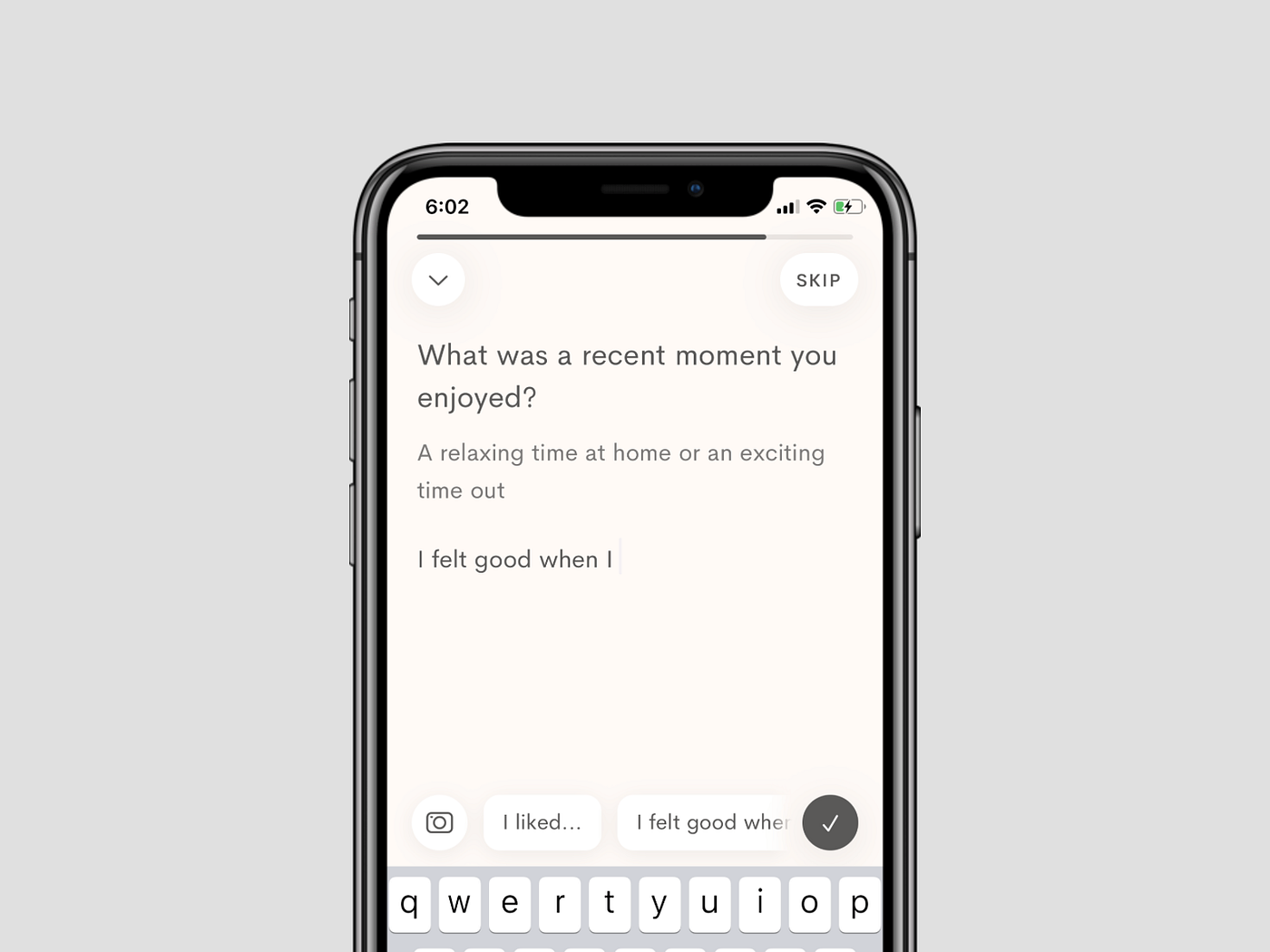
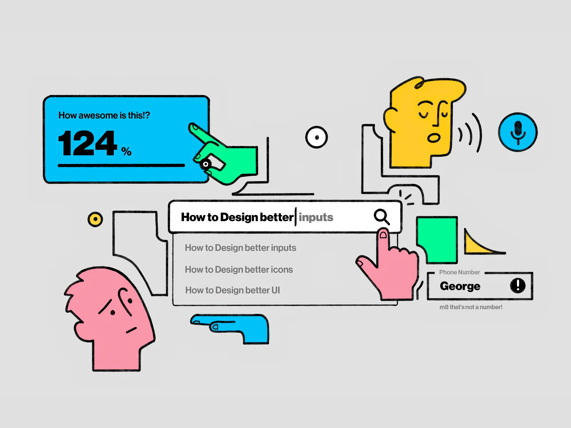
A user shouldn’t have to guess what we‘ve got in mind, so we need to clearly communicate the type of information we are expecting from them.
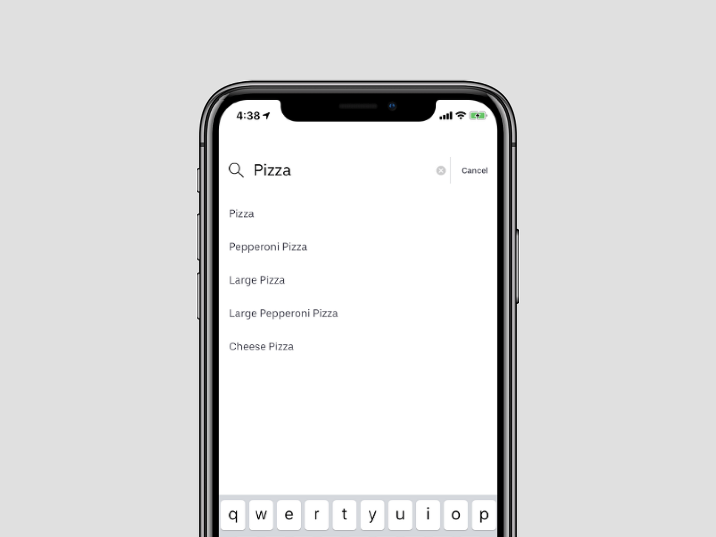
That description can be an input label like “surname”, some longer text like “What’s on your mind…” or even a whole paragraph like in the above screen.
Input fields must seem interactive
There are a couple of solutions to communicate it:
· Having an action word in a description label like “write…” or “choose…”
· Different font colour than the body text
· The graphic line below the label
· Bordered rectangle space below or around the label
A user has to know instinctively that the input is interactive, so we can provide data.
There isn’t one best way to do that. I’ve decided to show you a couple of them with the pros and cons. Moreover, I’ve also added the context of use and a recommended purpose.
Different types of text style inputs
I divided the text input fields into the three most common styles.
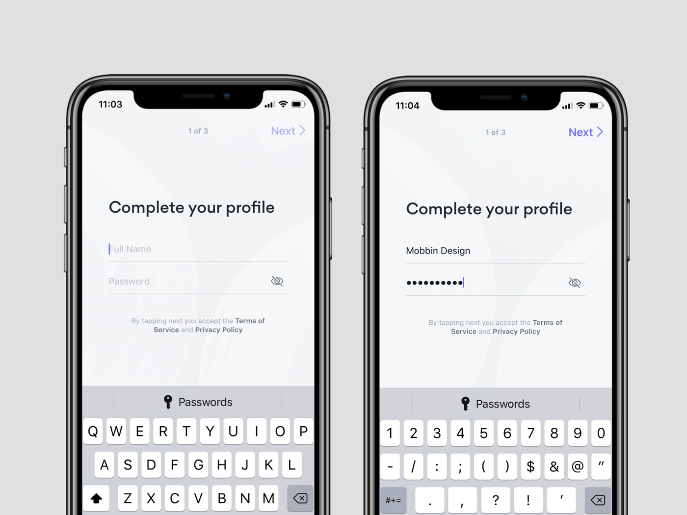
Material design type
It appears in three types: linear, filled and outlined. This is the most common and usable type of input field.

Pros:
· The label is always visible (even when we click on the input)
Cons:
· Needs more vertical space (as we have to keep the name visible)
· May seem cluttered with longer forms
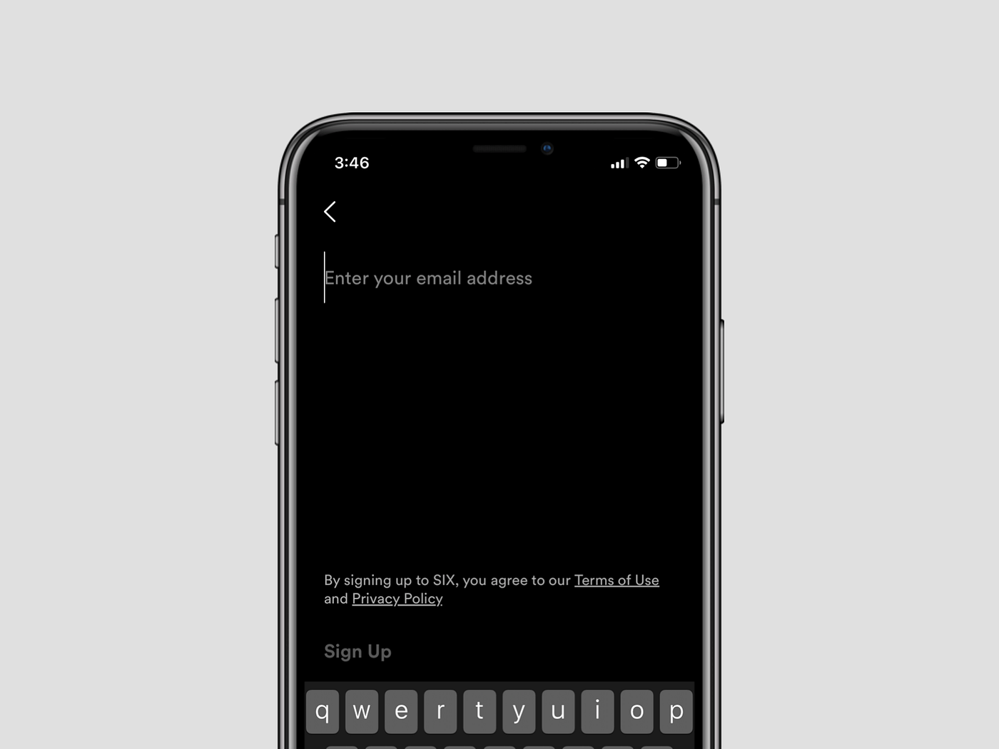
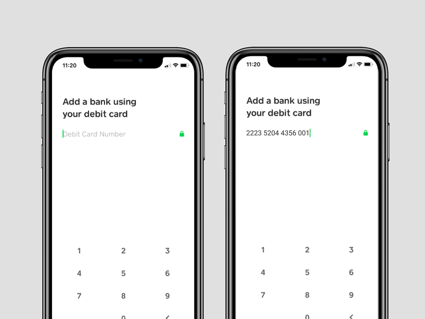
Apple design type
Pros:
· Doesn’t need much vertical space
· Looks slick and clean
Cons:
· Label disappears after providing content
Especially useful when the title of the form contains a question or call to action. Then we avoid a label text redundancy.
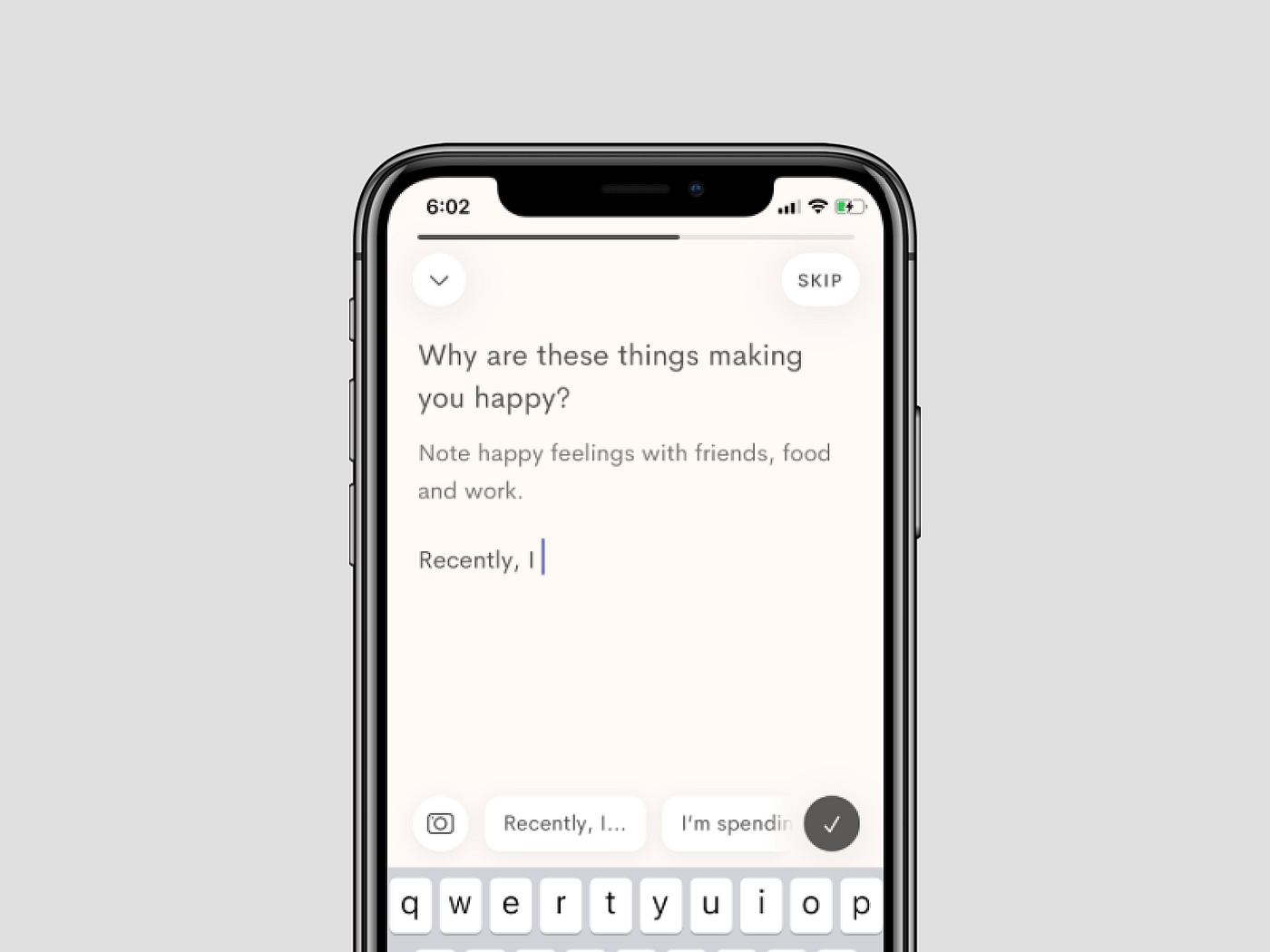
Invisible
Pros:
· Useful when we have only one major input field
· More space for big, clear label
In this case, it is recommended that you apply the automatic focus (blinking cursor). Otherwise, there’s a chance the interactivity of the field could be overlooked.
Table style
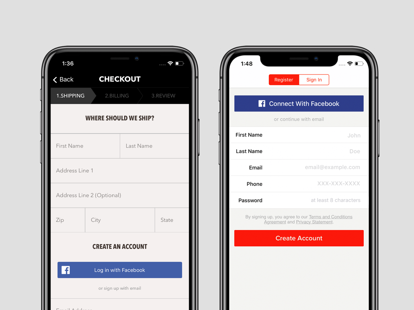
Pros:
· Looks more creative
Cons:
· More complex in responsive implementation
Useful in forms between 3–7 fields. There are two types of table style inputs: spreadsheet and receipt type.
Other types of inputs
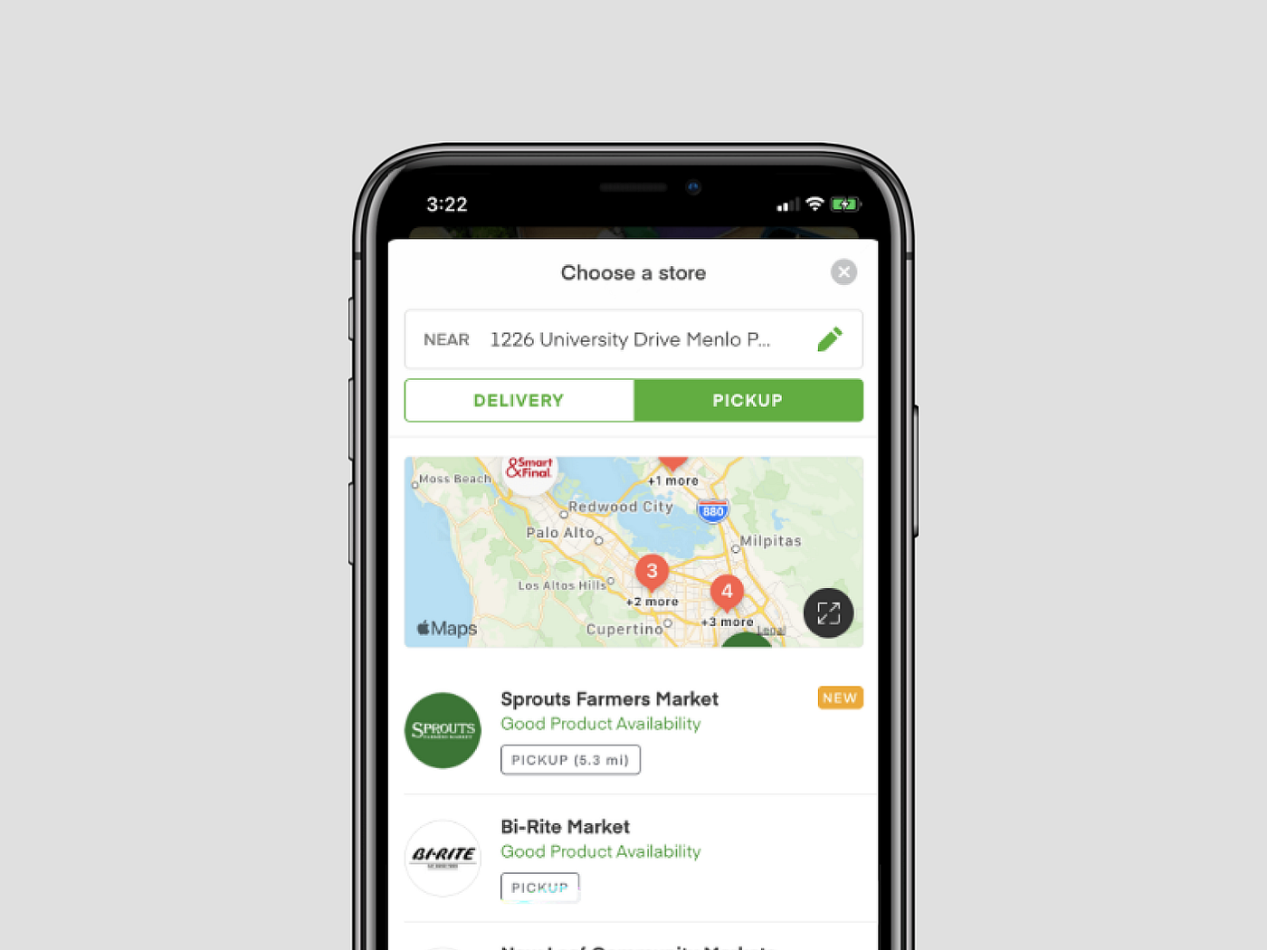
Dropdown / Picker inputs
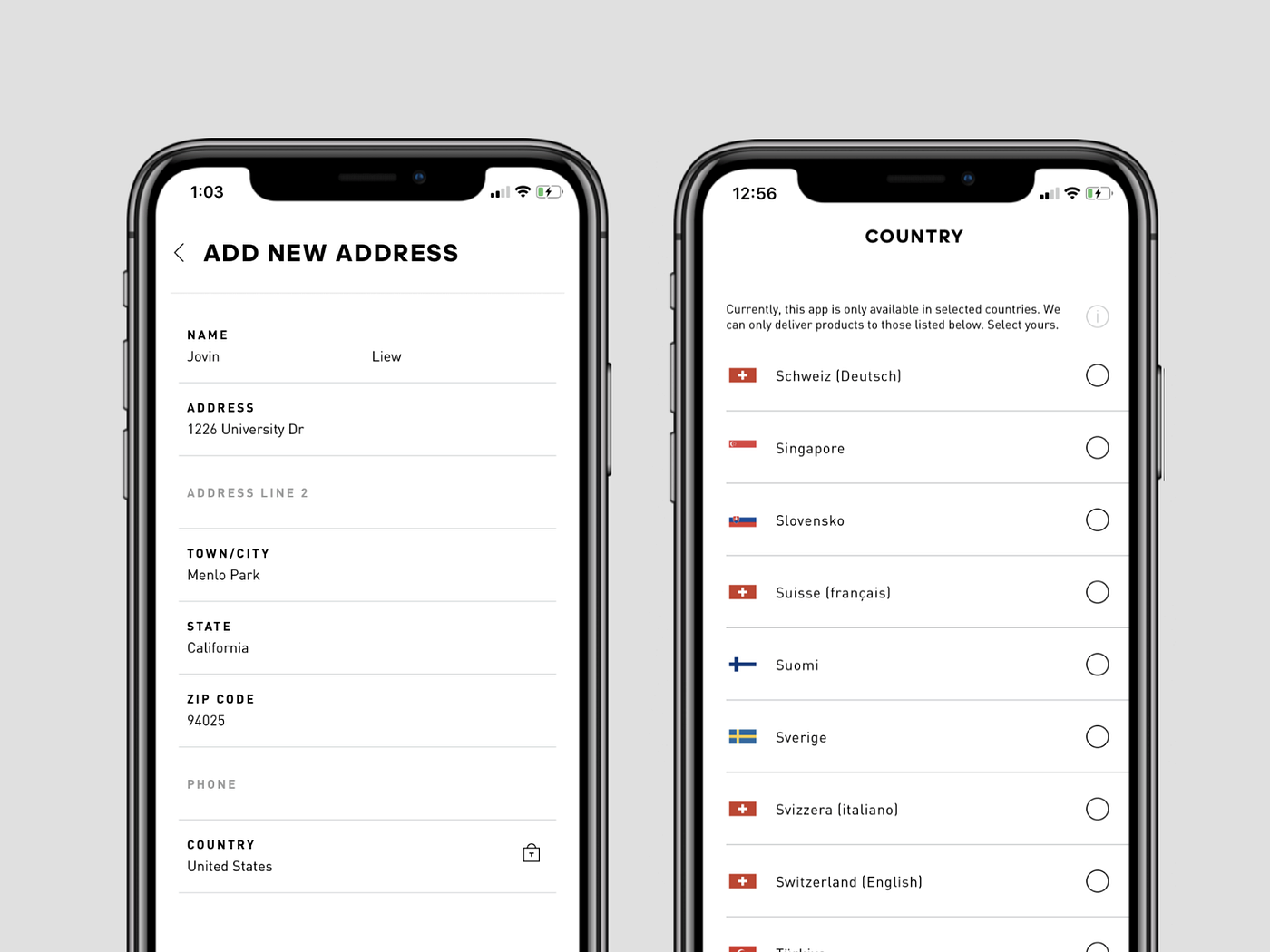
Pros:
· Contains only data that the system expect
· Fast and convenient to select
Useful when the number of answers is specified (e.g. country or colour)
Voice inputs
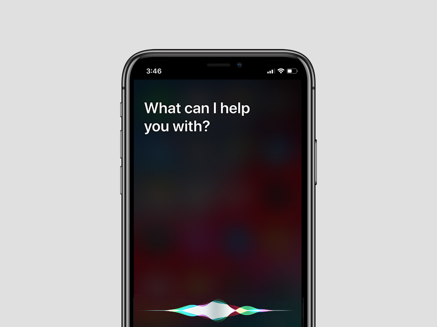
This is not a common type of input, especially useful in a case where you shouldn’t focus your sight on the screen. The best example is the voice commands recognition in modern cars, as your eyes are focused on the road. Also, voice inputs work well with mobile phones (for example, Apple Siri), we can use commands to set various features of the system. Additional convenience is dictating the content instead of typing it into the input field.
Pros:
· Doesn’t need a keyboard and the attention of our eyesight
Cons:
· May be very inaccurate
· For a narrow range of use cases only
· Questionable privacy*
· I have to mention that there are many opinions where devices might listen to us without our knowledge.
Extras
There are a bunch of ingredients to increase general usability. You can add them to your work while designing inputs:
Privacy feature
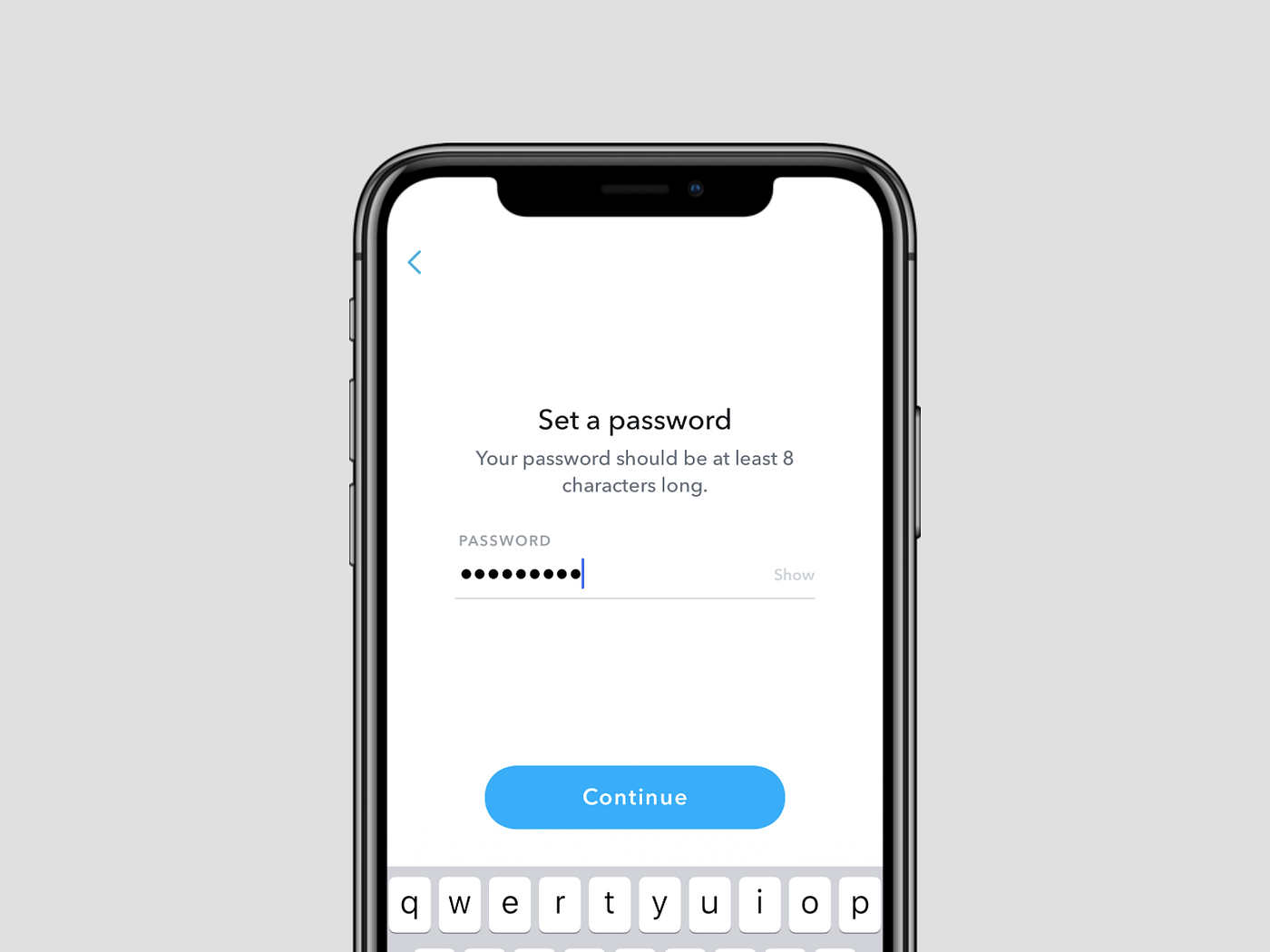
Fortunately, this is a standard solution now. The most common use case is a password field which displays dots or stars instead of text. The extra feature is the icon/label on the right side of the field, which can be used to reveal and hide the password we input.
Multidata feature
This feature allows you to type more than one data unit into the field. It can be found in an email app (recipient field) or while setting tags/categories in search on certain websites.
Pros:
· Useful in case if you need to type more similar data at once
Cons:
· For more tech-savvy users
It can also be added into a dropdown input field with a multiple-choice option.
Prefill feature
This feature can be helpful when the system can set and prefill, eg. your location (address, city or country). This way, you don’t have to select it every time. Also, that function may work well in user case scenarios. For example, when a user clicks a banner of a weekend trip offer to Barcelona, then the system can prefill a search input with particular data and filters.
Pros:
· Saves user’s time
· Doesn’t distract a user from the flow
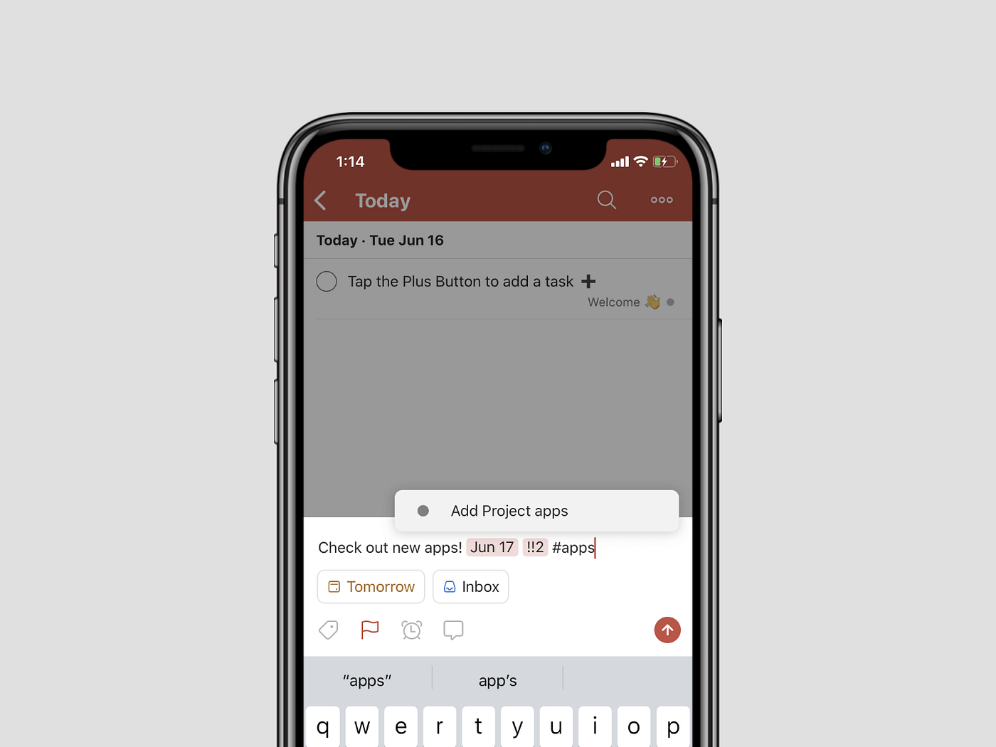
Search feature
Adding this feature to your input would be useful in terms of fast and convenient filling of the field. Users can type the text inside and get the list of hints. This way, a user can specify a more accurate answer. This feature works well with an open question and with dropdown lists too.
Optional fields
Good practice in designing is to treat all the fields as mandatory by default. Otherwise, it would help if you pointed out the fields that are optional by a tiny label.
Auto-format
A handy feature you can add to some of the inputs is auto-format. It aligns the data inside a field in a form which is pleasant to the eye. The most common formatted fields you probably find are those with phone and bank account numbers. The numbers are arranged to a specified pattern.
Hints
Hints are a good practice to help direct a user to the type of answer we’d expect. Sometimes, it can contain critical information. (e.g. minimum length of a password we require).
The second type of hint can be a letter counter. The most popular field with this solution is on Twitter, where you’ve got a limited number of characters to use.
Validation and errors
This is the next phase of the user experience of forms/inputs. You need to inform a user if everything works correctly and inform them when the action they take is complete. Otherwise, you need to report what happened — this is called validation. We can select two types of validation:
· Inline — when we get immediate feedback info (e.g. red label with tooltip) right after filling the field.
· After submission — when we get feedback after we click on the button.
Inline feedback is better in terms of user experience. However, it needs to be consulted with a backend developer to prepare the system for that kind of solution. Additionally, you as a designer should develop a clear set of rules that every input must pass (e.g. format of data or minimum length of text).
Moreover, you have to be prepared for errors that are not related to a particular input field but rather for all forms. The most common problem is a lost connection with the database. It can be presented by a general text paragraph above the form or a toast type label.
Final thought
This article doesn’t deal with all aspects of the subject. I highly recommend going into a more profound study of a particular point to learn more.
If you find this useful, please don’t hesitate to share it. If you have questions or would like to give me some feedback, please comment below.
What's Your Reaction?