
![[VIP] Uicon V1.0 / Animated Icons](https://design.rip/uploads/cover/blog/uicon.webp)

![[VIP] Talkative Brand Book & Style Guide](https://design.rip/uploads/cover/blog/talkative-brand-book--style-guide.webp)
![[VIP] UX Stack Guru](https://design.rip/uploads/cover/blog/uxstackguru-bwikur.webp)
![[VIP] The Professional Style Guide Kit](https://design.rip/uploads/cover/blog/the-professional-style-guide-kit--indesign-format.webp)
![[LS] iPhone 14 Pro Longscroll Mockups](https://design.rip/uploads/cover/blog/iphone-14-pro-longscroll-mockups.webp)
![[LS] Acryl Abstractions](https://design.rip/uploads/cover/blog/acryl-abstractions.webp)


![[VIP] PАТАТА SCHООL: 2D to 3D Grease Pencil in Blender](https://design.rip/uploads/cover/blog/patataschool-blender-grease-pencil.webp)
![[VIP] The curious craft of demo reel titles](https://design.rip/uploads/cover/blog/the-curious-craft-of-demo-reel-titles.webp)
![[VIP] DesignCode: Build Beautiful Apps with GPT-4 and Midjourney](https://design.rip/uploads/cover/blog/designcode-gpt4.webp)
![[VIP] AppCoda: Mastering SwiftUI - Professional Packet (Updated 04.2023)](https://design.rip/uploads/cover/blog/appcoda-mastering-swiftui-professional-packet-worth.webp)
![[VIP] AppCoda: Beginning iOS Programming with Swift (Updated 04.2023)](https://design.rip/uploads/cover/blog/appcoda-beginning-ios-programming-with-swift.webp)


![[VIP] Whoooa! 156 vector Lottie animations](https://design.rip/uploads/cover/blog/whoooa-156-vector-animations.webp)
![[VIP] Design+Code: Learn to design and code React and Swift apps [2017-2023, ENG + Sub]](https://design.rip/uploads/images/202312/image_430x256_658ccc86afe53.webp)


![[VIP] Motion Sound Vol. 1](https://design.rip/uploads/cover/blog/designrip-svx.webp)
A Brief Guide to the different schedules and recommendations for their selection
Numerous studies in cognitive neuroscience show that the brain likes visual content more than plain text. Medical scientists have found that if a drug instruction contains only text, a person absorbs only 70% of the information from it. And if you add pictures to the same instruction, this percentage (or indicator) will increase to 95%.
Numerous studies in cognitive neuroscience show that the brain likes visual content more than plain text.
Medical scientists have found that if a drug instruction contains only text, a person absorbs only 70% of the information from it. And if you add pictures to the same instruction, this percentage (or indicator) will increase to 95%.
Humans tend to process visual information. Besides, data visualization has several advantages:
- focusing on different aspects of the data;
- analyzing a large data set with a complex structure;
- reducing information overload and keeping people's attention;
- unambiguous and clear data output;
- highlighting the interconnections and relationships contained in the information.
Therefore, as designers who often work with large amounts of data, it will be useful for us to be able to present a large layer of information visually.
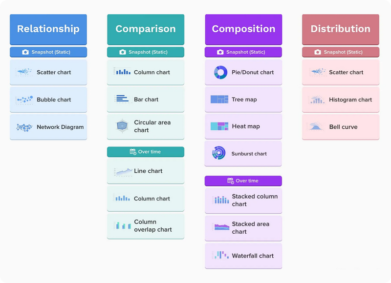
There are many types of charts you can use to visualize your data. So let's take a look at them to quickly choose the right type.
Let's divide all charts conditionally by what shape will be displayed (point, line, circle, etc.).
Scatter plots (dots)
If we place the point on a plane, we get our first graph - a scatter plot:
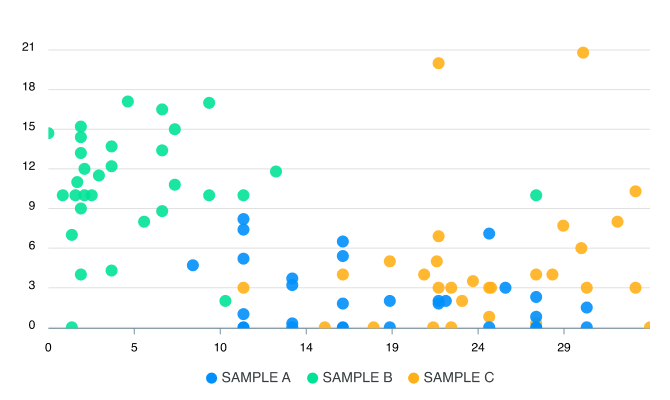
A scatter plot shows the relationship between two different variables or demonstrates distributive trends. It's great if you have a lot of different point data and want to find the commonalities in a set of them. This visualization works well when looking for outliers or patterns in data distribution. It's the easiest and most effective way to show the relationship between two variables at a given moment.
But there are also drawbacks. Usually, it's data overload (this applies to all the following graphs as well), which makes it unreadable:
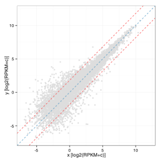
How to fix it?
To fix this, you need to replace it with another type of graph (we'll look at it below) or another subtype of dot plot.

1. A bubble chart is a type of chart that shows three dimensions of data. The size of the point (now a disk) is added. Bubble charts can make it easier to understand social, economic, health, and other scientific relationships.
2. Astrip plot is a scatter plot along a single axis. Values are represented by points along one unique axis, where points with the same value can overlap. To show overlapping values, you can change the opacity or color of the points, or you can use a jitter plot or count plot instead. Typically, multiple bar graphs are placed side by side to compare the distribution of data points across multiple values, categories, or ranges.
3. Ajitter plot is a variation of a bar chart with a better view of overlapping data points. It is used to visualize the distribution of many individual one-dimensional values.
The values are displayed as points along one axis. These points are then randomly shifted along another axis that is not itself relevant to the data, allowing the points to not overlap.
Typically, multiple jitter plots are placed side by side to compare the distribution of data points across multiple values, categories, or ranges.
4. Network Visualization - This type of visualization shows how things are interconnected using nodes and lines of connections.
Line graphs
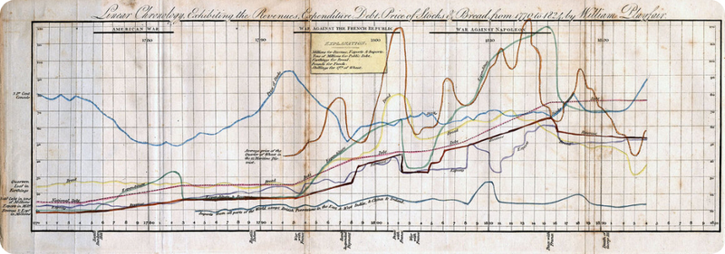
Line graphs help you navigate complex data sets and understand the whole story. It is one of the best visual analysis tools for tracking and comparing data over time.
A line chart or line graph shows the change in one or more numerical variables. Data points are connected by straight lines. It's similar to a scatter plot, but the data points are organized (usually by value on the x-axis) and connected by straight lines. A line graph is often used to visualize a trend in data over time, so the line is often drawn in chronological order.
Variations of line graphs
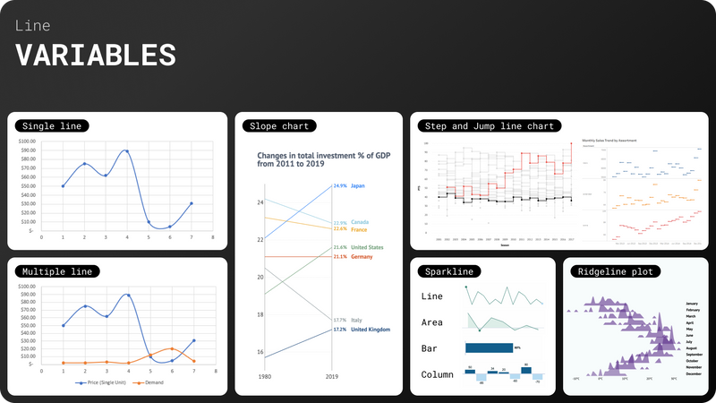
1. Multiline - several graphs on the same plane.
2. ASparkline is essentially a small line graph created to be placed in a line with text or next to values in a table. The main purpose of a sparkline is to show changes over a period of time. It is often seen in a financial context.
In addition to line graphs, sparklines can be columns or bars.
3. ARidgeline chart (sometimes called a Joyplot) shows the distribution of a numerical value for several groups. The distribution can be represented using histograms or density plots aligned on the same horizontal scale and presented with little overlap.
4.A slope chart is an excellent substitute for a line graph. It emphasizes the progression between two values by using the angle of the slope to convey the difference. As an example, a slope chart can be used to visualize changes in employment rates between different industries.
5. Line chart of steps and jumps. The difference between a step line and a jump line is the vertical line segments that connect the "steps" of the jump line. Jump line charts are usually used to show rates.
Area diagrams (area chart)
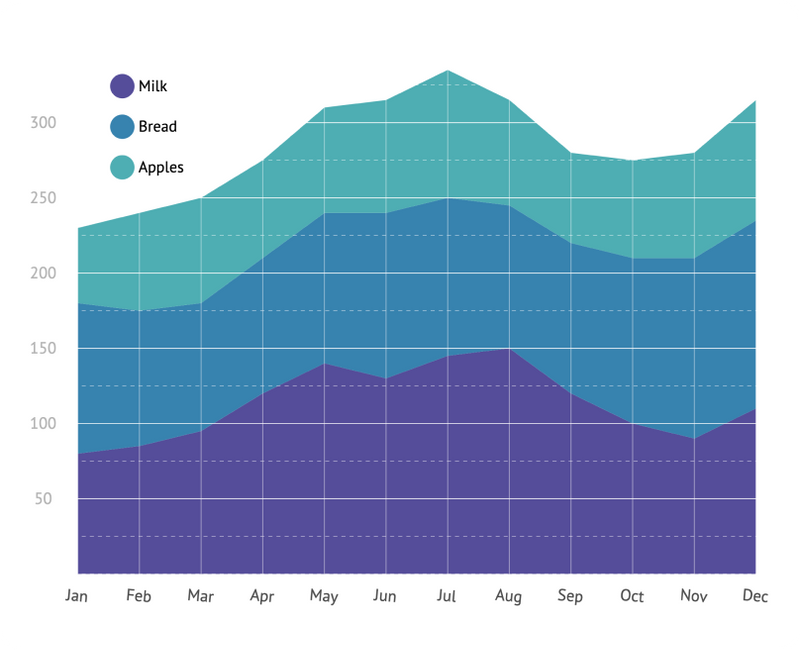
This is a unique subtype of line chart. In general, it is the same line chart, but with a filled area between the line and the axis. The main purpose of this chart is to draw attention to the magnitude of change over a certain period of time.
Types of plane diagrams
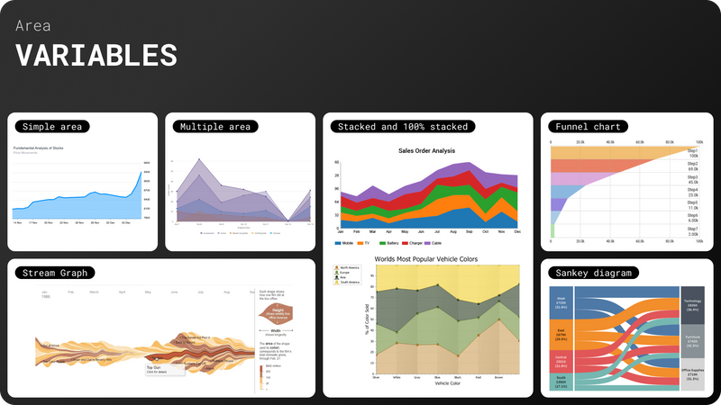
1. Single and multiple. Just like in a line graph (one or more graphs on a coordinate system).
2. Stacked and 100% stacked graphs. The entire graph represents the total sum of all plotted data. Stacked area graphs also use areas to represent integers, so they don't work for negative values. In general, they are useful for comparing multiple variables that change over time. The peculiarity of a 100% stacked graph is that all changes are displayed in percentage terms and their sum at each time interval cannot be greater or less than 100%.
3. Stream Graph. This visualization is a type of accumulation chart, but instead of displaying values on a fixed straight axis, a stream graph has values shifted around a variable central baseline. Stream Graphs display changes in data over time for different categories using smooth, organic shapes that somewhat resemble a river flow. This makes Stream Graphs more aesthetically pleasing.
4. Funnel charts are a type of chart that is often used to represent the stages of the sales process and show the amount of potential revenue at each stage. This type of chart can also be useful for identifying potential problem areas in sales processes.
5. Sankey diagram. A way to visualize the flow from one state to another over time. The thickness of the ribbons is proportional to the volume of movement in that direction. Diagrams of this type emphasize the main directions of transfers in the system. They help to identify the most important contributions to the flow.
Pie chart (pie chart)
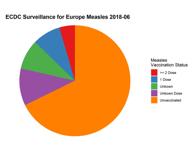
Pie charts are quite popular, although they have a rather narrow use case that is particularly well encapsulated by their definition. In order to use a pie chart, you must have some kind of whole divided into several separate parts. The main purpose of a pie chart should be to compare the contribution of each group to the whole, not to compare groups to each other. If the above points are not met, then this type of graph is not appropriate and another type of graph should be used instead.
Types of pie charts
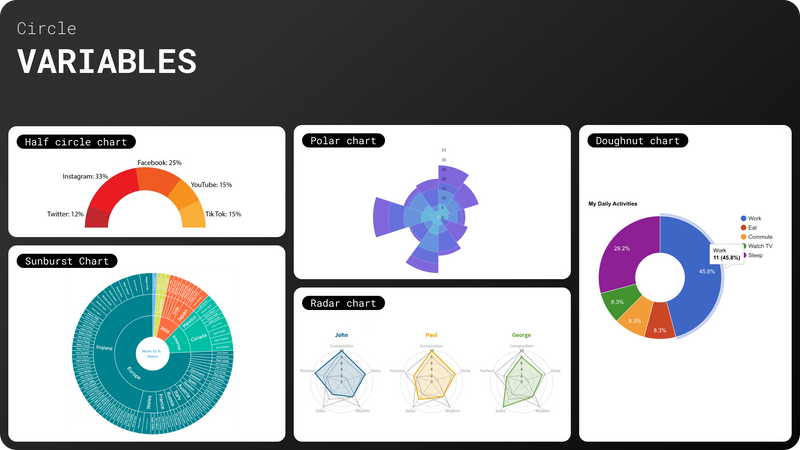
1. Doughnut chart - essentially the same chart as a pie chart, but with an empty area in the middle. In addition, doughnuts are more information-intensive than pie charts, since the empty space inside the pie chart can be used to display information in it.
2. Half circle chart - half of a donut. Sometimes it can save space on your dashboard and looks original.
3. Polar chart - similar to a pie chart, but each segment has the same angle - the radius of the segment differs depending on the value.
4. Sunburst Chart - similar to a pie chart. This is similar to nested pie charts, but with a hierarchical nature, which means that each level represents a detail of the previous one. In other words, the child segments at each level make up the entire parent segment.
5. Radar chart is a cross between a pie chart and a plane chart. It is a graphical way of displaying multidimensional data in the form of a two-dimensional chart with three or more variables. These variables are represented on axes that have a common origin. Each axis of this chart is a specific characteristic with its own gradation.
Bar chart
Bar charts are very versatile and can be used almost everywhere and for everything. It is the most popular and convenient graph.
A bar chart uses horizontal or vertical bars (column chart) to show discrete numerical comparisons between categories. One axis of the chart shows the specific categories being compared, and the other axis represents a discrete scale of values.
Types of bar charts
Since there are many types of bar charts, I will describe only some of them.
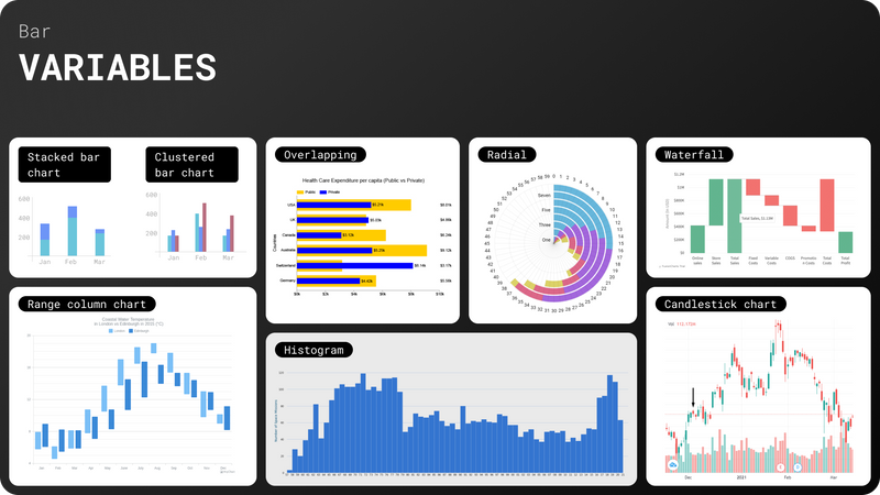
1. Stacked bar chart - a bar consists of several separate columns that seem to stand on top of each other. In this case, the total result for several categories is shown.
2. Clustered bar chart. In this case, the columns are grouped and this group is placed on the axis as readings for one dimension or period. Good for comparing different values in the same graph.
3. Overlapping - A cross between stacked and grouped graphs. In this case, two columns are overlaid (one wider than the other) and each is read separately. This option takes up less space on the chart.
4. Radial. This type of graph displays columns in a polar coordinate system. Concentric circles are used for the scale of values, while radial dividers (lines extending from the center) are used to indicate each category. Looks interesting and nice.
5. Bar graph. In this case, the columns are close to each other along the axis. Each bar on the histogram represents a tabulated frequency for each interval. The overall picture looks like a regular plane graph, but it is focused on specific values, so it gives both a picture in dynamics and accuracy.
6. AWaterfall chart is a graphical tool that is primarily used to show the combined effect of successive positive and negative variables on a starting point. Essentially, it is a well-structured and easy-to-understand way of depicting gradual transitions that emphasizes the process by which various factors add up to the final value.
7. Range column chart - used to show the ranges of a data set between a minimum and a maximum value. Range charts are ideal for comparing ranges, usually between categories.
Keep in mind that range charts only focus the reader's attention on the extremes and do not provide information about the data points between the minimum and maximum values.
8. Candlestick chart. This chart is a more advanced version of the interval chart. The bar has the shape of a candle and also shows the minimum and maximum values, but at the same time provides information about the distribution of values within it.
It is important to understand that in the latter two cases, there are a certain number of discrete values in one column, not a single digital value.
Some more graphs
Let's look at some other types that are not so common and not always easy to read.
1. Tree map chart 1.
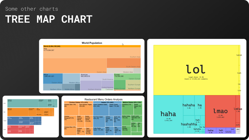
A chart that represents hierarchical data. As the name implies, tree charts have data organized as branches and sub-branches (it can be interpreted as a sunshine chart that is arranged in a rectangular shape). It works well with information that has a large number of categories and subcategories.
2. Heat map 2.
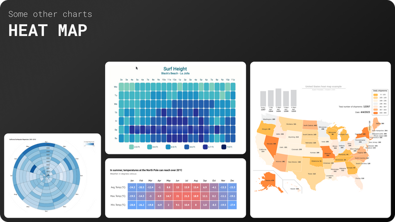
It is a rectangular matrix in which the individual rows and columns are divided into subcategories that match each other in the matrix. Cells are intersections of rows and columns that can contain either categorical data or numerical data.
A heatmap shows the relationship between two elements and provides rating information. For example, from high to low or from poor to excellent.
This chart displays rating information using different colors or saturation. Because they rely on color to convey values, heatmaps are a chart that is better suited to displaying a more generalized view of numerical data, as it is more difficult to pinpoint the difference between shades of color and extract specific data points from them. However, this problem can be solved by displaying data values in cells.
3. Waffle chart 3.
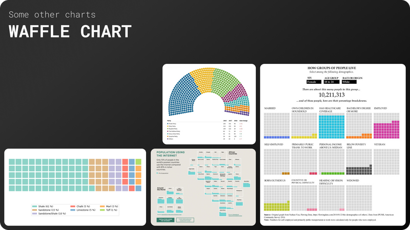
A waffle chart is basically a square display that usually consists of 100 smaller squares arranged in a 10 by 10 format. The squares are colored according to the proportions you are looking to visualize, similar to how you would color the different pieces of a pie chart. However, compared to a pie chart, a wafer chart is much easier to read - our brains are not very well suited to comparing different angles and slices, but we can compare different areas quite easily.
In conclusion.
Additionally, I would like to add a sign that allows you to select the desired schedule depending on the tasks.
What's Your Reaction?