![[PRO] Company Starter Kit](https://design.rip/uploads/cover/blog/company-starter-kit.webp)
![[VIP] Uicon V1.0 / Animated Icons](https://design.rip/uploads/cover/blog/uicon.webp)

![[VIP] Talkative Brand Book & Style Guide](https://design.rip/uploads/cover/blog/talkative-brand-book--style-guide.webp)
![[VIP] UX Stack Guru](https://design.rip/uploads/cover/blog/uxstackguru-bwikur.webp)
![[VIP] The Professional Style Guide Kit](https://design.rip/uploads/cover/blog/the-professional-style-guide-kit--indesign-format.webp)
![[LS] iPhone 14 Pro Longscroll Mockups](https://design.rip/uploads/cover/blog/iphone-14-pro-longscroll-mockups.webp)
![[LS] Acryl Abstractions](https://design.rip/uploads/cover/blog/acryl-abstractions.webp)


![[VIP] PАТАТА SCHООL: 2D to 3D Grease Pencil in Blender](https://design.rip/uploads/cover/blog/patataschool-blender-grease-pencil.webp)
![[VIP] The curious craft of demo reel titles](https://design.rip/uploads/cover/blog/the-curious-craft-of-demo-reel-titles.webp)
![[VIP] DesignCode: Build Beautiful Apps with GPT-4 and Midjourney](https://design.rip/uploads/cover/blog/designcode-gpt4.webp)
![[VIP] AppCoda: Mastering SwiftUI - Professional Packet (Updated 04.2023)](https://design.rip/uploads/cover/blog/appcoda-mastering-swiftui-professional-packet-worth.webp)
![[VIP] AppCoda: Beginning iOS Programming with Swift (Updated 04.2023)](https://design.rip/uploads/cover/blog/appcoda-beginning-ios-programming-with-swift.webp)


![[VIP] Whoooa! 156 vector Lottie animations](https://design.rip/uploads/cover/blog/whoooa-156-vector-animations.webp)
![[VIP] Design+Code: Learn to design and code React and Swift apps [2017-2023, ENG + Sub]](https://design.rip/uploads/images/202312/image_430x256_658ccc86afe53.webp)


![[VIP] Motion Sound Vol. 1](https://design.rip/uploads/cover/blog/designrip-svx.webp)
47 Key Lessons for UI & UX Designers
A mega-list of critical knowledge for UI, UX, Interaction, and Product designers alike.

This is a mega-list of the most critical knowledge for UI, UX, interaction, or product designers at any level.
Many of these lessons are also applicable to project managers, engineers, strategists, QA, researchers, and others involved in product development.

A list of reliable design rules to follow, when in doubt.
Original article — 10 Rules of Thumb in UI Design.
1. Design for density, not pixels
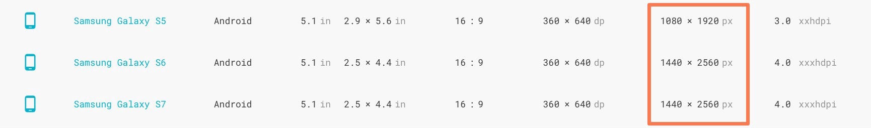
What is density? Density is the number of pixels per inch of a screen, also known as PPI. The unit “dp” is short for “density-independent pixel,” also sometimes abbreviated as “dip.”
Why do we use density instead of pixels? When designing an interface, it’s recommended that we don’t design for pixels, but rather for the pixel density of the device. This ensures that our elements are appropriately scaled to fit different device sizes.
We do this, so if we design a button asset, for example, at 200 x 50 dp, it’s displayed at 200 x 50 px on a 160ppi screen and 400 x 100 px on a 320 ppi screen, or 2x the size of the original asset.
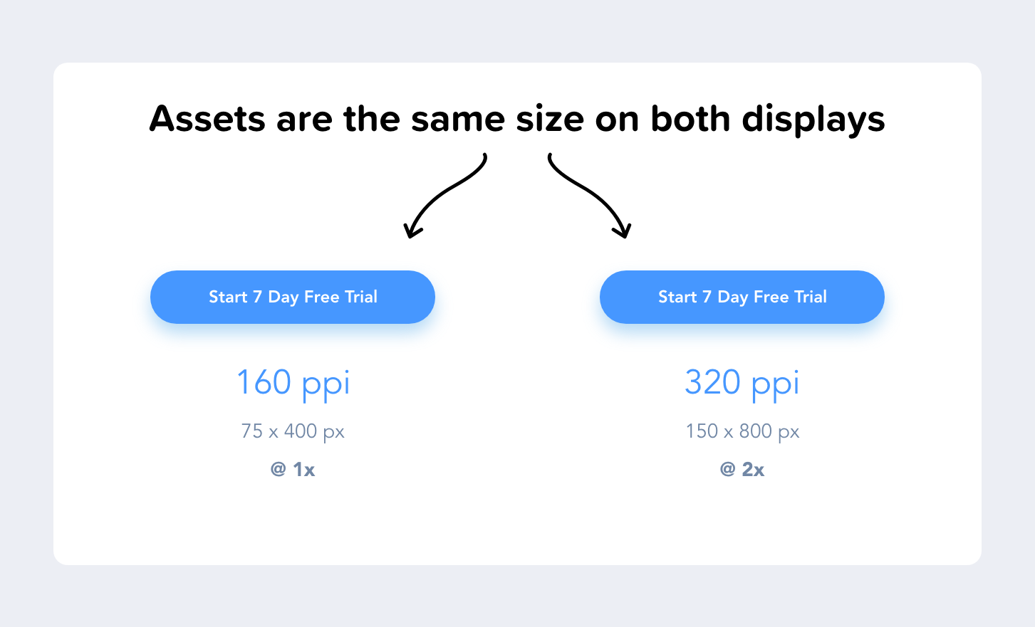
Since some screens have more pixels per inch than others, the assets aren’t displayed smaller on screens with a high pixel density; they’re rendered at 2x, 3x, 4x their original size. This makes sure that all assets maintain their sizing across different devices with varying densities.
How does density translate to screen size? The dimensions for the iPhone XS Max’s screen, for example, is 414 x 896. But that’s not pixels, that’s the number of points. In pixels, it’s 1242 x 2688 px. With that in mind, when designing for the iPhone XS Max, I would design at 414 x 896 points and then deliver assets @ 3x.
2. Use 8dp increments
Why design with spacing in increments of 8? There’s a simple explanation for this; We use magic number 8 because it renders odd numbers properly. As opposed to 5, for example, on a device with a 1.5x resolution, odd numbers won’t render correctly.
Additionally, the vast majority of modern screen dimensions are divisible by 8, making it simple to align our designs appropriately on those devices.
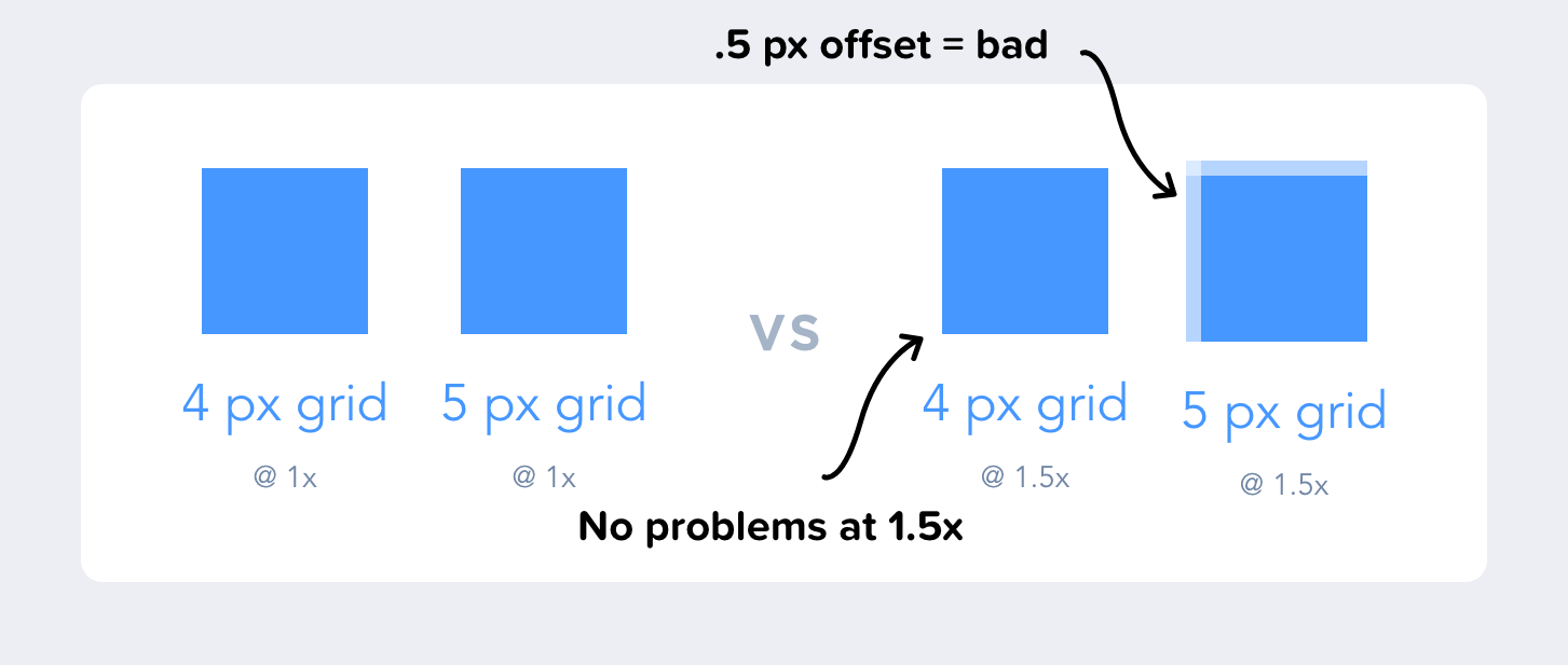
By designing in increments of 8 on an 8-point grid, it creates consistency in our designs. There is no guesswork for spacing, and everything is aligned perfectly with the spacing conventions that we’ve defined.
Where to learn more? Read Bryn Jackson’s 8-Point Grid article.
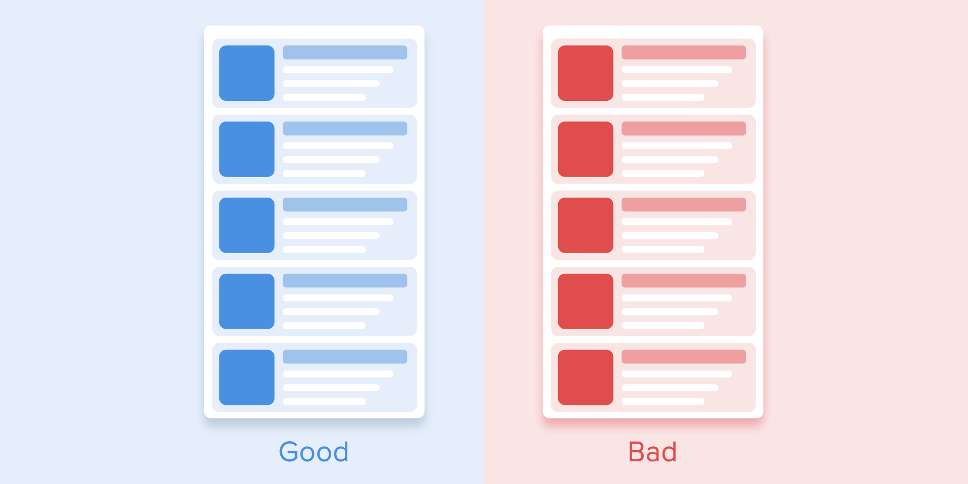
3. Use color weight to establish hierarchy
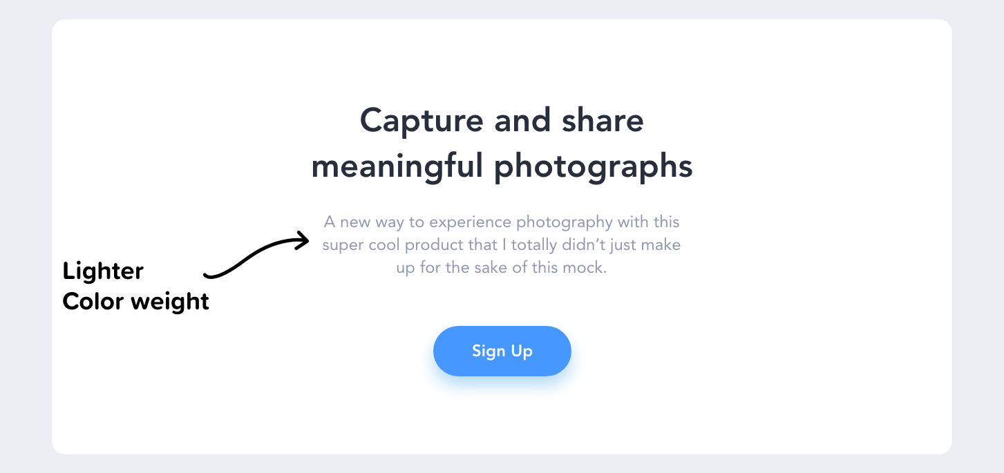
Every color has a visual weight, which we can use to create a hierarchy among our content. By using lighter hues of color, we can assign different levels of importance to elements.
What’s the rule of thumb for color weight? If an element is more important than another, it should be of a higher visual weight. This makes it easy for a user to quickly skim the page and distinguish between the important and less important information.
The bigger, bolder information is what the user’s eyes will be drawn to first, and then they will move on to the supporting information below it.
If you’d like to quickly create weight (tint & shade) variances, try Shaderade.
4. Don’t slow me down
As a user, speed and efficiency are of paramount importance when interacting with a product. I’m using an application to solve a specific job to be done.
“I wanna go fast” — Ricky Bobby
If the experience of digitally depositing a check into my banking app is enjoyable, then that’s great, but don’t let your creativity get in the way of my objective as a user.
What’s the rule of thumb for animations? If the animations and micro-interactions add unnecessary time, then they’re not improving the experience. Being purposeful with animations can improve the experience, but adding unnecessary distractions and movement to elements will not.
I frequently see designs on Dribbble for landing pages that animate as the user scrolls through the page. It’s often overly animated with everything fading and moving, with little attention being paid to the UX. As a user, it can be challenging to know what I should pay attention to when so much is happening on the screen. It’s also wasting my precious time.

What is the optimal speed for animations? “Numerous researches have discovered that optimal speed for interface animation is between 200 and 500 ms. These figures are based on the particular qualities of the human brain. Any animation shorter than 100 ms is instantaneous and won’t be recognized at all. Whereas the animation longer than 1 second would convey a sense of delay and thus be boring for the user.” — The ultimate guide to proper use of animation in UX
Key takeaways: The two parts to this are, if you’re using animation — be purposeful about it. And if those animations are purposeful, then don’t make me wait more than 500ms. In 2020 it only takes a millisecond to peeve your users.
Using honest UX design to create reputable and trustworthy experiences.
Original article — 10 Principles of Ethical UX Designs
5. Notify Me
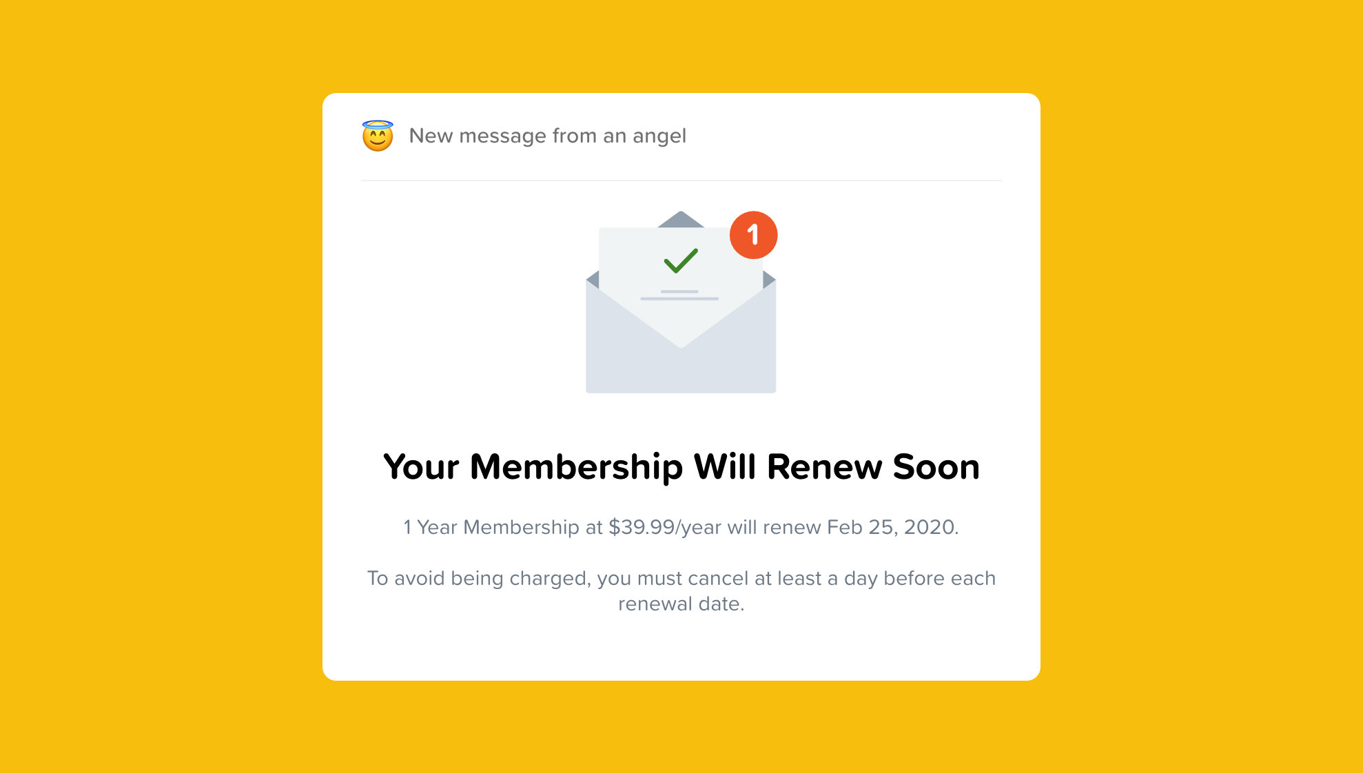
It’s far too familiar for companies to rely on users registering for a free trial and then forgetting about it, causing them to pay for a subscription they no longer want.
We should keep our users informed and allow them to cancel their subscription after a free trial if it’s no longer of use to them.
Or better yet, if you’re offering a free trial, don’t ask for a credit card at all because it is free — right?
Inform your users every time they are about to be charged or have been charged.
6. Highlight negative information
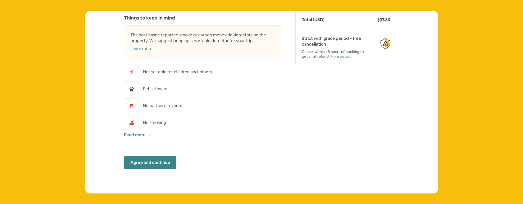
Instead of leaving it up to the user to be informed on the possible negative aspects of a decision they’re about to make, it should be made crystal clear.
I like how Airbnb informs me that the host I’m booking with doesn’t have a carbon monoxide detector, and I can’t throw parties. They could very easily hide this information, but they emphasize it to make sure you’re making a decision that you’re comfortable with.
7. Stop Spamming
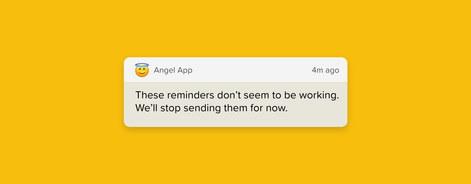
There’s nothing that makes me delete an app faster than spam notifications.
Respect your user’s time by only sending the most relevant notifications when it’s necessary. It’s also essential that you allow users to adjust their notification preferences quickly and easily.
And if the notification isn’t responded to after a certain period, then it’s not doing its job and should be disabled automatically. It’s not doing anyone any good.
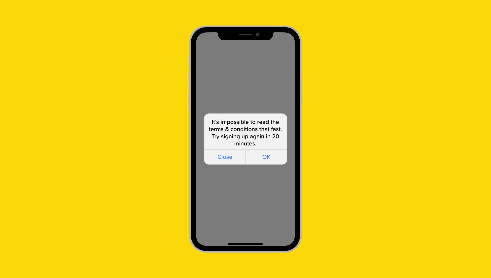
8. Privacy transparency
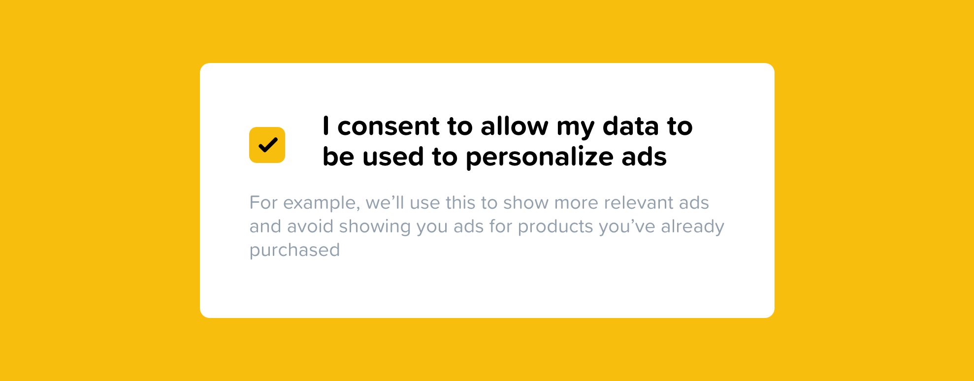
Stop hiding everything behind a privacy policy.
If you’re gathering valuable information, then that’s something I need to know about and consent to. You can elaborate on the details in your privacy policy, but it’s very disingenuous when a company hides pertinent information in a document that no one reads.
9. Make it easy as pie to cancel
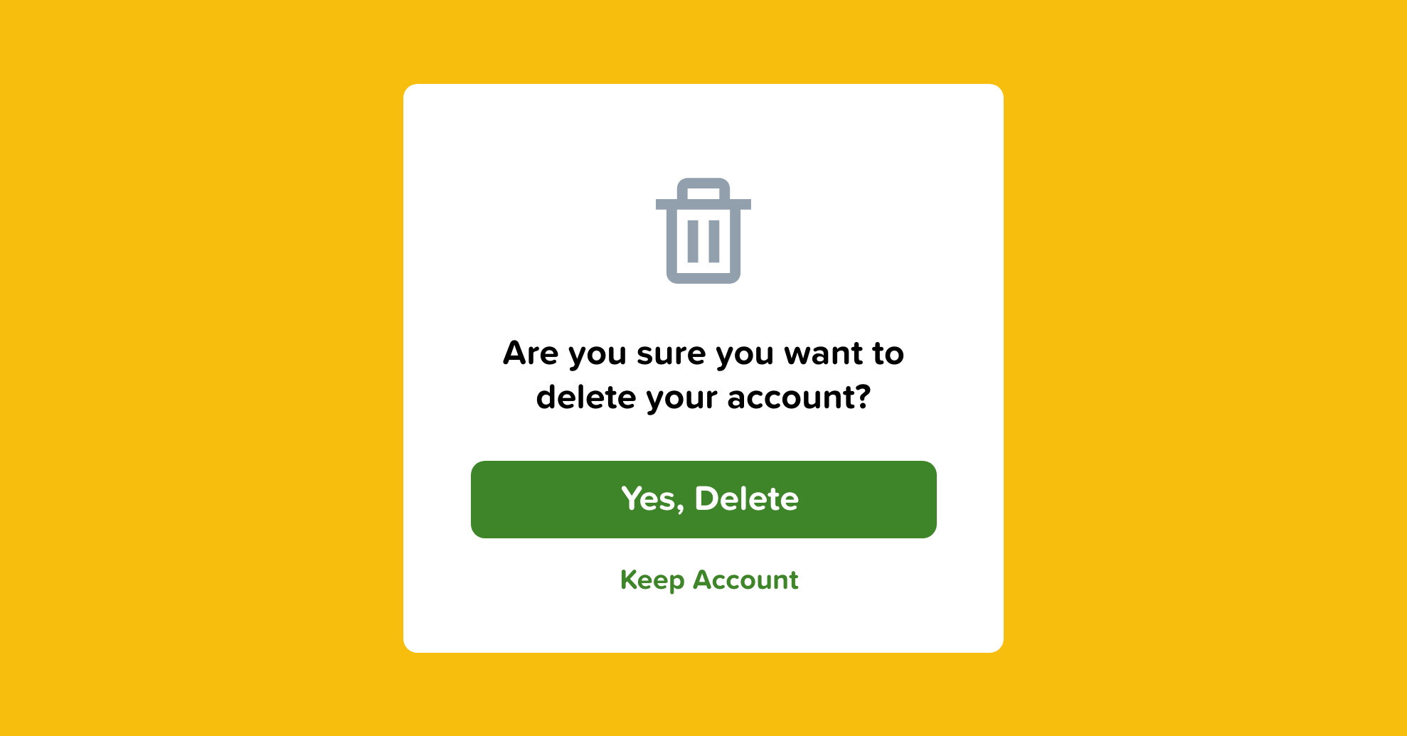
A roach motel is a dark UX pattern that makes it very easy to get into a situation and then annoyingly difficult to get out of it.
If I’ve subscribed to your product, make it dead simple to eliminate it.
I shouldn’t be required to call a support line, send an email, read your FAQ, or chat with an agent. Just give me a damn button that says “cancel” and let me go on with my life.

Ways to improve the look and feel of your UI designs.
Original article — 10 Ways to Spice up a UI Design.
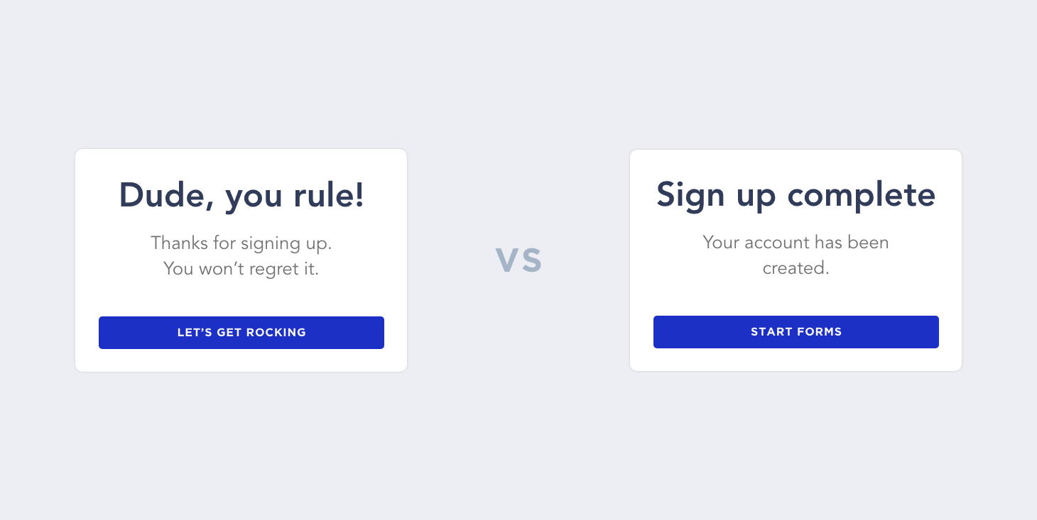
10. Inject life into your copy
Whether it’s an onboarding screen or a loading message, users find delight in the small details. This is why companies like Old Spice and Geico have such a recognizable brand. By infusing humor and personality into their marketing, they create more memorable ads and content.
Aarron Walter, MailChimp’s director of user experience, says — “We’ve discovered that humor laced into copy, the personality of Freddie the MailChimp, and many easter eggs tucked into the workflow can transform an otherwise mundane task into an experience that people look forward to, and sometimes even miss.”
Injecting life into copy is the difference between saying “Loading…” and “Our team of highly trained monkeys is working on it.” It’s unexpected and provides a bit of entertainment for your user.
Good copy doesn’t necessarily mean it has to be humorous, either. It just means writing engaging and worth-reading text.
Humor can also be excessive, and in some applications or industries, it just downright is not appropriate. As Lianna writes on her website, punchlinecopy, “Mortuaries, surgeons, and nuclear power plants should stay out of the humor copy arena.”

Alexis Ohanian, the co-founder of Reddit, said something in Tools of Titans that I loved — “Invest that little bit of time to make it a little bit more human or — depending on your brand — a little funnier, a little more different, or a little more whatever. It’ll be worth it, and that’s my challenge.”
When designing your next product, consider how you can tie the experience together with engaging or amusing copy.
11. Add a dark mode option silly
Depending on the application you’re developing, adding a dark theme option could provide solace for users like myself who live in dark mode. Dark mode is easier on the eyes, and it suddenly doesn’t feel like I’m staring at a lightbulb.
Designing for dark mode isn’t much different than designing in light mode. All it requires is a different color palette. I’d recommend letting the user decide between dark mode or light mode — providing the ability to toggle between the two modes will improve the experience of your app and allow the users to maintain control over their experience.
12. Make error states that don’t suck
See every event in your application, even the not so exciting ones, as an opportunity to provide a memorable experience.
Error states are generally negative experiences, but you can turn them into positive ones by providing a touch of personality or enjoyment.

My favorite example of this is Google Chrome’s “no internet” error screen. They provide all the necessary information to inform the user on how to fix it, but also, there is a T-Rex endless runner game. Genius!
Another one of my favorites is Dribbble’s 404 page. It’s brilliant because it keeps the user engaged and they can quickly get back to browsing dope designs.
“People still tweet about our error message on Hipmunk, and it’s an error message. Why are they doing that? Because it gave them a moment of levity when they were doing something that they expected to be pretty boring, like searching for a flight.” — Alexis Ohanian, the founder of Hipmunk, said.
13. Throw in some patterns and gradients
Patterns and gradients are another great way to make unappealing content more eye-catching and aesthetically pleasing. Adding simple patterns and gradients behind images or to backgrounds adds style and flavor to otherwise bland and unexciting designs.

You can be as creative or as minimal as you’d like with patterns. They shouldn’t distract from the main content, though.
Design principles that are frequently missed.
Original article — 10 Commandments for UI Design
14. Empty States
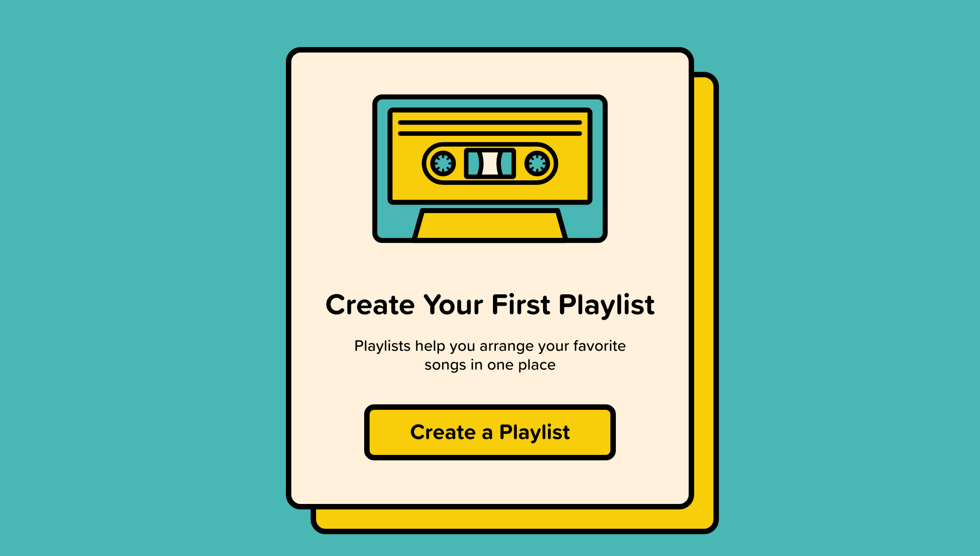
Thou shalt make blank states more than just an empty display
A display that would typically be populated with user input is blank because the user has opened your product for the first time.
This could be a list of books, projects, to-dos, customers, or songs — but since they haven’t added anything yet, it’s empty.
Leaving a blank slate where the content would be is a missed opportunity for you to provide guidance and information about your software.
You should use your empty state to orient users.
You can use empty states to provide advice, guidance, an overview of possible actions, or simply replace the empty state with a screen allowing users to input the missing information.
Whatever you decide to do, make sure you don’t just say, “There’s nothing here yet…”
15. Targets
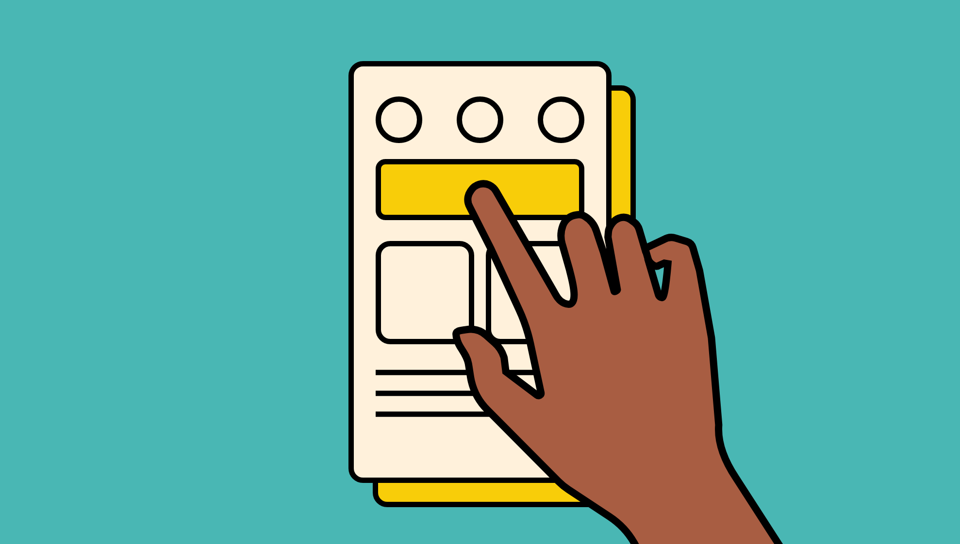
Thou shalt make controls large enough for human fingers
If your interface is used by touch, then give an adequate size to tappable elements.
Having to avoid one item to select another is frustrating, and it doesn’t provide a pleasant experience if they choose an option they didn’t intend to.
2mm padding between elements is a good rule of thumb to prevent mis-taps.
Apple’s iPhone Human Interface Guidelines recommends a minimum target size of 44 pixels wide 44 pixels tall.
Microsoft’s Windows Phone UI Design and Interaction Guide suggests a touch target size of 34px with a minimum touch target size of 26px.
16. Infinite Scroll
Thou shalt use infinite scroll for feed style content only
Infinite scroll is what all the social media apps are using. No need to click to the next page, the content loads asynchronously as the user scrolls.
This works great in a newsfeed, but if applied to messages, emails, to-do items, search, and so on then, the user won’t be able to determine where the beginning, middle, and end is.
When a user can see that there are 945 pages in a list, they can decide whether to narrow the list down with search, sort, or filter. They can’t make that decision if they have no idea how many items there are in the list.
17. Show don’t tell
Thou shalt not require laborious reading to understand how a program works
The expression “show don’t tell” is often attributed to playwright Anton Chekhov, the technique of allowing the reader to experience the story through senses and feelings rather than the author’s description.
Users don’t want to read to understand — instead, show them the situation and allow them to experience it visually.
Showing users how to use your product is always better than telling them.
Video demos are ideal for complex software and interfaces, but if a video isn’t possible, then onscreen tips are a great starting point. Be sure, though, to make the tips visually appealing and dismissable.
18. Native Components
Thou shalt use device native interface components where possible
By leveraging components already built into products, we can provide users with a familiar experience and avoid input errors.
Regardless of how good of a designer you are, you can’t justify designing a calendar date picker from scratch. Even if yours is objectively better, the user still has to learn a new component when there’s a perfectly fine one built into their device.
Native components are a no-brainer — use them to save time and effort for your team and reduce friction for your users.
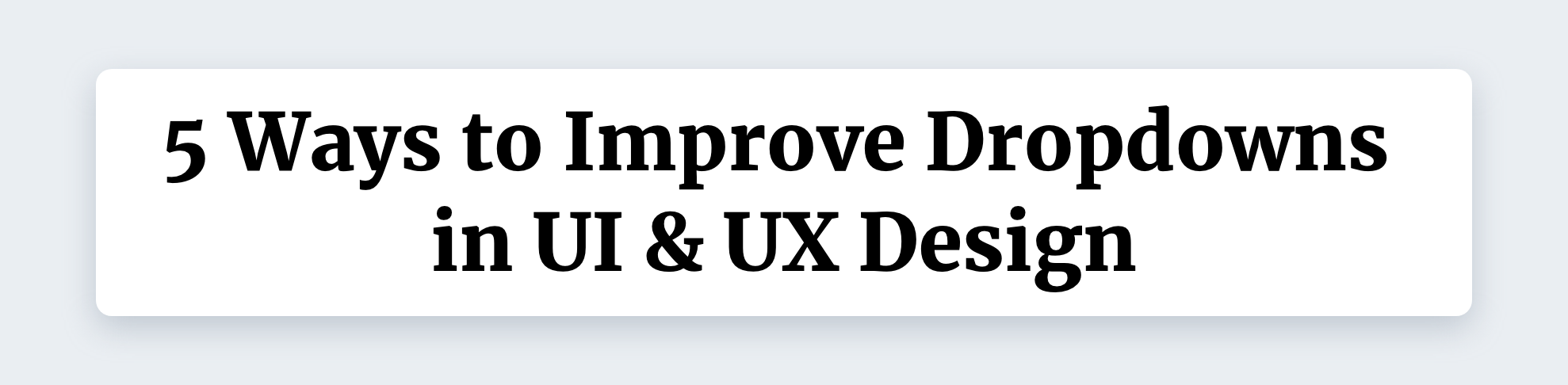
If appropriately used, dropdowns don’t have to be awful.
Original article — 10 Ways to Improve Dropdowns in UI & UX Design
19. Smart Default
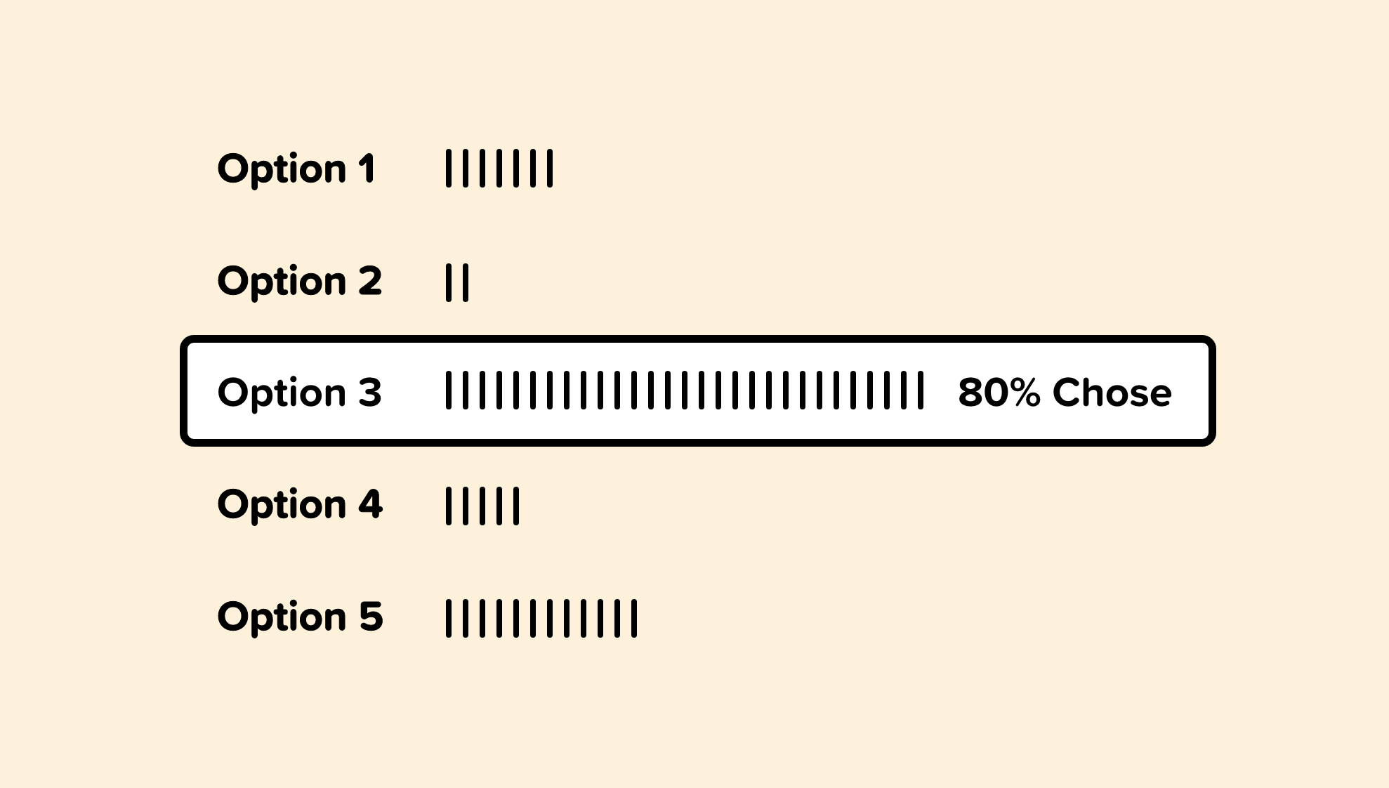
By utilizing analytics and overall usage patterns, we can determine which option is selected most frequently from our dropdown.
If 80% of the users select a specific option, we can allow 80% of users to skip this step entirely by making that option the smart default.
If you’re paying a speeding ticket on a Colorado website, for example, it makes sense for the smart default to pre-select Colorado as the state.
20. Simplify
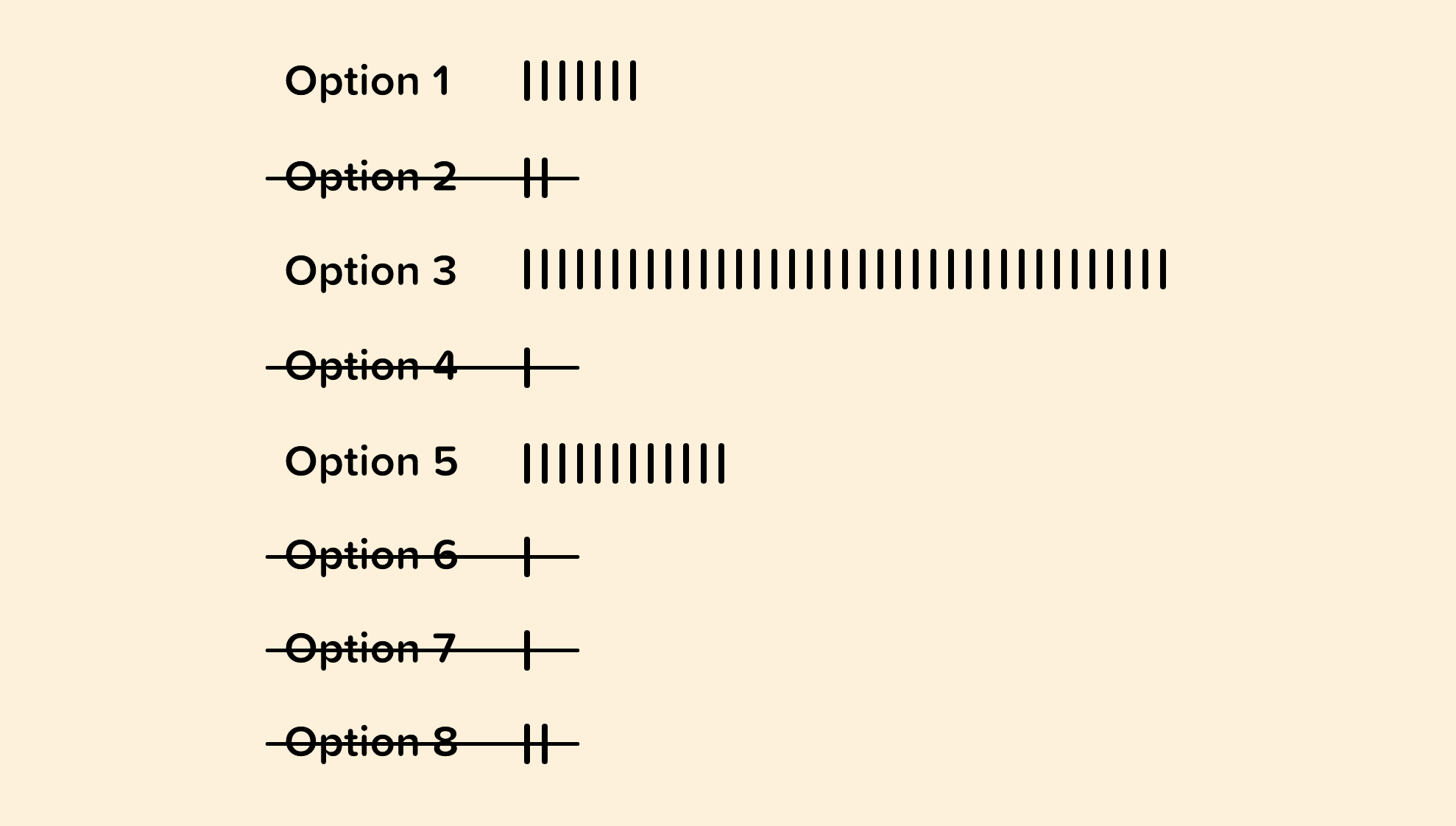
When possible, we can use analytics to inform on which options from our dropdown may be unnecessary.
If users are only selecting a handful of options and rarely selecting or never selecting others, then we can consider removing them.
Having a concise dropdown will make it easier for our visitors to quickly choose the option that is most relevant to them.
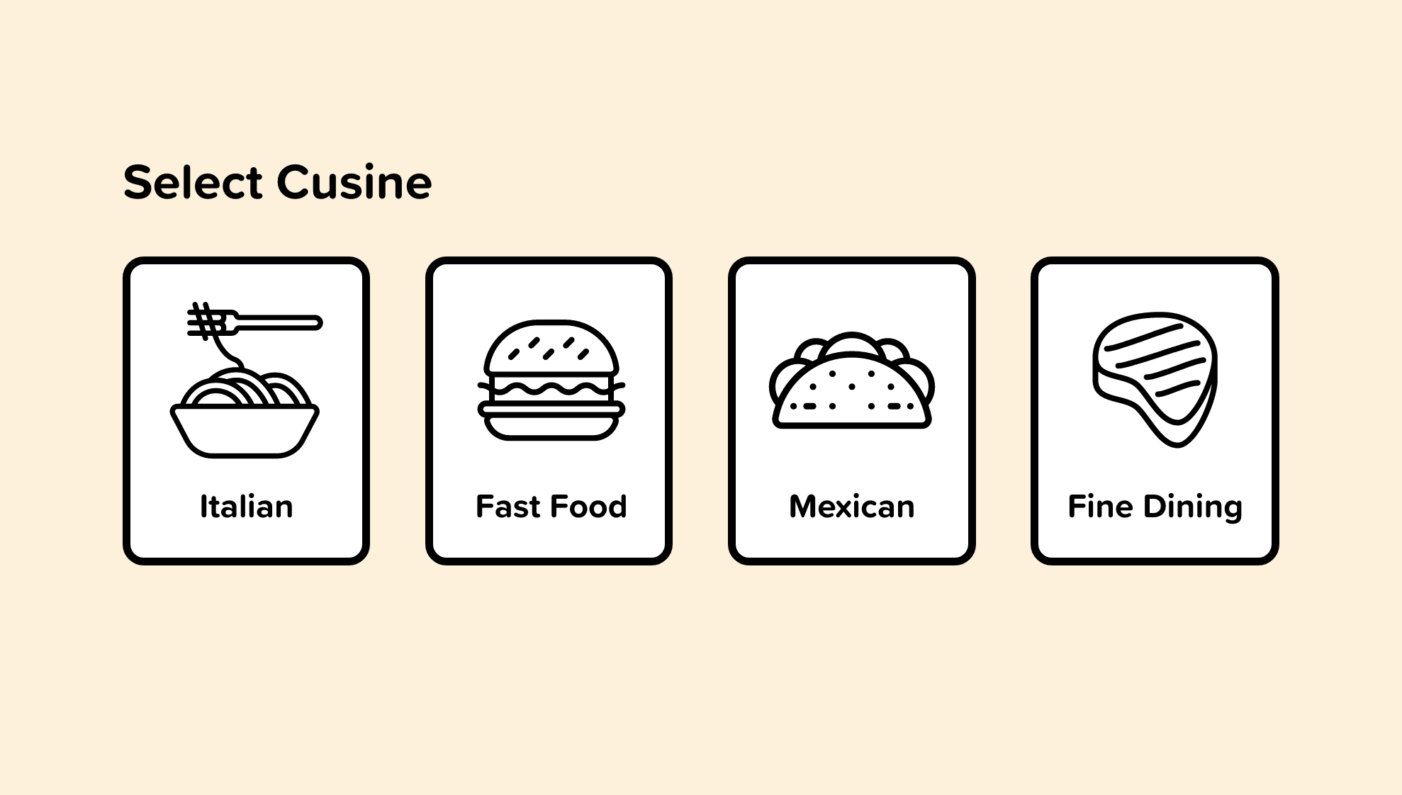
21. Individual Usage Patterns
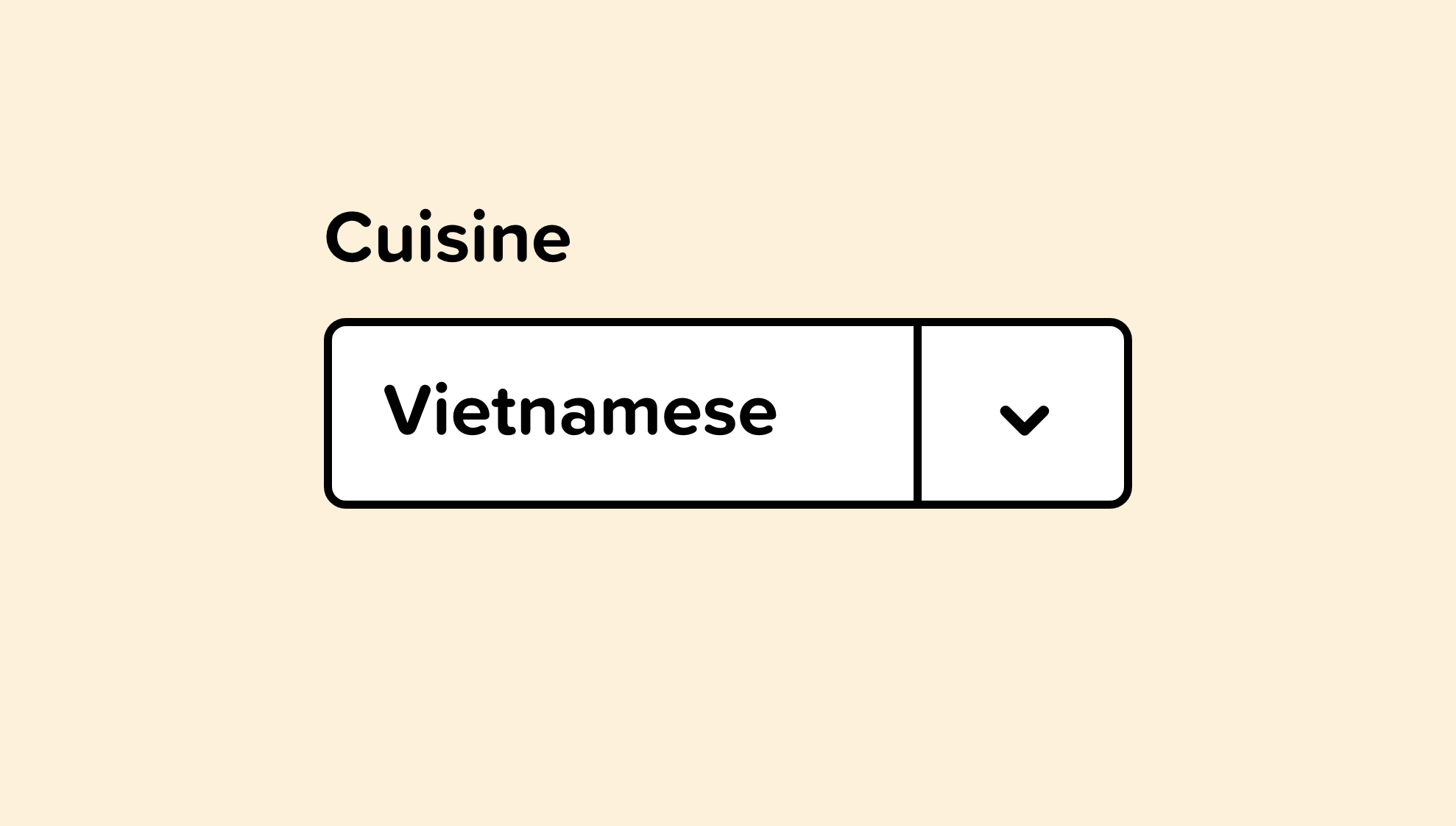
Similar to smart defaults, we can pre-select an option that is specific to an individual user.
For example, if our logged in user frequently orders Vietnamese food, we can pre-select that cuisine and display relevant options to that selection.
The smarter our inputs can be, the better the experience for our users.
This could also work for airlines or travel software. Once a booking website knows where you frequently fly from and fly to, those options could be set as your default.
22. Use Visual Elements
Occasionally the options in a dropdown are visual elements. Instead of placing them in a dropdown, we should design our interface to represent them as what they are.
We see this frequently with color options on an e-commerce site. Displaying the possible color options is an improved experience over a dropdown.
23. Use Listboxes
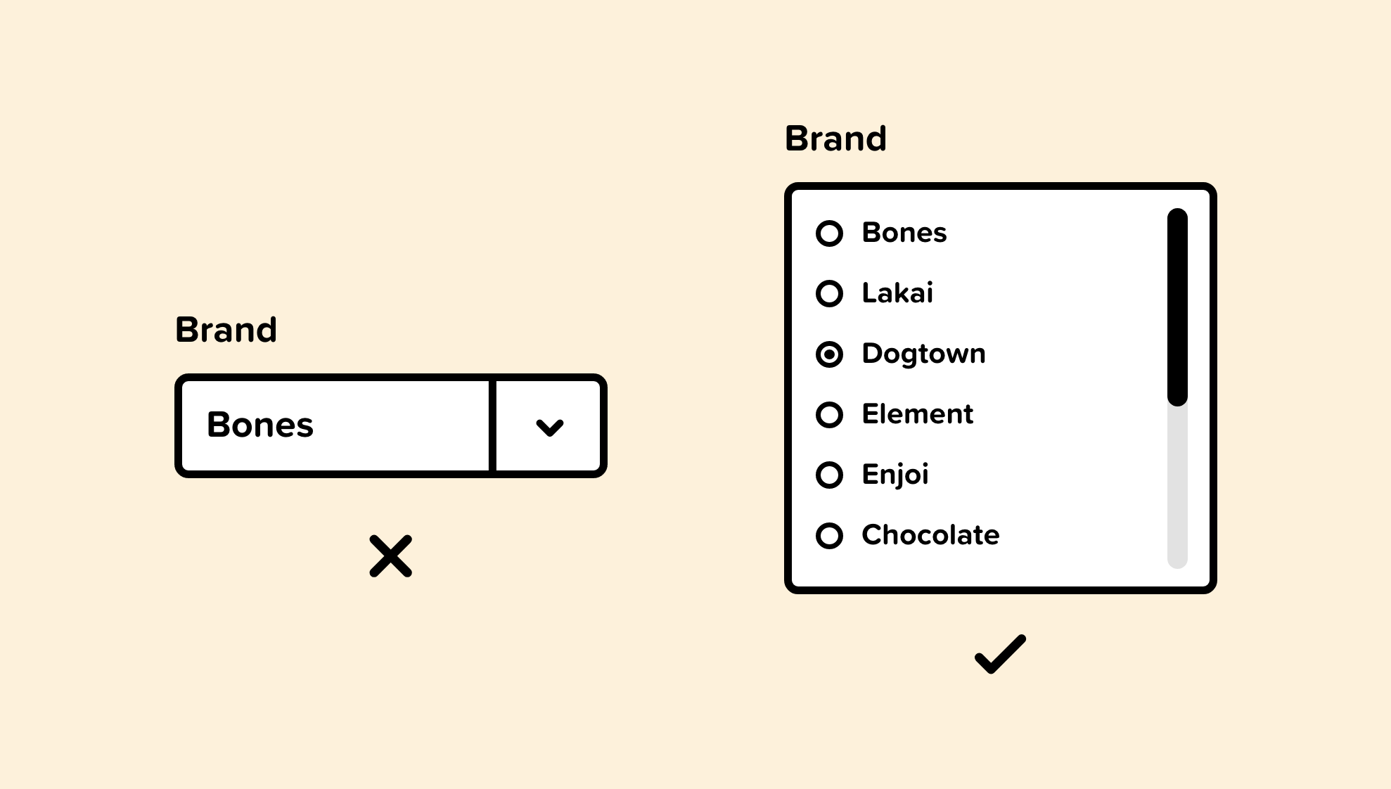
Dropdowns require clicking into them to see the options. Listboxes, in contrast, allows the user to see the possibilities without them hiding inside a dropdown.
Listboxes can include checkboxes, radio buttons, or toggle switches.
Listboxes are frequently used on e-commerce websites when displaying categories, size, price range, color, and so on.
Developing social skills are vital to a successful career in UI & UX.
Original article — 10 Soft Skills for UI & UX Designers.
24. Feedback
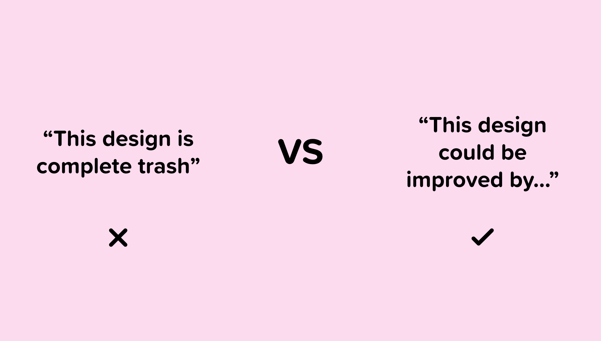
Giving constructive feedback, and responding to less-than-constructive feedback is a critical skill that can be uncomfortable for many new designers.
Lack of awareness of basic feedback skills leads to clients providing vague and worthless feedback like “can you make it pop?”
To provide effective feedback, we need to be clear and specific. “The imagery used on our careers page doesn’t represent our culture well. Let’s show a playful and relaxed vibe to connect better with the candidates we hope to attract” is more useful feedback than “make it pop.”
When it comes to receiving feedback, it’s important to define exactly what we want feedback on. We should also be open-minded to the feedback we receive and continually ask to clarify or elaborate on vague input.
25. Active Listening
Active listening is focusing on the other person and not thinking about the thoughts, opinions, or ideas that pop into our head.
This skill is effective when interviewing customers, speaking with colleagues, or gathering insights about a business problem from our client.
Active listening won’t just benefit our design career — it will help us in friendships, interviews, intimate relationships, or anything that involves communicating with people.
This Forbes article, 10 steps to Effective Listening, is a great read for anyone hoping to improve active listening skills. These are my favorite tips from the article:
- Face the speaker and maintain eye contact
- Listen to the words and try to picture what the speaker is saying
- Don’t interrupt and don’t impose your “solutions”
- Wait for the speaker to pause to ask clarifying questions
- Ask questions only to ensure understanding
- Give the speaker regular feedback (verbal or non-verbal)
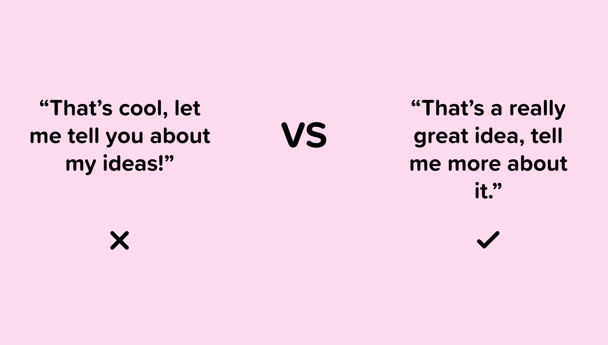
26. Every Communication is a UX project
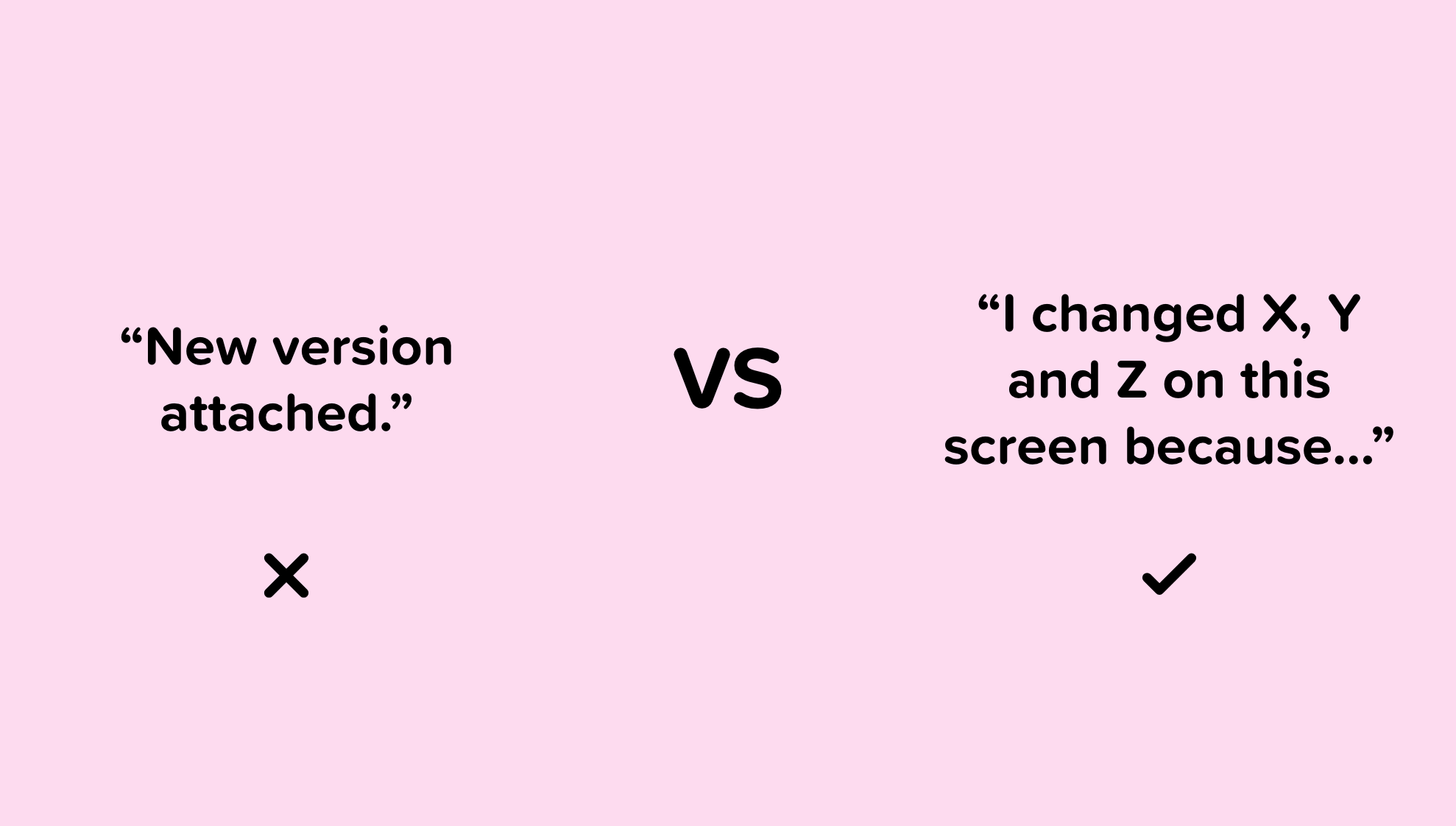
When we send an email, message, text, or snail mail to a colleague, client, or customer, it’s a good skill to communicate in a way that requires less work from the person on the other end of that message.
Making every piece of communication a seamless experience for the people that we work with will make working with us more enjoyable and improve our credibility as a UX designer.
Instead of sending messages that require the other person to do the work like “I’m sure there’s a product out there that we can use” we should make it easier for them and say something like, “I did some research and found product x, y, and z that could solve our hiring issue.”
Investing an extra few minutes into our message can make a dramatic difference in the experience others have when working with us.
27. Lose the ego
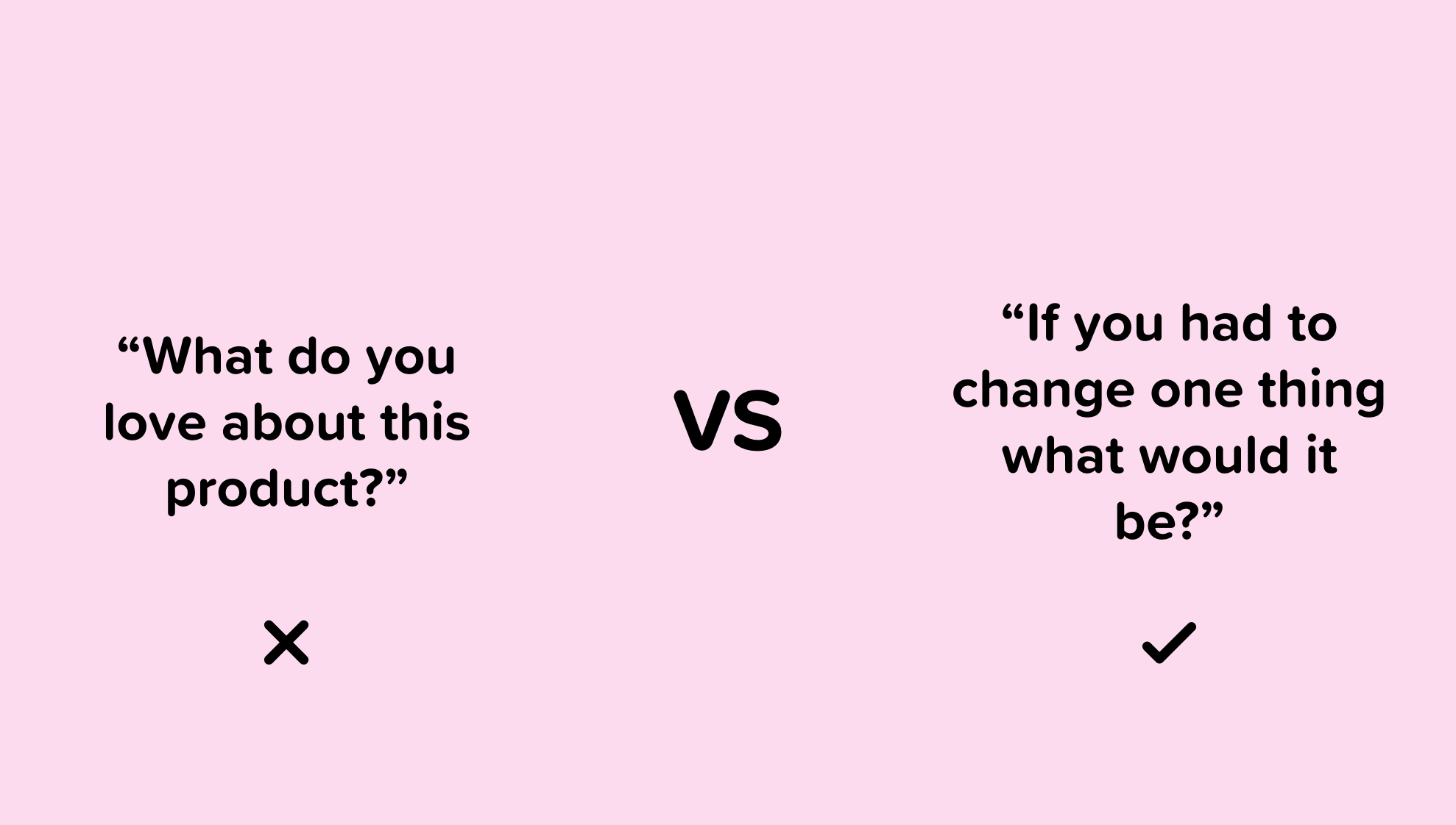
We love it when people give us praise, that’s human nature. But it’s a good skill to be able to detach ourselves (and our egos) from our design work.
When conducting feedback, it’s more useful to focus on the areas of improvement rather than seeking compliments on what the user liked. Ask people what they would change rather than seeking acknowledgment for things done well.
When given feedback that we don’t agree with, don’t get defensive, but instead ask what they would change or how they envisioned it.
The ability to not feel personally insulted by negative comments about our design is not an easy trait to have, but it’s a crucial skill.
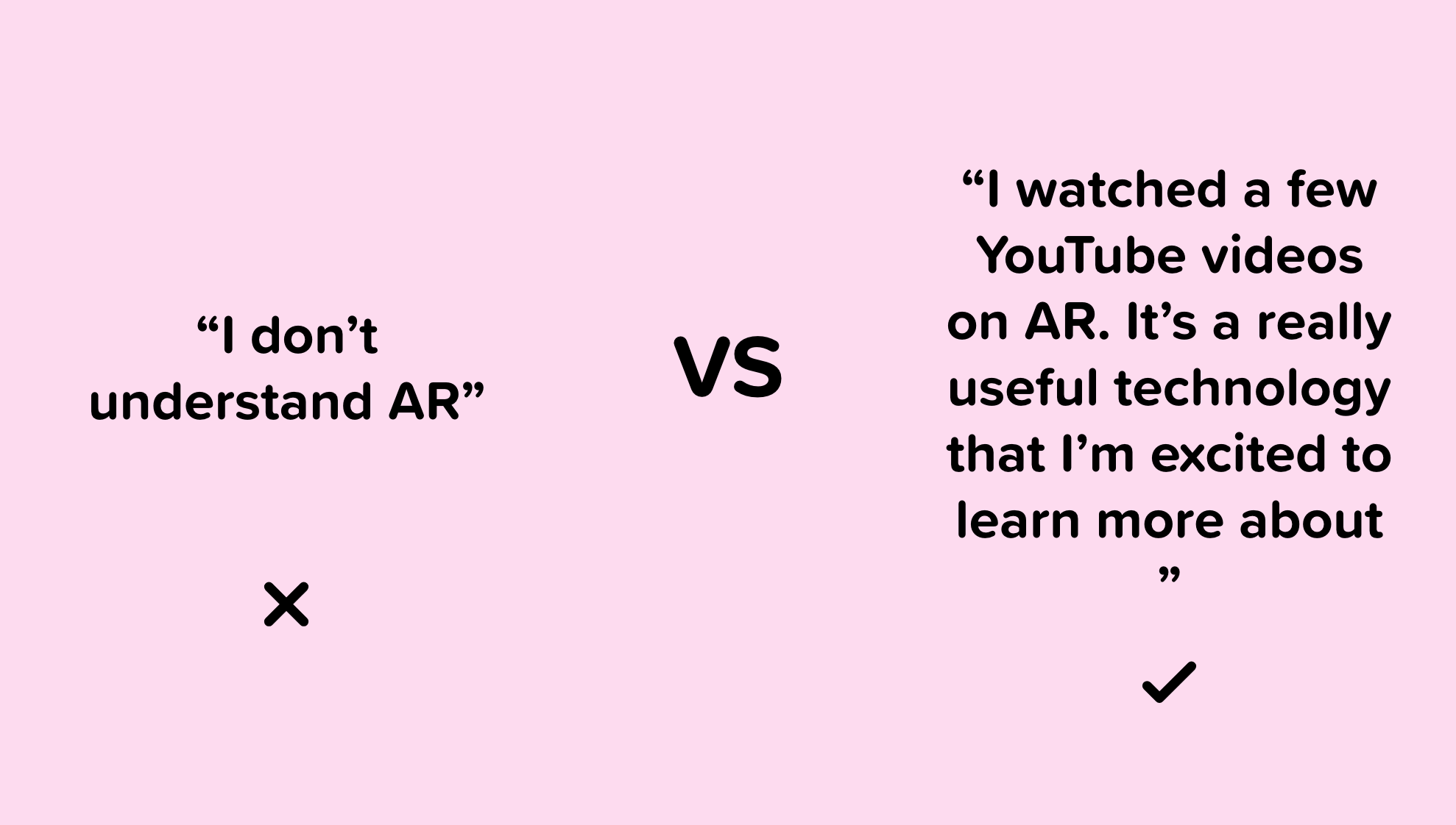
28. Autodidacticism
An autodidact is a self-taught person, someone with the will power to be the driver of their success. UI & UX aren’t industries that are dependent on fancy degrees or credentials — success is based on work ethic and consistency.
Being an autodidact is an essential skill because everyone in the design space, at some point, encounters problems, jargon, programs, and so on, that they do not understand.
When this unavoidable challenge arises, we can’t go back to school to learn how it’s done, and we can’t bother our coworkers all the time. By having the skills and willpower to figure things out on our own, we will grow remarkably by our own volition.
With the internet, there is no excuse for not being able to teach ourselves everything we want to know about UI & UX. Everything we need is right in front of us, but only those with self-discipline will take advantage of it.
29. Adaptation
It’s no secret that the digital and physical world is constantly evolving.
It’s vital that designers familiarize themselves with emerging technologies, products, trends, and so on.
Not only do we risk being displaced, but we also risk missing out on opportunities to improve our product’s experience.
Being adaptable and having the initiative to educate ourselves about disruptive technologies will put us ahead of the curve and ensure that we still have a job through the inevitable changes our industry will encounter.

Remember these mistakes when designing your next interface.
Original article — 10 Common Mistakes UI Designers Make
30. Disregarding scope
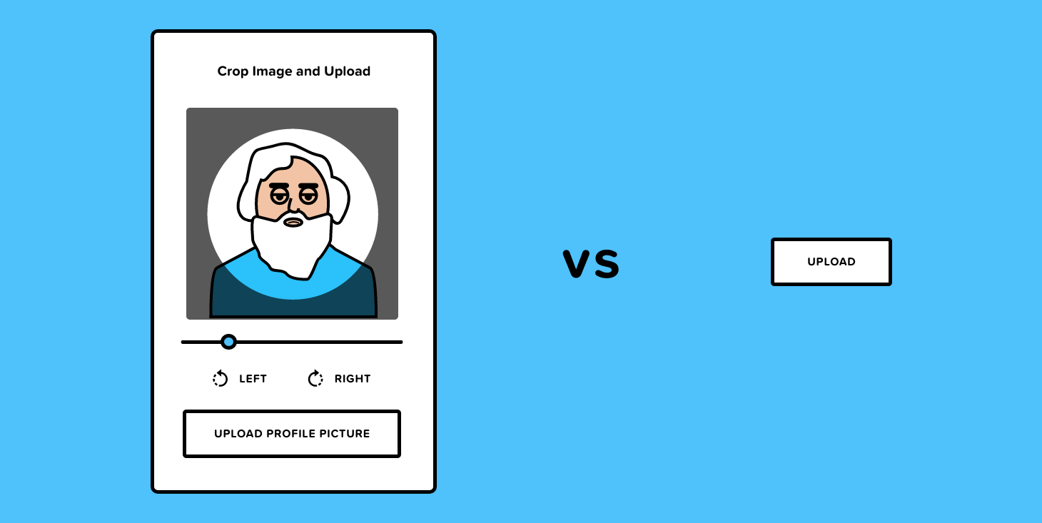
It’s not uncommon for designers to introduce features that will overcomplicate the development process while bringing no additional value to the application. Focusing on the business objectives, project scope, timeline, and the way products are developed are all valuable considerations when prioritizing features for design.
If, for example, we’re designing an option for the users to upload a profile picture, but we also add functionality to crop, scale, and rotate the photo, then this would unnecessarily complicate the design.
It’s effortless to add a “rotate” or “crop” button in design but would be trickier to implement in development. A safe bet is to avoid adding features unless they’re essential to the application. Always keep the business and user goals at the forefront of the design process.
31. Overlooking the user’s context
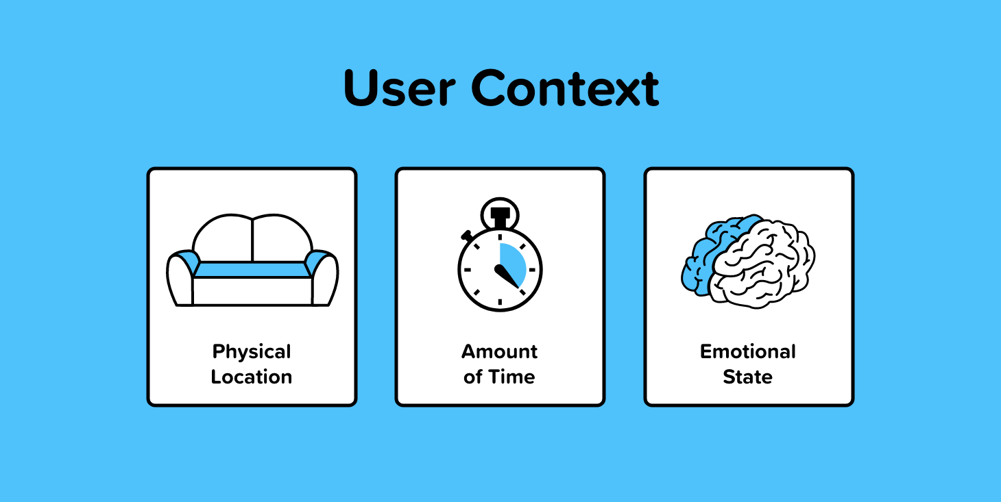
There are various contextual factors that influence a user’s behavior when interacting with an interface. Consider where the user is when using our app, how much time they have, and what their emotional state is.
A perfect example of this is the sleep cycle app. The app has a calming dark display making it easy on the eyes and perfect for someone setting the alarm before going to bed.
You can see good and bad examples of this everywhere. Navigation apps have minimal reading or touching required, Kindle’s have no glare when reading outside, note-taking apps are available offline, and so on.
If our app is meant to be used while jogging, then some constraints and considerations need to be taken into account in the design.
The best way to ensure our interface and UX fit the user’s context is to test it in situations where it may be used and test it with users.
Shopify has a great article about designing with the user’s context in mind that I recommend for anyone interested in diving deeper into this topic.
32. Focusing heavily on how it looks, not how it works
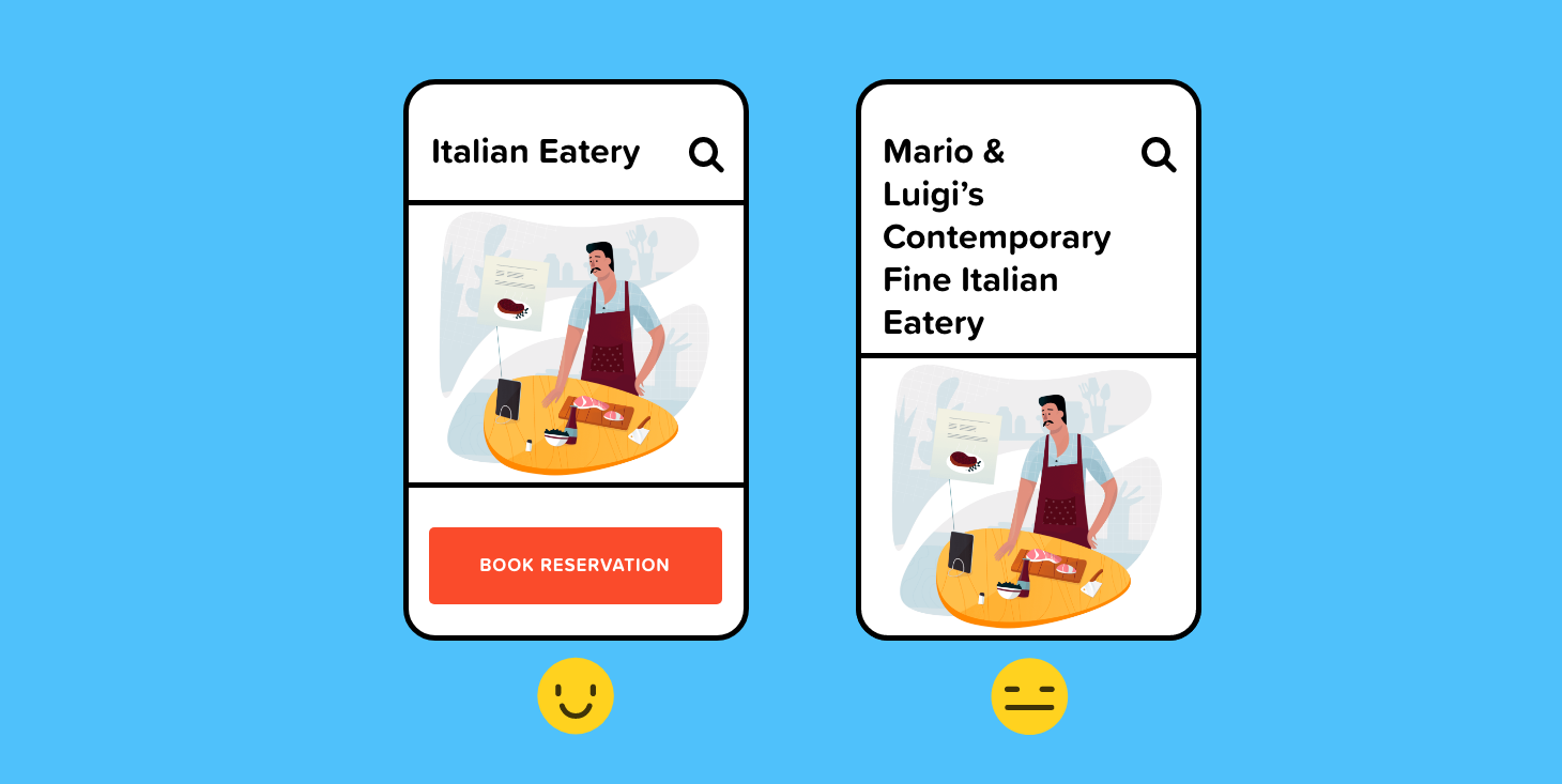
One thing every UI designer hates doing is breaking their designs.
Breaking a design essentially means to input data that would ruin the layout or aesthetic appeal of the interface. This can be uncomfortable to do as a designer, but it’s a crucial component to designing a flexible, scalable, and user-friendly product.
When the mockup I sent to production has a six-letter first name, it probably looks great, but what happens when Hubert Blaine Wolfeschlegelsteinhausenbergerdorff Sr. tries to use the app?
Test designs and take a step back while designing to ensure that the interface can fit a wide variety of use cases, not just the ideal ones.
33. Missing design states
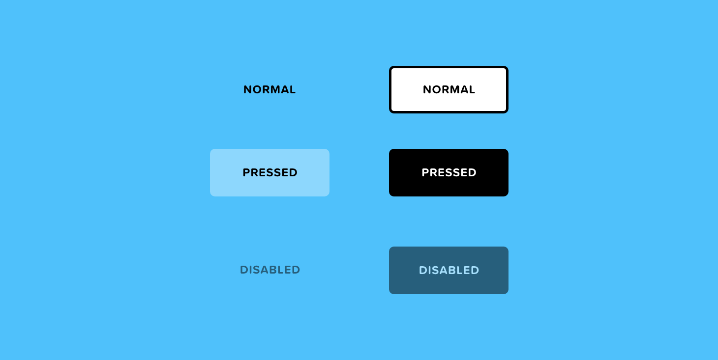
When designing for development, missing states will either create a gap in the experience or will need to be filled in by the developer. This can often create inconsistencies in the design and hiccups down the road.
We need to account for all of the different states that are possible such as error, success, active, disabled, hover, empty, filled, loading — to name a few.
If I were designing a wishlist, for example, I would need to consider the state before a user had added anything to their wishlist: the empty state. Without this state, there will be a gap in the experience.

Noteworthy takeaways from the IOS design guidelines.
Original article — 10 Insights from Apple’s Human Interface Design Guidelines
34. Delay sign-in as long as possible
“People often abandon apps when they’re forced to sign in before doing anything useful. Give them a chance to fall in love with your app before making a commitment to it. In a shopping app, let people browse your merchandise immediately upon launch, and require sign-in only when they’re ready to make a purchase. In a media-streaming app, let people explore your content and see what you have to offer before signing in to play something.” — Apple Authentication Guidelines
Apple urges us to re-assess the entrance experience to our app. If possible, remove sign-in and sign-up altogether.
Unfortunately, the app I’m designing right now doesn’t allow me to completely remove sign-in. But I’ve moved the sign-up screen to the end of onboarding so the user can at least get a feel for the type of experience they can expect after they sign up.
It’s also a good idea to introduce a variety of sign up options to make signing in seamless. The app I’m working on right now supports Password Autofill, Facebook login, Google login, Sign in with Apple, and default email + password.
35. Show content as soon as possible
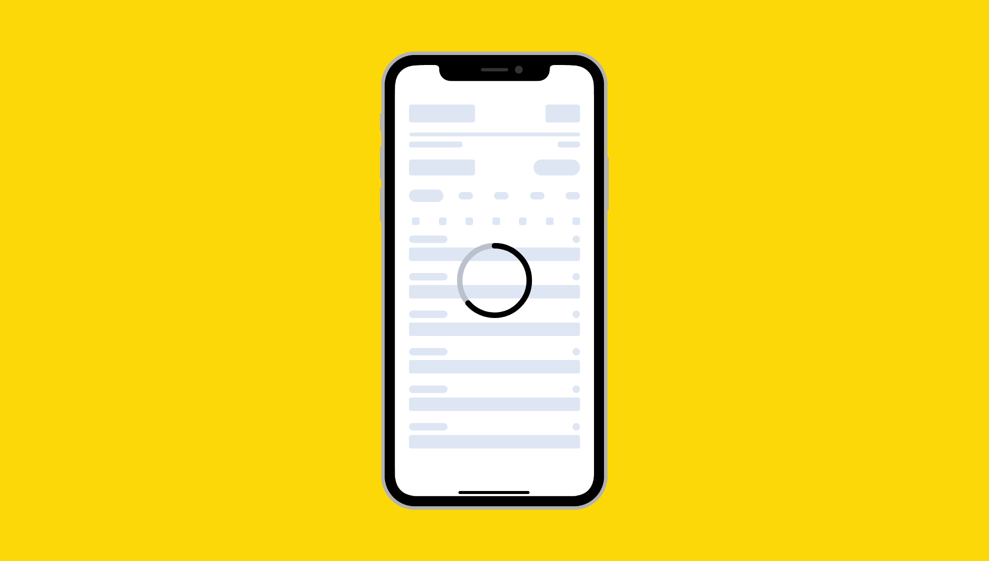
Not to be confused with the splash screen, the launch screen is the screen that introduces the elements on the page. Design a launch screen that’s nearly identical to the first screen of your app.
“If you include elements that look different when the app finishes launching, people can experience an unpleasant flash between the launch screen and the first screen of the app. Also, make sure that your launch screen matches the device’s current appearance mode; for guidance, see Dark Mode.” — Launch Screen Guidelines
“Don’t make people wait for content to load before seeing the screen they’re expecting. Show the screen immediately, and use placeholder text, graphics, or animations to identify where content isn’t available yet. Replace these placeholder elements as the content loads. Whenever possible, preload upcoming content in the background, such as while an animation is playing or the user is navigating a level or menu.” — Apple Loading Guidelines
36. Anticipate the need for help
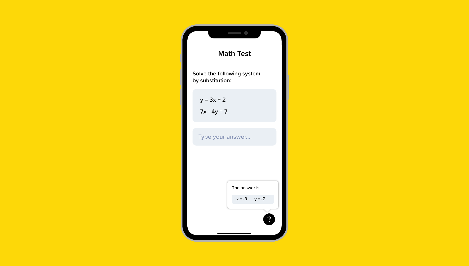
“Proactively look for times when people might be stuck. A game, for example, could casually show useful tips when paused or when a character isn’t advancing. Let people replay tutorials in case they miss something the first time.” — Apple App Architecture Guidelines
Adding quick tips, customer service chat, chatbots, FAQ, a help center, and so on will create a fail-safe for users who may get confused.
In the app I’m creating, I have a few instances where I include help icons to educate the user on what the actions mean. This keeps my interface clean but also provides an option to learn more if needed.
37. When necessary, help people avoid information loss
“Regardless of whether people use a dismiss gesture or a button to close the view, if the action could result in the loss of user-generated content, present an action sheet that explains the situation and gives people ways to resolve it.” — Apple Modality Guidelines
“Instill confidence that work is always preserved unless canceled or deleted. In general, don’t make people explicitly save files. Instead, save changes automatically at regular intervals, when opening and closing files, and when switching to another app. In some cases, such as while editing an existing file, save and cancel options may still make sense for the sake of confirming when the edits are actually captured.” — Apple File Handling Guidelines
38. Don’t include sensitive, personal, or confidential information in a notification
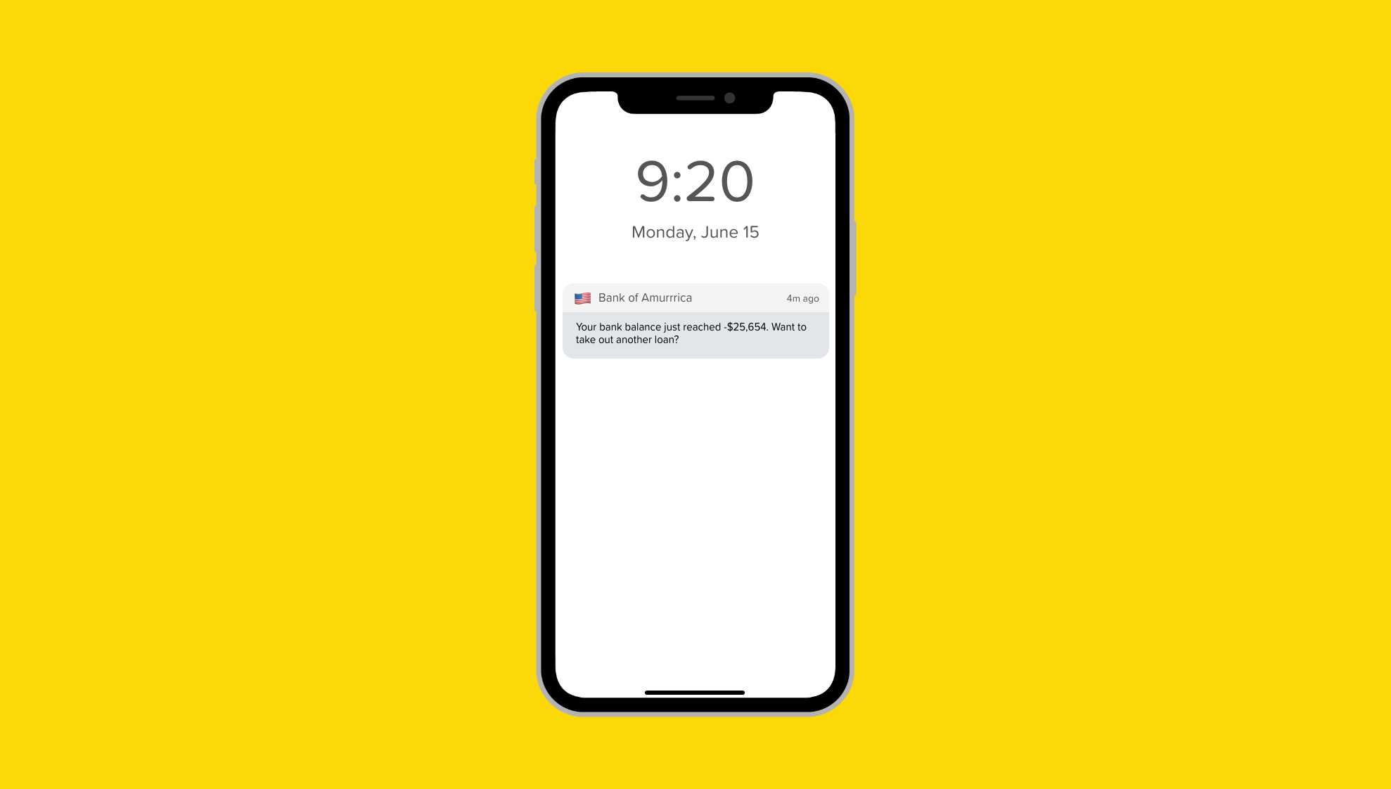
“You can’t predict what people will be doing when they receive a notification, so it’s essential to avoid including private information that could display on the device screen.” — Apple Notification Guidelines
Common behaviors that people demonstrate as they relate to product design.
Original article — 10 Behavior Patterns for UX Design
39. Safe Exploration

“Let me explore without getting lost or getting into trouble.”
“When someone feels like they can explore an interface and not suffer dire consequences, they’re likely to learn more — and feel more positive about it — than someone who doesn’t explore. Good software allows people to try something unfamiliar, back out, and try something else, all without stress.”
Unlike in the real world, interfaces make it easy for users to mend their mistakes. If you’re at the office and spill coffee on your skirt, then you’re kind of screwed — you can’t CTRL + Z that. In contrast, our interface designs should encourage users to explore the different options available and then allow them to get back where they started or undo any actions easily.
Examples:
- Back buttons making it easy to get back where I started
- Trying photo filters but making it easy to undo if I don’t like the result
- Saving history
- Undo buttons for documents
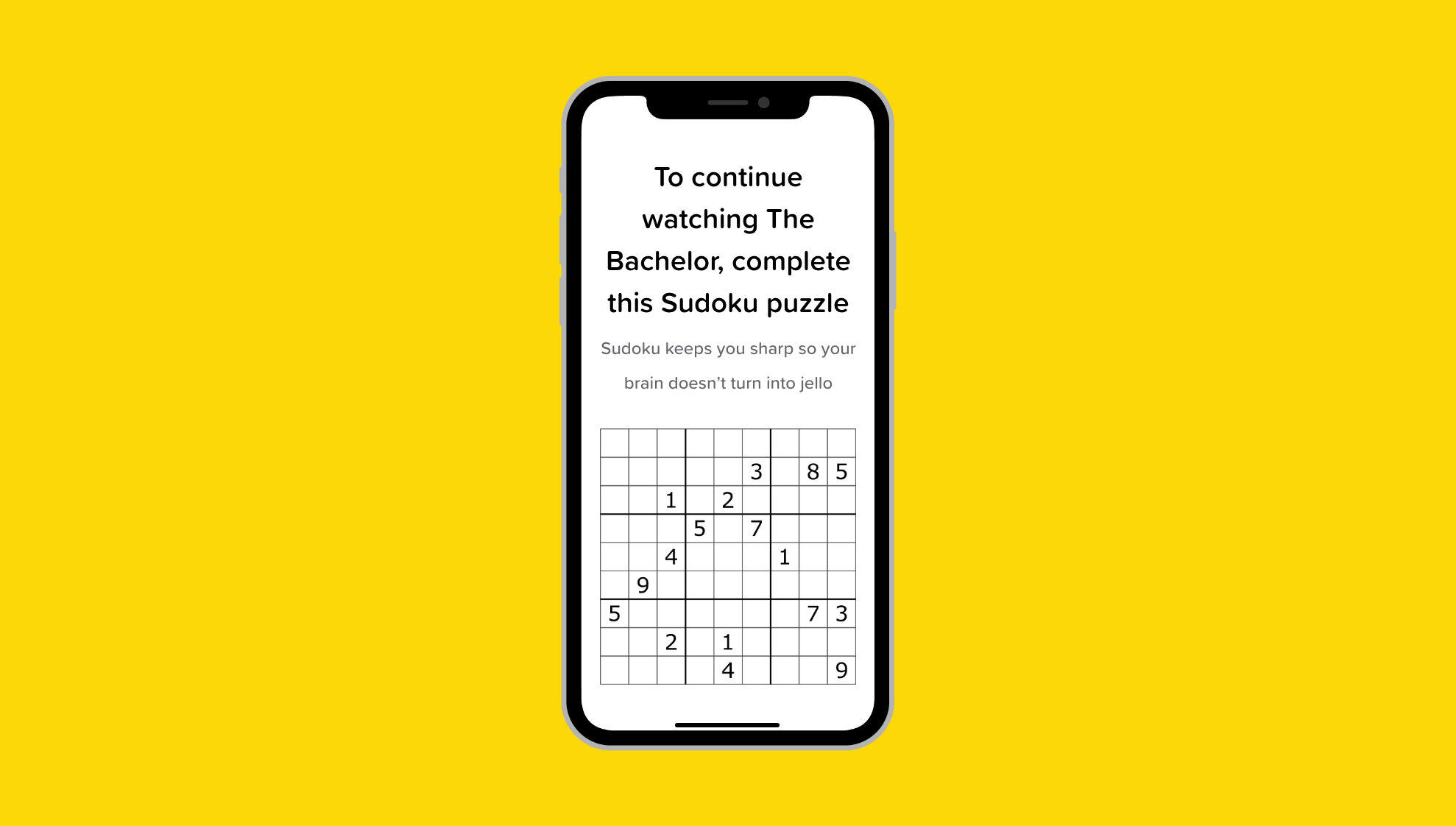
40. Instant Gratification
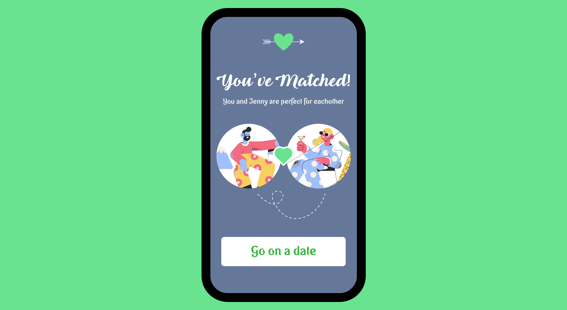
“I want to accomplish something now, not later.”
“People like to see immediate results from the actions they take — it’s human nature. If someone starts using an application and gets a “success experience” within the first few seconds, that’s gratifying! They’ll be more likely to keep using it, even if it becomes more difficult later. They will feel more confident in the application, and more confident in themselves, than if they had taken a while to figure things out.”
In our fast-moving digital world, everything is getting that much quicker and easier. Hungry? A door dasher can be at your place in 30 mins or less. Need a ride? Uber is minutes away. Want a date? You could be matched with a potential date in a matter of seconds on dating apps. The list goes on…
If our product isn’t providing an instant hit of dopamine, then it’s at risk of being disrupted by a competitor’s product that is. Consider in your design how you can give your users a feeling of satisfaction or achievement in the experience.
Examples:
- Getting a match on a dating app
- A blast of Confetti when you complete a habit
- Calling an Uber and immediately having one on the way
- Hitting the snooze button
41. Habituation
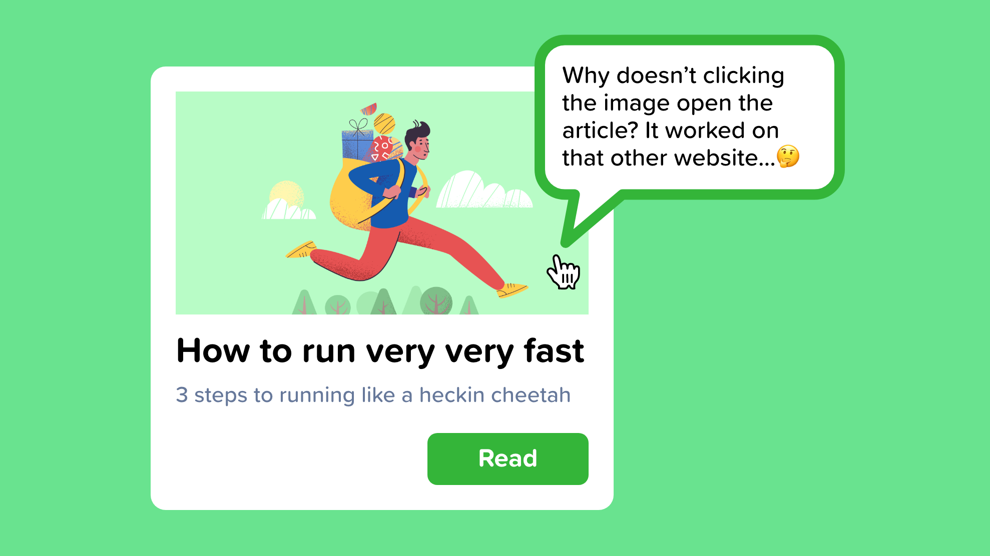
“That gesture works everywhere else; why doesn’t it work here, too?”
“When you use an interface repeatedly, some frequent physical actions become reflexive: pressing Ctrl-S to save a document, clicking the Back button to leave a web page, pressing Return to close a modal dialog box, using gestures to show and hide windows — even pressing a car’s brake pedal. The user no longer needs to think consciously about these actions. They’ve become habitual.”
As someone who uses Figma, XD, and Sketch in tandem daily, I am impressed with how uniform most of the controls are but still get annoyed at the occasional difference.
If there is an industry-standard for interaction or UI, then it’s best to follow these conventions to be safe — redesigning existing patterns is generally more confusing than useful. Save your creativity for other aspects of the product.
Examples:
- CTRL + S, CTRL + Z
- Swiping left or right to go to the next or previous screen
- Pressing X to exit a dialog
- Swiping down to refresh on mobile
42. Deferred Choices
“I don’t want to answer that now; just let me finish!”
“This follows from people’s desire for instant gratification. If you ask a task-focused user unnecessary questions in the process, they might prefer to skip the questions and come back to them later. For example, some web-based bulletin boards have long and complicated procedures for registering users. Screen names, email addresses, privacy preferences, avatars, self-descriptions… the list goes on and on. “But I just wanted to post one little thing,” says the user.
“Why not allow them to skip most of the question, answer the bare minimum, and come back later (if ever) to fill in the rest? Otherwise, they might be there for half an hour answering essay questions and finding the perfect avatar image.”
As UX designers, we should be considering where we can slim the fat wherever necessary. Don’t ask for unnecessary information, but more importantly, allow information to be entered later or make it optional.
Anything that isn’t 100% necessary should be skippable.
Key points:
- Don’t have too many steps
- Allow users to ‘skip’
- Separate important questions from the ones that are less important
- Allow users to add, change, or edit things later
43. Streamlined Repetition
“I have to repeat this how many times?”
In many kinds of applications, users sometimes find themselves needing to perform the same operation over and over again. The easier it is for them, the better. If you can help reduce the operation down to one keystroke or click per repetition — or better, just a few keystrokes or clicks for all repetitions — you will spare users much tedium.”
I used to do a decent amount of customer service for my first company and found myself continually copying and pasting the same generic responses from a doc. I eventually said, to hell with this, there has to be a better way. There was — I found a chrome extension that used text shortcut to auto-fill what I was trying to say. If I typed “greet%,” it would auto paste my greeting message.
This saved me enormous amounts of time and helped me recognize the importance of streamlining user experiences for frequently repeated actions.
If your users are continuously repeating the same command or action — make a shortcut or workflow for it to make their life easier.
Examples:
- Autofill when you start typing something
- Google Chrome auto-completing the query “yo” with “www.youtube.com”
- Automating routine processes in Slack with workflow builder
- “Delete All” or “Select All”

You are creative — let me prove it to you.
Original article — 10 Tips & Exercises to Develop Your Creativity.
44. No judgment

“One thing I tell people all the time, never judge your work while you’re doing it. Just let it go. Flow with it. All judgment stops creativity.”
— Terry Crews
If you ask a room of people to write a lyric, draw a picture, come up with a business idea, or build something with legos, you’ll hear grumbles like “I’m so bad at this,” or “I don’t have a creative bone in my body” throughout the room.
The problem with this mindset is we’ve given up before we’ve started. Then, as soon as we do start, we’re picking apart every decision as we make it.
The key to creativity is to free ourselves from judgment and allow the unconscious parts of our mind to take over.
“If you hear a voice within you say, ‘You cannot paint,’ then by all means paint, and that voice will be silenced.”
— Vincent Van Gogh
We hold ourselves to such high standards that it limits our ability to create anything at all.
Instead of stewing over the quality of our ideas or trying to do our best work, we should focus on creating — we can always refine it later.
45. Quantity over quality
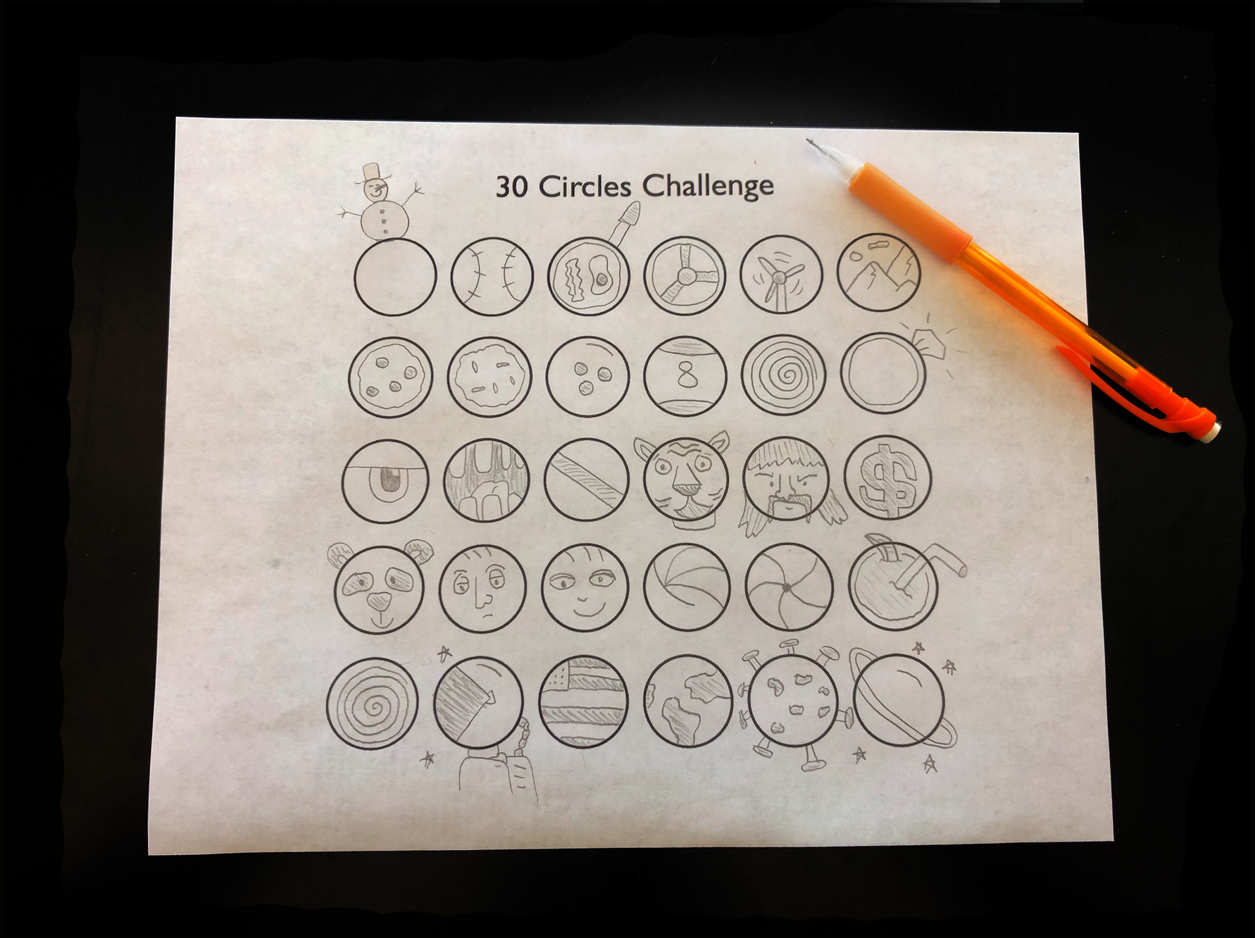
Instead of focusing on the quality of output, focus on the quantity. Quantity exercises are excellent for creativity because they teach us that creativity is about expression — not results.
We instinctively self filter our ideas as they arise. Quantity over quality trains us to allow all ideas to flow — even the bad ones.
If you’ve ever been in a brainstorming session, then the leader will often say that “no idea is a bad idea.” Their goal is to get as many ideas on paper as they can because those ideas can always be polished later.
One of my favorite quantity exercises is the 30 circles challenge. In this challenge, you strive to fill in as many of the 30 circles as you can in 5 minutes. Try it for yourself and see how many you can complete — here’s a blank sheet.
The goal isn’t to have amazing drawings — it’s to fill all the circles before the timer runs out. This trains you to worry less about your artistic abilities and rather to generate many ideas in a short amount of time.
46. Unplug from inputs
Mahershala Ali’s quote below sums it up perfectly:
“Social media has colonized what was once a sacred space occupied by emptiness: the space reserved for thought and creativity.”
— Mahershala Ali
In our modern world, we don’t go a moment without being entertained. Every dull moment is flooded with stimulus from our mobile device, ads, tv, magazines, video games, and so on.
Our devices and technology are great in moderation, but occasionally switching them off and sinking into a state of boredom can do wonders for our mind and creativity.
The board game Scrabble was invented by a bored, unemployed, Alfred Mosher Butts. The boredom of unemployment helped fuel Butts. “Well, I wasn’t doing anything,” Butts said. “That’s the trouble. I didn’t have anything to do; I didn’t have a job. So I thought I’d invent a game.”
Boredom can be the change that’s needed to allow your ideas to break through the noise.
Growing up in the middle of nowhere in rural Pennsylvania, we had no TV or video games, and I was homeschooled, so I had few friends for most of my early childhood. We weren’t Amish, but that’s not too far from the truth.
These years of my life might sound dull to most. But they were far from it. My lack of input led to some of the most creative years of my life. I found ways to entertain myself by taking toys apart, building with Legos and Lincoln Logs, drawing, and “inventing things.”
Seek moments of peace and boredom, and we just might find the creative spark we’ve been looking for.
47. Try new things
Similar to reading, the more information, and skills we know and understand, the easier it will be to generate creative connections between unrelated things.
In the past year, I tried improv, took a class drawing nude models, attended parkour classes, got scuba certified, traveled, and so much more.
I wasn’t expecting to become a parkour master or a nude model artist — I simply wanted to learn about something I knew nothing about.
Every experience gives us a better understanding of the world and can provide inspiration for us to draw ideas from in the future. I encourage everyone to try new things because we never know where our next splash of inspiration will come from.
What's Your Reaction?