
![[VIP] Uicon V1.0 / Animated Icons](https://design.rip/uploads/cover/blog/uicon.webp)

![[VIP] Talkative Brand Book & Style Guide](https://design.rip/uploads/cover/blog/talkative-brand-book--style-guide.webp)
![[VIP] UX Stack Guru](https://design.rip/uploads/cover/blog/uxstackguru-bwikur.webp)
![[VIP] The Professional Style Guide Kit](https://design.rip/uploads/cover/blog/the-professional-style-guide-kit--indesign-format.webp)
![[LS] iPhone 14 Pro Longscroll Mockups](https://design.rip/uploads/cover/blog/iphone-14-pro-longscroll-mockups.webp)
![[LS] Acryl Abstractions](https://design.rip/uploads/cover/blog/acryl-abstractions.webp)


![[VIP] PАТАТА SCHООL: 2D to 3D Grease Pencil in Blender](https://design.rip/uploads/cover/blog/patataschool-blender-grease-pencil.webp)
![[VIP] The curious craft of demo reel titles](https://design.rip/uploads/cover/blog/the-curious-craft-of-demo-reel-titles.webp)
![[VIP] DesignCode: Build Beautiful Apps with GPT-4 and Midjourney](https://design.rip/uploads/cover/blog/designcode-gpt4.webp)
![[VIP] AppCoda: Mastering SwiftUI - Professional Packet (Updated 04.2023)](https://design.rip/uploads/cover/blog/appcoda-mastering-swiftui-professional-packet-worth.webp)
![[VIP] AppCoda: Beginning iOS Programming with Swift (Updated 04.2023)](https://design.rip/uploads/cover/blog/appcoda-beginning-ios-programming-with-swift.webp)


![[VIP] Whoooa! 156 vector Lottie animations](https://design.rip/uploads/cover/blog/whoooa-156-vector-animations.webp)
![[VIP] Design+Code: Learn to design and code React and Swift apps [2017-2023, ENG + Sub]](https://design.rip/uploads/images/202312/image_430x256_658ccc86afe53.webp)


![[VIP] Motion Sound Vol. 1](https://design.rip/uploads/cover/blog/designrip-svx.webp)
Laws of UX. Laws that help to improve user experience and increase product value
Everyone has probably heard that design is at the intersection of creativity, business, technology and psychology. But quite often there is a misunderstanding - where exactly is psychology here? How important a role does it play in the user experience and how exactly does it correlate with the profit and monetisation of the product? This is what I propose to deal with today.
Everyone has probably heard that design is at the intersection of creativity, business, technology and psychology. But quite often there is a misunderstanding - where exactly is psychology here? How important a role does it play in the user experience, and how does it relate to the profit and monetisation of the product? That's what I propose to deal with today.
Any UX designer will confirm the importance of understanding such aspects of a project as the target audience, user pain points, process mapping, and product usability testing. But sometimes there are situations when you don't have enough resources to conduct a full-fledged research. And since we need quantitative and qualitative justifications for our design decisions, it can be difficult to disagree with the customer's arguments and preferences and not slip into the so-called "tastefulness". This is where psychology comes in handy, as it can help us understand user behaviour.
A designer can use generalised UX laws that assimilate the approaches of analytical, behavioural, and gestalt psychology and translate them into a certain set of laws that explain user actions. After all, let's not forget that Human Centred Design is always led by a living person. This means that nothing human is alien to our users.
These laws are very well combined with Jakob Nielsen's heuristics and help to validate design solutions. And this, in turn, can improve the experience and increase the value of the client's product.
Jacob's Law.
Users spend most of their time on other websites, and they prefer your site to work in the same way as other sites they already know
The law was first formulated by the world-famous usability expert Jakob Nielsen in 2000 in his book The End of Web Design. Here, it is worth focusing on the level of cognitive load that a user is forced to endure on a website.
Every time a user comes to a website for a certain purpose, they follow a certain flow, and a person develops a model of thinking and understanding of how to interact with the site. If a user comes across a website whose flow is unknown and complex, and there is no understanding of the mental model, he or she has to make more effort to get through the necessary flow. Thus, the user gets a cognitive overload and everything becomes incomprehensible, bad, annoying, and eventually the person leaves the site without performing the target action.
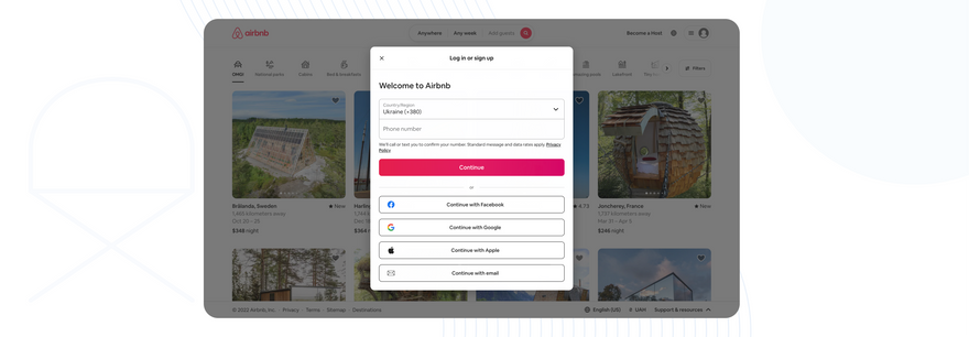
That's why, if you look closely, all e-commerce sites are the same. They reduce the cognitive load and thus increase the chances of buying a product on the site. All online stores work almost in the same way so that if you have already made a purchase somewhere, you have a pattern of "how to buy", and the next time you visit another site, you will have an understanding of how to buy.
That's why, to make the interface more understandable for the user, the interface elements are so similar to things from the real world. For example, various swipes, checkboxes, etc. are so similar to the switches and toggles of a device dashboard.
Very often, products allow their users to reduce the cognitive load by switching to an older version of their product, and all global redesigns are done little by little to accustom users to the new interface gradually and thus reduce the load.
It's important to understand how you, as a designer, can help to take into account Jacob's Law and somehow handle complexity. You can do this by creating user personas to understand your user, creating a mental model to understand how the user sees your product, and creating and working through a customer journey map to understand the user's journey and the weaknesses that need to be improved.
Key points:
- Users transfer the expectations they have of one familiar product to another that looks similar
- By leveraging existing thinking patterns, we can create great UX design where users can focus on their own tasks rather than learning new patterns
- When making design changes, you should minimise innovation by giving users the option to continue using the version they know well for a limited time.
Fitts' law
The time required to reach a goal depends on the distance to the goal and its size
Usability is all about convenience, so you need to ensure that the user can navigate the interface in a simple, convenient, clear and comfortable way. Time is a very important factor in this movement.
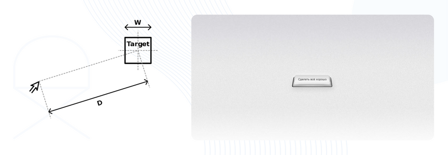
In 1954, Paul Fitts formulated a formula for moving quickly to the target area. It's worth emphasising that Fitts' Law appeared long before digital and interfaces as such, but it was used to derive certain requirements for the touch area in Material Design and Human Interface Guidelines.
In addition to the size of the interaction object, the distance to the object and its position on the screen are also important. For example, the average size of an adult's fingertip is 10-14 mm2, and the average size of a fingertip is 8-10 mm2, meaning that if objects are too close, a so-called miscue - an accidental click - can occur. That's why Material Design has a distance of 8 pixels between objects.

It is also important to place interface elements in places convenient for the user. The corners are convenient, as the mouse movement to them is as fast as possible, the sides of the screen, the centre of the screen.
If you are designing for mobile devices, you shouldn't forget about the screen's edge and not place CTAs in the "red" zones.
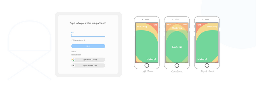
In order to improve the interface to comply with the Fitts Act, it is very common to increase the touch zone of fields on mobile versions, and separate fields and buttons.
Key points:
- Touch targets should be large enough for users to hit them accurately
- The distance between touch targets should be large enough
- Touch targets should be placed in areas of the interface where they are easy to find
Hick's Law.
The time required to make a decision increases with the number and complexity of options available
The Law was first formulated by psychologists William Hick and Ray Hyman in 1952, when scientists studied the relationship between time and the number of stimuli per person. Hick and Hyman drew a diagram of the law, which shows the dependence of reaction time on the number of options.
The key point of this law is the presence of a person's cognitive load, which means the amount of mental effort required by the user to understand, make a decision, and interact with the interface. We partially touched on this topic in the description of Jacob's Law.
In this case, cognitive load is critical. When a user experiences an excessive load, the so-called overload, their short-term memory has no free slots for memorisation and information is lost. You can verify this yourself - think of the number pi - how many decimal places can you remember?
The best example of Hick's Law is remote controls.
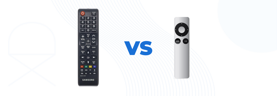
As you can see, one of the remotes gives the user a lot of features and functionality, but it is difficult to remember, so this remote is perceived as complex and inconvenient. And the other remote control is easier to perceive because of its simplicity, although it has the same functionality, if not more.
Hick's Law is very important for large e-commerce and marketplaces with a huge number of objects.
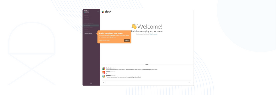
If a complex interface cannot be simplified, then the cognitive load can be reduced by onboarding. That is, introduce the user to the interface gradually, take them by the hand and show them everything they need. In my opinion, the best example of onboarding is Slack, which immediately after installation starts talking to the user with a bot and explains how everything works.
To solve the problem of a large number of objects, you can always use card sorting, grouping and sorting objects.
Key points:
- Minimise the number of choices available to the user if it takes too much time to make a decision
- Break down complex tasks into small steps to reduce cognitive load
- Avoid user overload by highlighting recommended options
- Use gradual training and familiarisation of new users with the product and the functionality of the product or service (onboarding) to reduce the cognitive load on new users
- Be careful not to over-simplify things to the point of meaninglessness
Miller's law
Now let's talk a little bit about Miller, and as a result, Hick's Law.
The average person can store only 7 (±2) items in their working memory
Miller's Law appeared in 1956 in an article by George Miller, a cognitive psychologist and professor at Harvard University's Department of Psychology, entitled "The Magic Number 7±2: Some Limitations of Our Ability to Process Information".
According to this article, people's short-term memory capacity is limited to 7 conventional chunks. Later, it turned out that 7 is not a constant value and depends on the individual, his or her physical and nervous state, fatigue, etc.
Miller also noticed that the process of memorisation is well affected by division into portions. A kind of decomposition of a large amount of data.
The simplest example is memorising a phone number in blocks, splitting a card number into 4 blocks of 4 digits each, decomposing a large text into small blocks, chapters, paragraphs, etc.
Key points:
- Don't use the "magic number seven" to justify unnecessary design restrictions
- Organise content in small chunks of information to help users process, understand and remember it easily
- Remember that short-term memory capacity depends on the individual, their prior knowledge, and the context of the situation.
Postel's Law (Principle of Sustainability)
Be conservative in what you do and liberal in what you accept from others
The law was derived by the American computer scientist John Postel in 1981 in his work "RFC 793: Transmission Control Protocol". John Postel formulated his law as follows:
"Be conservative in what you do" means that the interface should be primarily reliable, accessible and utilitarian. Regardless of the user's skills, device, input devices, technology, etc. The design must be efficient and reliable!
"Being liberal in what you accept from others" means accepting data from the user in the form that is convenient for the USER, from the devices on which the USER works! The design should be adjusted primarily to the user! Design should not be restrictive, but should be flexible and adaptable to the user!
For example, the declarative languages HTML and CSS, when the browser encounters an error when rendering a page, it skips it and continues to render.
Another example of conservatism is to ask the user for enough information when registering to avoid cognitive overload. And leave the full filling of the profile for later, when the user has the time and inspiration to do so.
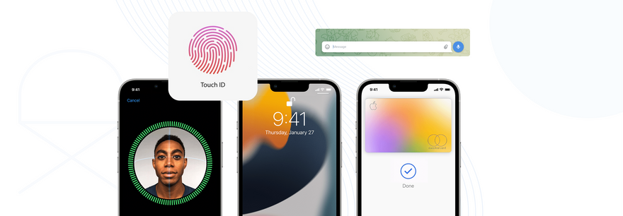
An example of liberality is the ability to log in to your iPhone with TouchID or FaceID and not force the user to remember the password, etc.
Other examples of liberality include:
- adaptive design and media queries - they allow the user to view content from any device (this is very important, as the number of mobile users has surpassed the number of desktop users since October 2016 and continues to grow);
- accessibility and WCAG standards - allowing people with disabilities or simply physical (or cognitive) fatigue to work without hindrance;
- Cross-browser compatibility - allows you to work from any browser, any operating system, etc;
- Localisation of websites and applications - allows users to consume content from users who speak any language;
- Voice assistants, voice dialling - for people with disabilities, or additional features;
- etc.
Speaking of designers and how you can use Postille's Law to improve your work, let's not forget about the existence of Design Systems, whose conservatism allows you to quickly reassemble new components from existing ones, which is liberal and flexible in relation to the team.
In general, Postille's Law helps to bridge the gap between man and machine!
Key points:
- Be responsive, flexible and tolerant of any action the user may take or any data they may enter
- Try to anticipate almost everything in terms of user input, data access and capabilities, while providing a reliable and understandable interface
- The more we can anticipate and plan for in the design, the more flexible the design will be
- Accept user input, adapting it to your requirements, identifying input limitations and providing clear user feedback.
The rule of evaluation at the peak and at the end
People judge their experiences primarily on how they felt at the peak and at the end, not on the sum total or average of each moment of their experience
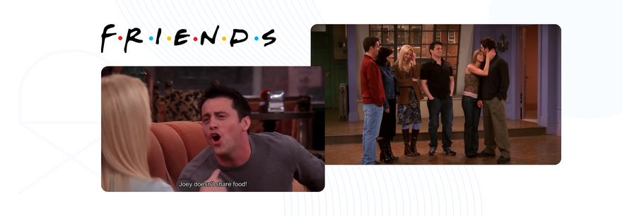
I think everyone who has watched this show remembers the moments when Joey doesn't share his food, when Phoebe sings the song "Smelly Cat" and when the friends say goodbye to Monica's apartment in the last episode. In fact, this is a reflection of the Evaluation Rule at the peak and at the end.
The rule was first introduced by Daniel Kahneman in his article "More pain is better than less: Adding a better ending" in 1993.
Kahneman conducted an experiment in which subjects held their hands under cool water. It turned out that the group of people who had an additional uncomfortable experience remembered their experience better.
The scientists concluded that people remember their peak negative and/or positive experiences best and most vividly, and also remember the last experience out of a certain number of similar ones. This effect is explained by one of the types of cognitive distortions, namely cognitive memory replacement.
The most striking example is any concert or festival - the best artist is the last to perform, and he or she is remembered for a long time. That's why he is called a headliner.
So how can a designer use this rule in their work?
For example, MailChimp uses this rule very successfully - they display messages with positive reinforcement during the campaign.

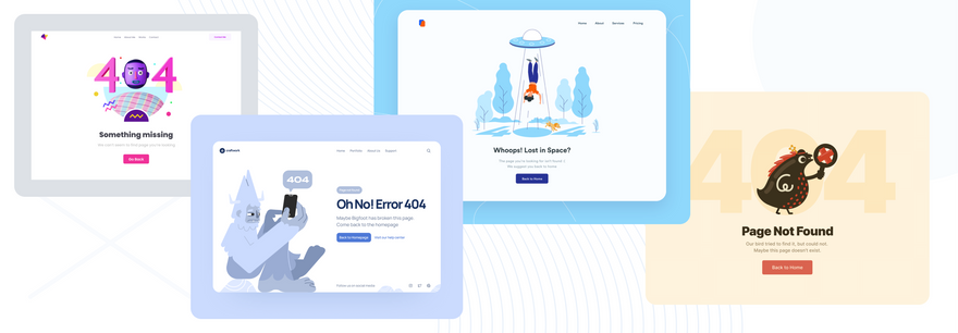
Another striking example is the error page. For example, a banal 404 error page can (in addition to directing the user to an alternative page or to the main page) convey positive and caring messages to the user. This will add positivity to the situation.
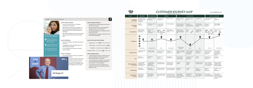
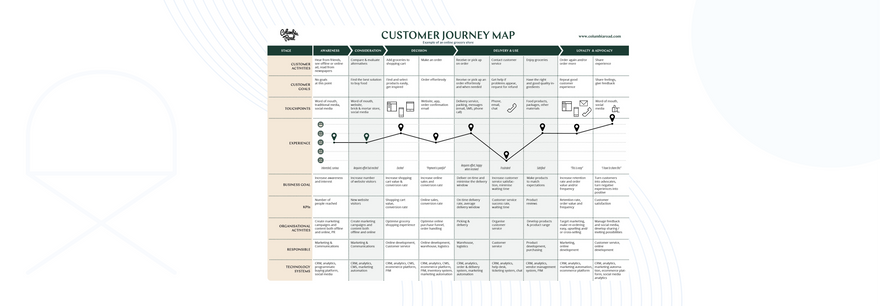
In general, for a better study of the user's experience, his peak impressions, it is advisable to use the Customer Journey Map, which will allow you to see all the problems of the user's path and fix them.
Key points:
- Pay attention to the most intense and final moments of the user journey
- Identify the moments when your product is most useful, valuable, or interesting, and organise the design to delight the end user
- Remember that people remember negative experiences more vividly than positive ones
The effect of aesthetics in usability
Users often perceive an aesthetically pleasing design as a design that is easier to use
Coco Chanel said: "You don't get a second chance to make a first impression". This is a very valid expression for design, and it perfectly shows the user's attitude to the interface.
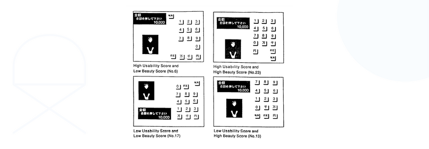
The Aesthetics Effect in Usability was first described in 1995 by researchers Masaaki Kurosu and Kari Kashimura at the Hitachi Design Centre. Prior to that, the relationship between beauty, clarity, and aesthetics had not been established. While testing the layout of an ATM interface (the researchers tested 26 layouts on more than 250 respondents), Masaaki Kurosu and Kari Kashimura noticed a correlation between convenience and attractiveness.
However, it should be noted that aesthetics is perceived by users as comprehensibility. This is where we come back to the cognitive load ???? Here, beauty and aesthetics are perceived by users as the fact that they do not need to make additional efforts to understand the interface and how to interact with it.
On average, it takes a person 50 milliseconds to understand the interface of a digital product and decide whether it is attractive.
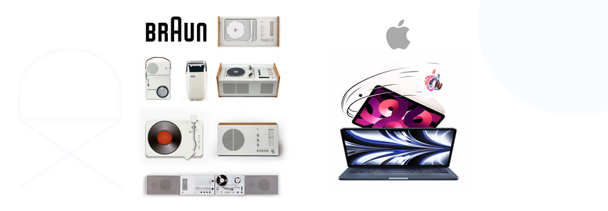
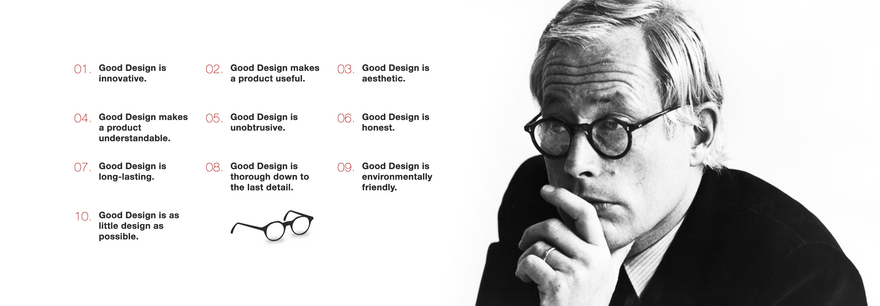
In my opinion, the best example of design aesthetics is Apple and its predecessor, BRAUN. Let's not forget that Steve Jobs and Johnny Ive, who greatly influenced Apple's design, were fans of BRAUN's Dieter Rams.
And Dieter Rams himself once introduced 10 rules of good design:
- Good design is innovative
- Good design makes the product convenient
- Good design is aesthetically pleasing
- Good design makes the product understandable
- Good design is unobtrusive
- Good design is honest
- Good design does not become obsolete
- Good design is worked out to the last detail
- Good design does not conflict with the environment and is environmentally friendly
- Good design is as little design as possible
Key points:
- Aesthetically pleasing design creates a positive response in people's brains and makes them believe that the design really works better
- People are more tolerant of minor usability issues when the design of a product or service is aesthetically pleasing
- A visually pleasing design can mask usability issues and make it harder to detect problems when using it
The von Restorff effect
When there are several similar objects, the one that is most likely to be remembered is the one that differs from the others
Since ancient times, the ability to distinguish between objects has been a key skill for humans, as it allowed them to see a predator and thus save their lives. This ability allowed us to survive. This is what gave humans a complex visual system and an even more complex cognitive image processing system.

If we recall Jakob Nielsen's 6th heuristic, it sounds like "Recognition instead of recall", meaning that recognition has a higher priority than memorisation. That is why we must control the user's attention. The designer should take into account the necessary important points in the work and focus the user on them.
This effect was discovered by the German psychiatrist Hedwig von Restorff in 1933. Please note that in 1933 there were no computers and interfaces ☺️. The scientist showed his subjects arrays of homogeneous words and noticed that people noticed and remembered only words that differed either in spelling, meaning, or colour.
The consequences of this effect are the cognitive distortions that arise in the user - selective attention, banner blindness, inattention blindness.
Given Miller's Law, a person cannot remember many different things, so to reduce the cognitive load, the psyche carefully "switches off" unnecessary information and a person may not notice certain background things, unimportant events and people.
This explains the so-called "banner blindness" - the inability of a person to perceive information on banners of various websites and in the environment (posters, stands, etc.).
Inattention blindness is the inability of people to perceive changes in the environment if they are focused on one specific element.
Key points:
- Highlight important information or key actions visually
- Be careful when emphasising visual elements so that they don't compete with each other and so that prominent elements are not mistaken for advertising
- Be mindful of people with colour blindness or low vision when relying solely on colour for contrast
- Be mindful of users with motion sensitivity when using motion on screen to convey contrast
Tesler's law
Tesler's law (the law of conservation of complexity) states that there is a certain degree of complexity in any system that cannot be reduced
The law was formulated by Larry Tesler, a computer specialist at XEROX PARC in the 1980s. At that time, XEROX was perhaps the most important company in the field of computer interfaces, because it was they who developed the graphical interface that was later bought by Apple and from which you work on your laptop every day.
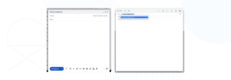
A good example of simplification is writing an email in G-mail:
- You create a new email, it has the fields sender, recipient, subject and body;
- We can simplify it - since you are the sender, the system can put your E-mail and there will be one less field;
- We can put a pre-prepared email subject line - one less field;
- We can display the recipient's E-mail using autocomplete - this will simplify our life and we won't need to keep extra addresses in mind;
- We can make a standard signature in the body of the email - this will save us time. *But this is as far as we can go to simplify or reduce complexity. This is our minimum, which is described by Tesler's Law.
We can also simplify the user experience when filling out forms:
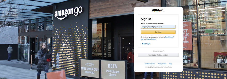
Another great example of using Tesler's Law is Amazon Go - a visitor simply takes all the things they need, does not stand in line, does not pay at the cash register, their experience is as seamless as possible. But you need to have a phone with an Amazon account. This is the very minimum complexity that cannot be reduced.
But it is also important to remember that a balance of complexity is needed, because excessive simplicity can lead to a loss of meaning, as often happens in mobile applications when the user cannot navigate because the menu is not obvious and ambiguous
Key points:
- All processes are based on a complex core that cannot be separated by design into system and users, so it must be perceived by either the system or the user as a whole
- Try to make sure that as much of the burden of system complexity as possible is removed from the users. Pay special attention to this when creating and improving the design
- Try not to simplify interfaces to the point of meaninglessness
Doherty Threshold.
Productivity increases when a computer and its users interact at a certain pace (less than 400 ms), which provides a state in which neither has to wait for the other
The Doherty threshold is a certain threshold value for the speed of interaction - process execution, performance, download speed, system response time.
It is important to mention here that according to HTTP Archive, the average page weight in 2011 was 608 kB, and in 2019 it is already about 2 mB. That is, in just 8 years, pages have tripled in size and are still growing. Of course, traffic speed has also increased, but let's not forget that:
- interaction at a speed of 100 ms (0.1s) is perceived by a person as instantaneous;
- interaction at a speed of 100-300 ms is acceptable and comfortable for the user;
- interaction at a speed of 1000 ms (1s) and more - a person perceives a delay, begins to be distracted, the cognitive load increases, which is why the user leaves your site.
There used to be a so-called 3-second rule. This meant that if a user did not understand and was not interested in the site within three seconds, he would leave it and not return. Thus, he will not go through the funnel, will not perform the target action, will reduce the conversion, and in general, everything will be bad.
Later, this rule became the 2-second rule, which was challenged in 1982 by IBM employees Walter Doherty and Arvind Thanadi. They proved that when the threshold is 400 ms, "productivity increases more than in direct proportion to the decrease in response time".
In other words, the ideal situation is when neither the user nor the computer is waiting for each other. Then the user experience is easiest and the satisfaction from this experience increases.
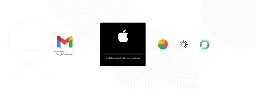
The Doherty threshold is widely used by designers and developers to create better experiences during loading and interaction.
For example, the so-called wireframe, or skeleton, loading screen was invented. It is displayed from the time the main content is loaded.
Very often, loading with blurring of large volumetric images is also used, which are then loaded and do not prevent the user from consuming the first content until it is fully loaded. Also, don't forget that it is advisable to optimise your images to reduce the loading time.
If the loading process takes more than 10 seconds, you should use animation and indicate the time remaining until the full successful download. That is why snowballs, spinners, wavers, progress bars and other interface elements have appeared that help the user, keep him/her engaged and remind him/her of 1 Jakob Nielsen's heuristic - Inform the user about the system state.
But sometimes, despite the Doherty Threshold, interaction processes are artificially slowed down. A striking example is banking apps that deliberately slow down transaction processes visually so as not to scare the user. In fact, the recalculations are almost instantaneous, but this reduces trust and does not reflect the process of debiting funds, so it is artificially slowed down.
Key points:
- Ensure system responsiveness within 400ms to keep users engaged and productive
- Leverage user-perceived performance to reduce system response times and reduce user expectations
- Animations are one way to visualise loading or processing processes that take place in the background
- Progress bars help make waiting times bearable, regardless of their accuracy
- Deliberately adding a delay to a process's execution time can actually increase its value and inspire a sense of trust, even if the process itself takes less time
There are also other UX laws. Here is their wording and a brief description:
Goal gradient effect
The tendency to approach the goal increases with the proximity of the goal
The law of the general region
Elements tend to be perceived as groups if they share an area with a clearly defined boundary
The law of proximity
Objects that are close to or in close proximity to each other are perceived by the user as one group
Pregnantz's law
People perceive and interpret complex images as the simplest possible form, because it is the interpretation that requires the least cognitive effort
The law of similarity
The human eye perceives similar elements as a whole picture, shape or group, even if these elements are separated
The law of uniform coherence
Elements that are visually united are better perceived as connected than elements without visual connection
Occam's razor
Among competing hypotheses, the one with the least number of assumptions should be chosen
Pareto principle
The Pareto Principle states that in most cases, 20% of the effort produces 80% of the result
Parkinson's Law.
Any task will increase in complexity until all the time available for its solution is spent
The serial position effect
Users tend to remember the first and last items in a series best
The Zeigarnik effect
Users remember incomplete or interrupted tasks better than completed ones
Now you've seen that even without research, an interface can be made better by applying the Laws of UX. It is advisable to do this in combination with Jakob Nielsen's Heuristics, Schneiderman's Golden Rules, and the use of best practices in design.
So let's not just drag pixels, let's make it convenient!
What's Your Reaction?