![[PRO] Company Starter Kit](https://design.rip/uploads/cover/blog/company-starter-kit.webp)
![[VIP] Uicon V1.0 / Animated Icons](https://design.rip/uploads/cover/blog/uicon.webp)

![[VIP] Talkative Brand Book & Style Guide](https://design.rip/uploads/cover/blog/talkative-brand-book--style-guide.webp)
![[VIP] UX Stack Guru](https://design.rip/uploads/cover/blog/uxstackguru-bwikur.webp)
![[VIP] The Professional Style Guide Kit](https://design.rip/uploads/cover/blog/the-professional-style-guide-kit--indesign-format.webp)
![[LS] iPhone 14 Pro Longscroll Mockups](https://design.rip/uploads/cover/blog/iphone-14-pro-longscroll-mockups.webp)
![[LS] Acryl Abstractions](https://design.rip/uploads/cover/blog/acryl-abstractions.webp)


![[VIP] PАТАТА SCHООL: 2D to 3D Grease Pencil in Blender](https://design.rip/uploads/cover/blog/patataschool-blender-grease-pencil.webp)
![[VIP] The curious craft of demo reel titles](https://design.rip/uploads/cover/blog/the-curious-craft-of-demo-reel-titles.webp)
![[VIP] DesignCode: Build Beautiful Apps with GPT-4 and Midjourney](https://design.rip/uploads/cover/blog/designcode-gpt4.webp)
![[VIP] AppCoda: Mastering SwiftUI - Professional Packet (Updated 04.2023)](https://design.rip/uploads/cover/blog/appcoda-mastering-swiftui-professional-packet-worth.webp)
![[VIP] AppCoda: Beginning iOS Programming with Swift (Updated 04.2023)](https://design.rip/uploads/cover/blog/appcoda-beginning-ios-programming-with-swift.webp)


![[VIP] Whoooa! 156 vector Lottie animations](https://design.rip/uploads/cover/blog/whoooa-156-vector-animations.webp)
![[VIP] Design+Code: Learn to design and code React and Swift apps [2017-2023, ENG + Sub]](https://design.rip/uploads/images/202312/image_430x256_658ccc86afe53.webp)


![[VIP] Motion Sound Vol. 1](https://design.rip/uploads/cover/blog/designrip-svx.webp)
How to safely upgrade and deprecate components in Figma
While keeping things simple for your design teams.

How to safely upgrade and deprecate components in Figma
While keeping things simple for your design teams
The Figma component properties update has been out since May 2022 and has the capability to transform how components are created, organised and maintained across complex systems.
Let’s take a quick look at ways we might want to upgrade an existing component to start using properties. If you’re not familiar with how properties work and how to use them check out this great guide to get you started.
Then, we’ll look at releasing the upgraded component with properties (or even without) with the goal of as little friction as possible for our end-users — our design teams.
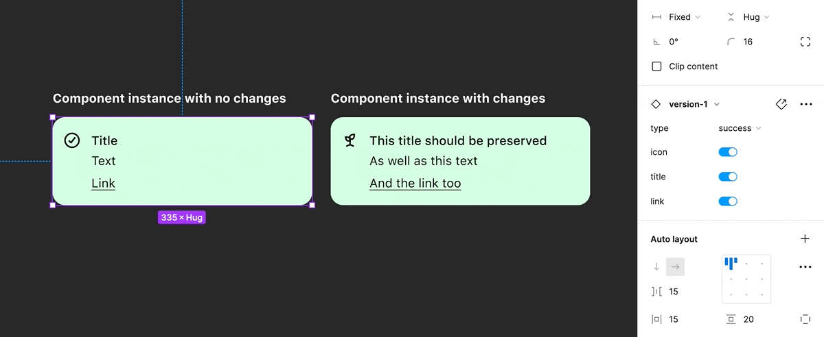
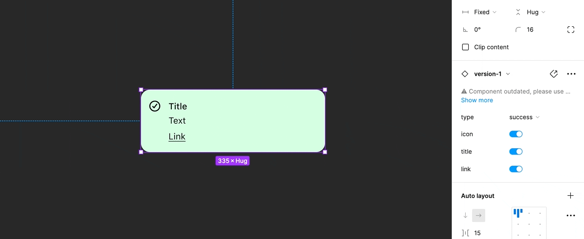
For this post, we’ll look at an alert-block designed by Klarna’s design systems team.
Our constraints/goals for releasing an upgraded component
- We don’t want to break any instances of the older component
- We don’t want to force designers who have files extensively using the older component to need to upgrade
- We want all new designs going forwards to use the newer component
- We want it to be easy for designers to upgrade from the old component to the new when they have the time
Upgrading the component
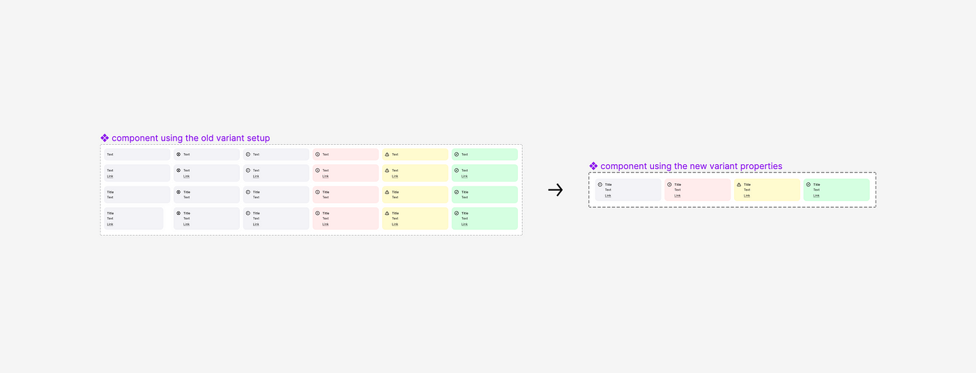
So, your team have identified a component that has waaaay too many variants and it’s a strong candidate to reduce down using the new properties feature — you have two options:
- You try and modify the existing variants and inevitably break all instance overrides in the process, affecting all the feature files containing those components upon publishing.
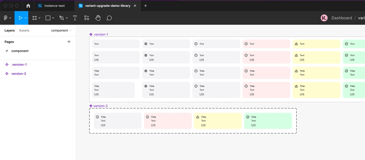
- You accept defeat and duplicate the component (creating another version), starting with the component variant that displays the most variants within it (to leverage the addition of Booleans) and applying the 4 properties; Type, Size, State & Icon where applicable.
Now, we know that we don’t want to break overrides so we’re going to go with option 2 and effectively fork the component —however, this will mean living with both the original and newer version for a while.
How to release the component without disrupting your team
Now we’ve created the new component, we don’t want to delete the original version of the component as it’ll break the “Go to main component” link which is useful for designers looking for more information about the new component/changes.
For now, we’ll want to add a full-stop to the beginning of the old component name — this will stop it from appearing in component searches in any files where it doesn’t already exist as an instance, however, it will continue to appear in search in files where it's used.
When someone does come to visit the library, we can also visibly mark the components with a title or a short description to ensure they don’t copy and paste from the older version.
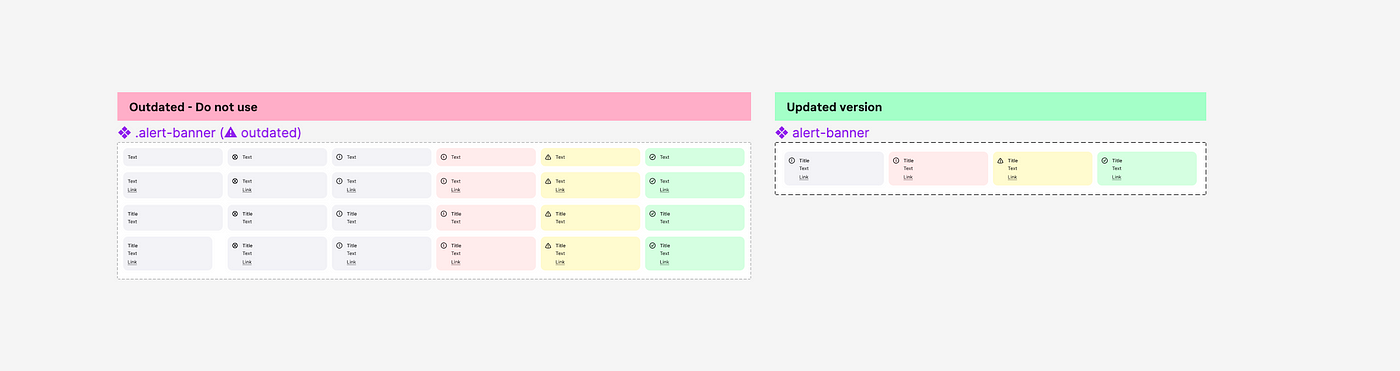
Alternatively, you can choose to hide the old component completely — it and the instances will still exist, but you won't have designers accidentally copying from the older component.
Next, we’ll mark the original as deprecated using the description and component name — using a name that’s similar helps ensure that finding the new version when swapping instances is easier.
You’re now ready to publish the library updates — at this point, it’s best to communicate with your team that changes have been made and they should look to use the newer version from now on and update the old version when they have the time.
Finally removing the old component
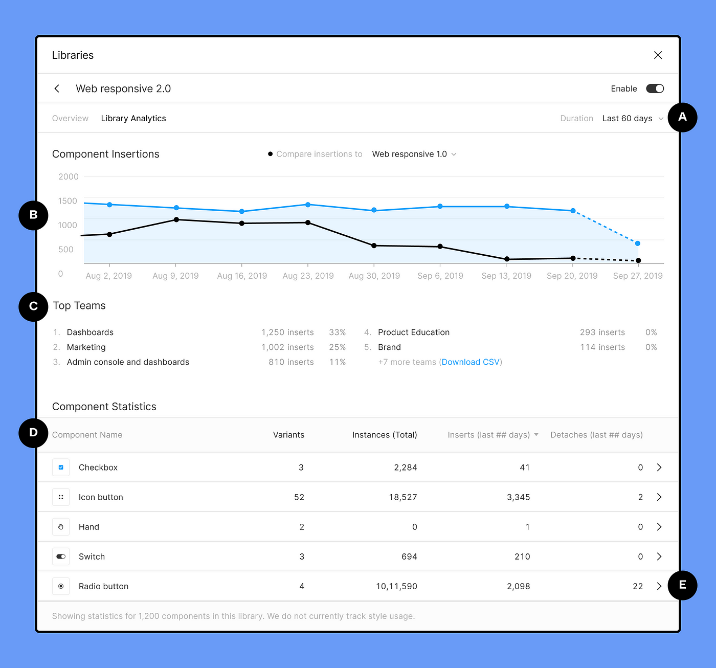
Once we’ve encouraged the team to use the newer version of the component using the subliminal messages throughout, we might need to find out how many files are still using the original component before choosing to actually delete it.
If you’re on an organization or enterprise plan, you can do this by looking at the library analytics.
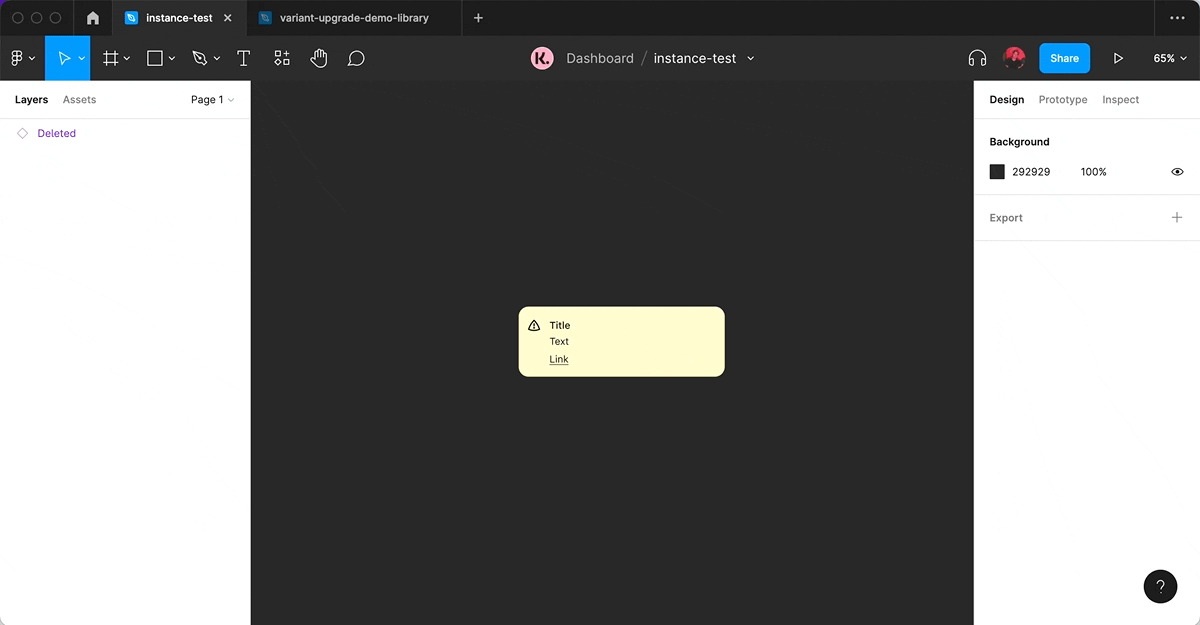
If you’re on a starter or professional plan, you’ll need to use an old, rather manual trick from the Sketch days to highlight the specific instances of a component that we want to identify and potentially remove — the big red box.
By placing the red box on the component and publishing the library, it makes it easier to identify old components in design files.
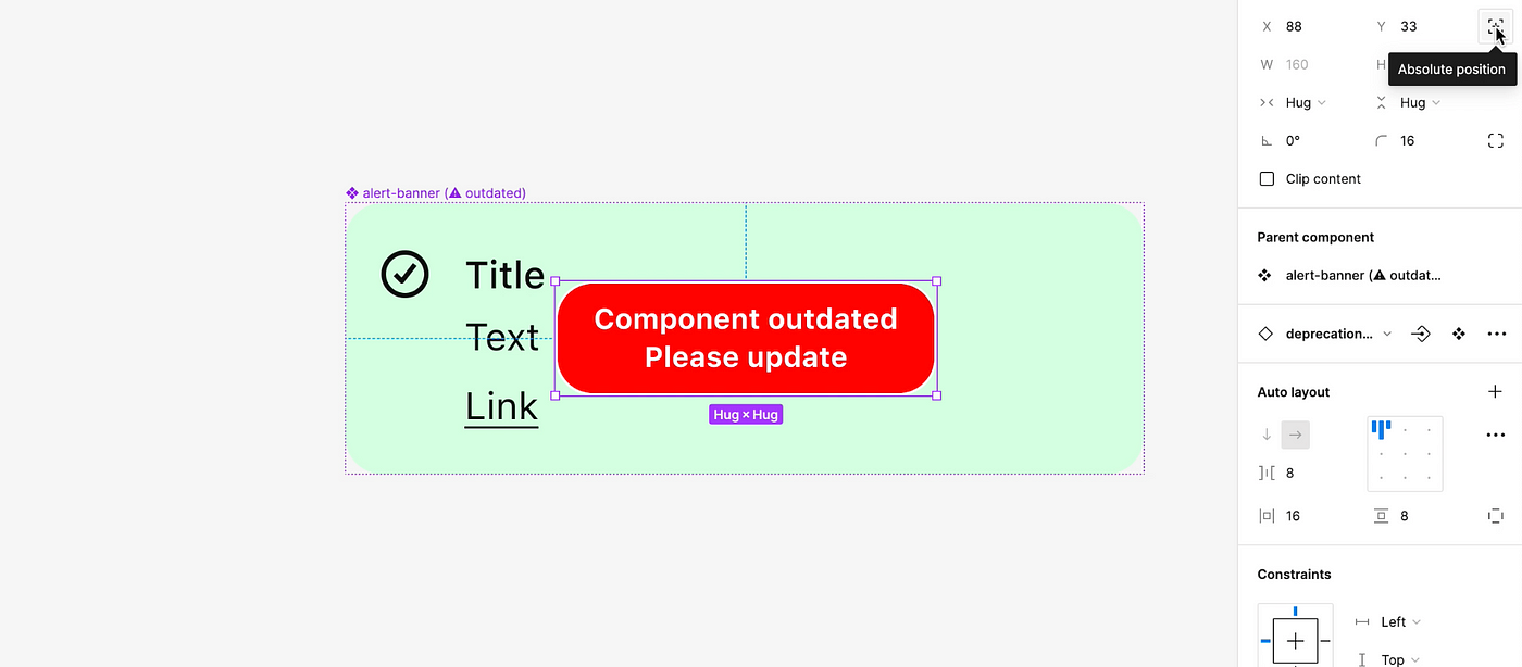
From there, if the component is used sparingly, you may choose to finally delete the original component. For any designers whose designs do fall prey to the big red box and need to remove them, they can always select and hide them in the file one by one, or use a plugin like Similayer to bulk select and hide them across the file they’re in.
To summarise
- Duplicating the original component you want to use with variant properties is your safest bet to avoid instance override hell ????
- When creating the new component, start with the variant that has the most visible variants so you can leverage booleans right from the get-go.
- Don’t delete the old component, instead — look to rename, add a description, make the difference between the old and new visible in the library and lastly, hide it if you have to.
What's Your Reaction?