
![[PRO] Company Starter Kit](https://design.rip/uploads/cover/blog/company-starter-kit.webp)
![[VIP] Uicon V1.0 / Animated Icons](https://design.rip/uploads/cover/blog/uicon.webp)

![[VIP] Talkative Brand Book & Style Guide](https://design.rip/uploads/cover/blog/talkative-brand-book--style-guide.webp)
![[VIP] UX Stack Guru](https://design.rip/uploads/cover/blog/uxstackguru-bwikur.webp)
![[VIP] The Professional Style Guide Kit](https://design.rip/uploads/cover/blog/the-professional-style-guide-kit--indesign-format.webp)
![[LS] iPhone 14 Pro Longscroll Mockups](https://design.rip/uploads/cover/blog/iphone-14-pro-longscroll-mockups.webp)
![[LS] Acryl Abstractions](https://design.rip/uploads/cover/blog/acryl-abstractions.webp)


![[VIP] PАТАТА SCHООL: 2D to 3D Grease Pencil in Blender](https://design.rip/uploads/cover/blog/patataschool-blender-grease-pencil.webp)
![[VIP] The curious craft of demo reel titles](https://design.rip/uploads/cover/blog/the-curious-craft-of-demo-reel-titles.webp)
![[VIP] DesignCode: Build Beautiful Apps with GPT-4 and Midjourney](https://design.rip/uploads/cover/blog/designcode-gpt4.webp)
![[VIP] AppCoda: Mastering SwiftUI - Professional Packet (Updated 04.2023)](https://design.rip/uploads/cover/blog/appcoda-mastering-swiftui-professional-packet-worth.webp)
![[VIP] AppCoda: Beginning iOS Programming with Swift (Updated 04.2023)](https://design.rip/uploads/cover/blog/appcoda-beginning-ios-programming-with-swift.webp)


![[VIP] Whoooa! 156 vector Lottie animations](https://design.rip/uploads/cover/blog/whoooa-156-vector-animations.webp)
![[VIP] Design+Code: Learn to design and code React and Swift apps [2017-2023, ENG + Sub]](https://design.rip/uploads/images/202312/image_430x256_658ccc86afe53.webp)


![[VIP] Motion Sound Vol. 1](https://design.rip/uploads/cover/blog/designrip-svx.webp)
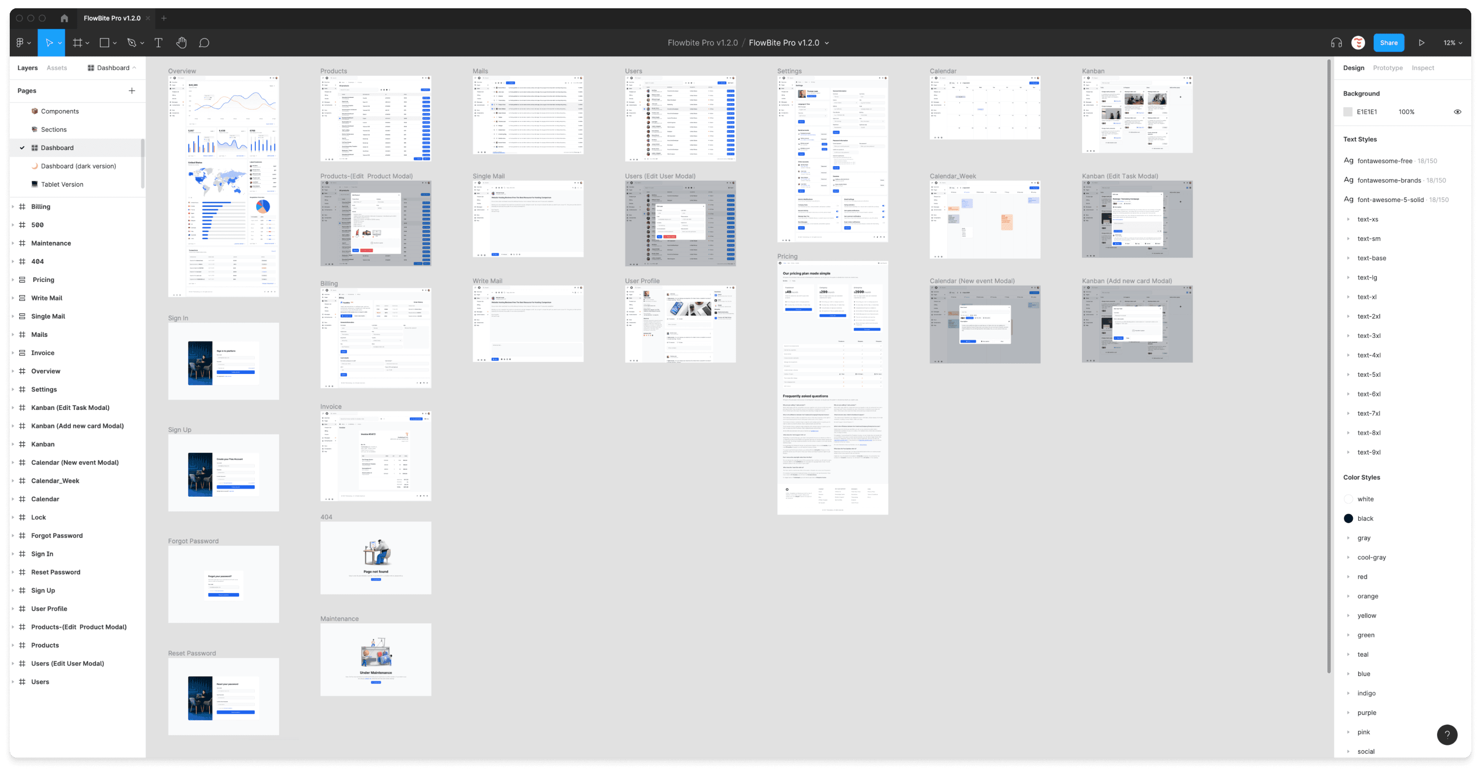
[$] Flowbite PRO: The ULTIMATE Figma UI Kit v2.7.0
Figma design system built for integration with Tailwind CSS. Design UI interfaces and simplify the process of integrating into live websites with Tailwind CSS using this professional Figma design system featuring 1000+ component variants, responsive pages, dark mode, and auto-layout.
Figma design system built for integration with Tailwind CSS
Design UI interfaces and simplify the process of integrating into live websites with Tailwind CSS using this professional Figma design system featuring 1000+ component variants, responsive pages, dark mode, and auto-layout
·
Integrate with Tailwind CSS
FlowBite is built around the utility classes available in the Tailwind CSS framework, which means that you can integrate a design built with this kit using Tailwind CSS without writing any extra HTML classes. Fun fact: this landing page was also designed in FlowBite and coded with Tailwind CSS.
·
27 hand-crafted pages
The structure of the pages available in Flowbite are set up using the auto layout feature from Figma, so that changing the order and width of columns and rows will be easy to do so.
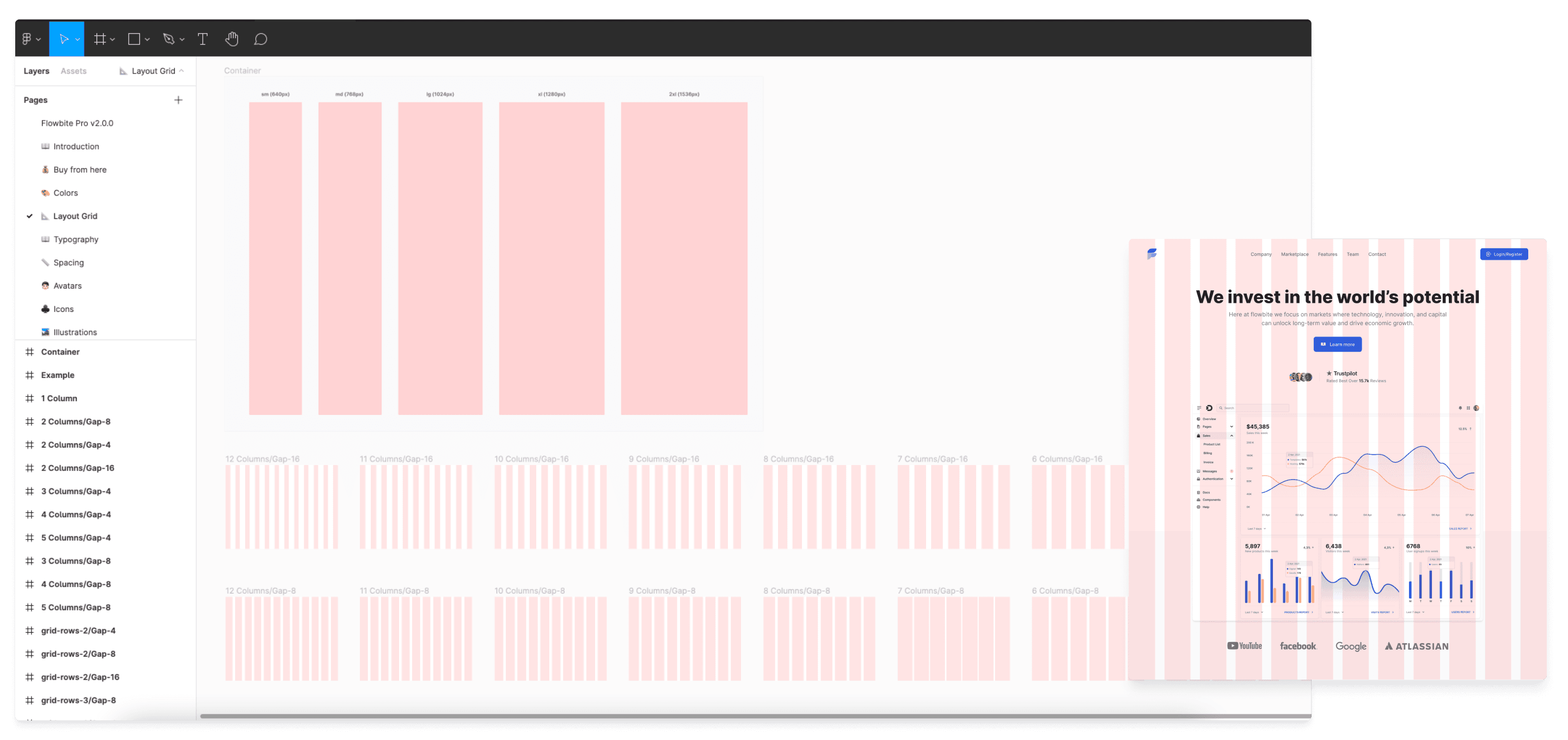
Built for all devices
Responsive design is an important requirement to build accessible user interfaces and provide a high quality experience for your users. That is why we built all of the desktop, tablet, and mobile screen examples for the devices from FlowBite.
Mobile vs Desktop vs Tablet Market Share:
- Mobile: 54.25%
- Desktop: 42.9%
- Tablet: 2.85%
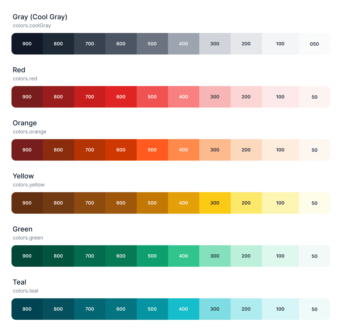
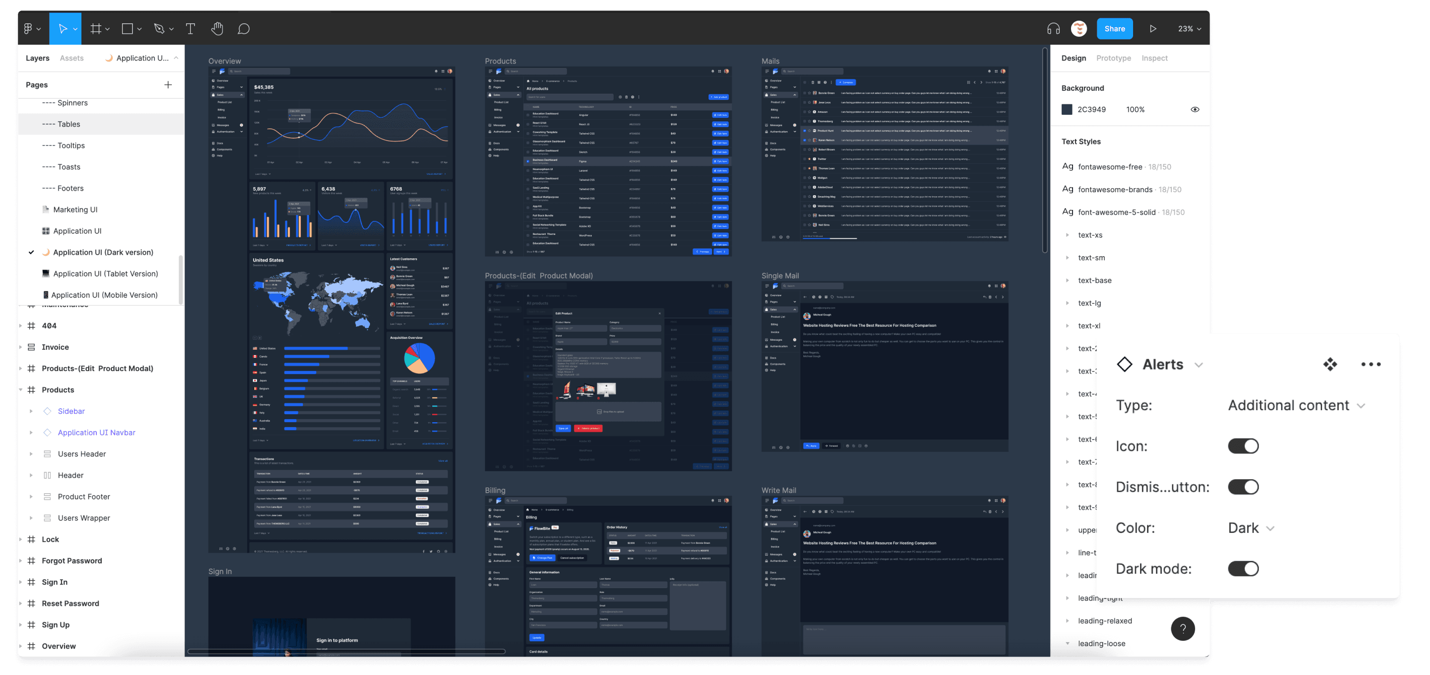
Style guideline
The style guideline is the backbone of the Flowbite project, completely identical with the structure of the utility classes from Tailwind CSS. We have covered color styles, typography, avatars, shadows, and many more.
- Avatars
- Typography
- Color styles
- Shadows

Figma variants
The variants feature from Figma is a great way to make development easier along the way by only having to select multiple style variants for a given component.
Most of the elements available in FlowBite have at least a couple of variants, such as for the buttons, forms, badges, tooltips, and many more.
- Buttons
- Forms
- Badges
- Progress bars
- Tooltips

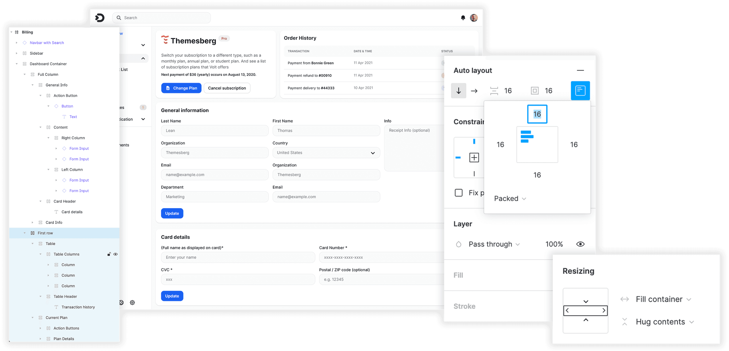
Auto Layout
The structure of the pages available in FlowBite are set up using the auto layout feature from Figma, so that changing the order and width of columns and rows will be easy to do so.
Dark mode
All of the components, sections, and pages from the Figma design system and code version also supports dark mode using Figma variants and the utility classes from Tailwind CSS.
Grid layout
Use the grid feature in Figma to preview the container widths for responsive devices and the grid column and row layout when using CSS grid and flexbox with the utility classes from Tailwind CSS and Flowbite.
What's Your Reaction?


![[VIP] Constructor UI Kit v2.65](https://design.rip/uploads/cover/blog/snqjn.webp)

![[VIP] Dashforge: Responsive Admin Dashboard Template](https://design.rip/uploads/cover/blog/dashforge-responsive-admin-dashboard-template.webp)
-
 badermutebif i join the vip will i be able to download it ?