![[PRO] Company Starter Kit](https://design.rip/uploads/cover/blog/company-starter-kit.webp)
![[VIP] Uicon V1.0 / Animated Icons](https://design.rip/uploads/cover/blog/uicon.webp)

![[VIP] Talkative Brand Book & Style Guide](https://design.rip/uploads/cover/blog/talkative-brand-book--style-guide.webp)
![[VIP] UX Stack Guru](https://design.rip/uploads/cover/blog/uxstackguru-bwikur.webp)
![[VIP] The Professional Style Guide Kit](https://design.rip/uploads/cover/blog/the-professional-style-guide-kit--indesign-format.webp)
![[LS] iPhone 14 Pro Longscroll Mockups](https://design.rip/uploads/cover/blog/iphone-14-pro-longscroll-mockups.webp)
![[LS] Acryl Abstractions](https://design.rip/uploads/cover/blog/acryl-abstractions.webp)


![[VIP] PАТАТА SCHООL: 2D to 3D Grease Pencil in Blender](https://design.rip/uploads/cover/blog/patataschool-blender-grease-pencil.webp)
![[VIP] The curious craft of demo reel titles](https://design.rip/uploads/cover/blog/the-curious-craft-of-demo-reel-titles.webp)
![[VIP] DesignCode: Build Beautiful Apps with GPT-4 and Midjourney](https://design.rip/uploads/cover/blog/designcode-gpt4.webp)
![[VIP] AppCoda: Mastering SwiftUI - Professional Packet (Updated 04.2023)](https://design.rip/uploads/cover/blog/appcoda-mastering-swiftui-professional-packet-worth.webp)
![[VIP] AppCoda: Beginning iOS Programming with Swift (Updated 04.2023)](https://design.rip/uploads/cover/blog/appcoda-beginning-ios-programming-with-swift.webp)


![[VIP] Whoooa! 156 vector Lottie animations](https://design.rip/uploads/cover/blog/whoooa-156-vector-animations.webp)
![[VIP] Design+Code: Learn to design and code React and Swift apps [2017-2023, ENG + Sub]](https://design.rip/uploads/images/202312/image_430x256_658ccc86afe53.webp)


![[VIP] Motion Sound Vol. 1](https://design.rip/uploads/cover/blog/designrip-svx.webp)
Building smarter Figma components: crafting for efficiency
Oxygen, doctolib’s design system, has existed for more than three years now and is becoming more and more robust. Three years of adding new components, new processes, breaking changes due to Figma’s new features (such as auto-layout), component updates or recraft, drifts (discrepancies between design component and dev component)…
All this leads to a Figma library (formerly called Core components) that was closer to a Frankenstein than a lean and refined library as we would have liked.
In parallel, we were regularly receiving negative feedback from the Product Designers, notably mentioning that Figma files were really heavy, and consequently slooooooooow and annoying to work on. Massively important if you consider that a Product Designer works at least half the day on Figma.
On the Design System side, we discovered:
- Lots of component properties were unused, or even worse, bypassed by designers, and some of them told us components were over-engineered
- There was no official nomenclature of properties, meaning from a component to another a similar property had a different name
- We also struggled with what we call “Ghost components”, which are instances without source components.
We realized that it was time to do a big clean up and create a version two of our Design System
The horrible truth
To address the more important topic (and clearly the blocking one) — file weight — we started using the Layer Counter plugin. This plugin was really helpful to weigh our components and then measure our progress and impact.
And then, we discovered the horrible truth: files were heavy because our components were not heavy, they were HUUUUGE! And honestly, we were shocked!
Let’s take the Pill component as example. This component has many variants, multiple semantic color themes, includes nested components from the Design System (Icon buttons, Avatars, Icons, Spinner Loader, Badges…) and has several available sizes, types, etc.

And this Pill was using…. 8,684 layers.
NB: depending on the selection (source component or instance) the Layer Counter result may vary a bit.
Question then was:
How to create lightweight and resource-efficient components, maximizing efficiency without sacrificing quality?
After a round of ideations and research, we decided to focus on 3 axis:
1) Remove all the useless nested components and create private nested
In the Pill use case (and in all our components in the feedback family), the semantic icons are not meant to be changed, so we removed the ?Icon component used as nested in favor of the SVG icon from our icon library. This helped us to:
- Remove a flexibility to the Product Designers that was not existing on the dev component (and then avoid handoff misunderstanding and non-compliant customization in production)
- Remove a huge load of layers
- Remove the display of the useless properties on the right sidebar, which automatically simplified the properties panel and its usage

2) Simplification of the structure
In parallel, we have a library called Helper components containing components constantly used by Product Designers, but not considered in the Design System. In particular, this library contains external UI Kits (OS mobile keyboards, notifications…), mouse cursors, homemade items to manage file organisation (such as handoff cards, project covers…), etc. The Pill was using one of these Helper components to manage paddings with boolean properties, the Grid Spacer. We used them in the past to have a granular management of paddings, and more precisely to be able to change the size of a component with a boolean without needing to introduce a new variant. We removed the Grid Spacers and created a smarter structure of the component with auto-layouts.

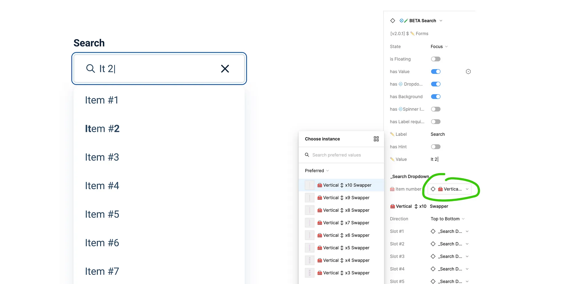
For components that may have an undefined number of values, such as Dropdown, or Menu, we used to offer 10 rows or items by default. That means if a designer only needs 2 of them, then the 8 others would be hidden layers, adding useless weight. For this specific use case, and thanks to Mr Biscuit, we created Helper components called Swappers. This way, our Product Designers can select the required amount of rows or items needed, with a vertical or horizontal auto-layout.
3) Split up the component
For the Alert component, we used to have 1 component for 3 families of variants:
- Banner (full width)
- Card (card style)
- Hint alert (for low emphasis)
At first, we thought it was simpler to import one component and change properties depending on needs through the properties panel (which is more or less true). But having this mindset means your component contains lots of useless unused layers at each instance imported on a file, and at each usage the designer adds a lot of weight that can be avoided.

Here it’s an example with a standalone component, but imagine a Table cell, used tens times in a Table, and this Table used in tens of layout… the file will be off limit quite fast.
To conclude, we drastically reduced the weight of the components, still offering the exact same possibilities as before, and removing the extra customization that was not allowed on code side.
On a more global scale, our 64 components represented more than 130,000 layers before, versus 21,700 after. This means that 83% of the layers were removed.
Since then, we never had any complaints from Product Designers, and files are much faster to play with.
Properties standardization
You know how it works, 3 years forging a Design System, with multiple stakeholders, with process changes on dev side and design side… At first, craft was more intuitive than structured, which leads to a lot of inconsistencies in terms of properties and usage. That’s why our components were not following any nomenclature, with clear and efficient wording to facilitate the understanding of components.
For instance:
- Text properties could be: ✏️ label, description, ↪️✏️ label, ✏️ title
- Theme color could be: UI style, Color, Label color
We took the occasion of re-crafting the components to set a glossary of properties linked to the one used on code side.
Key highlights are:
- Text properties: always displayed with a ✏️ emoji
- Boolean properties or variant: always conjugated as on code side such as has Left asset, has Title, is Closable, is Disabled
- More standards variants: straightforward words such as position, size, state, style, type

We also try at the maximum to keep the same order of properties accros all components.
On Figma, the huge benefit of aligning all components together is that when you swap a component with another, the overrides on the component remain. A side effect for us as design system maintainers is that it’s straightforward to choose the property names and type.
Make components easy to use
By the past, all nested components were official components (for example, a List Item was using the official Avatar). In this component rework, we stopped using official nested, only private nested with a dedicated nomenclature. That way:
- We are only displaying properties that are really used, edge cases are no longer displayed, and then less properties are available.
- By default, we used to expose all properties on the right panel. Now, for each component, we validate which one should be exposed and which one should not.
- Simplify boards. We used to put the source component inside a frame to have a clean and neat library. The thing is, when importing a component, this frame was causing an extra click.
Then, we are facilitating Design System’s users’ daily life, and we can have more rational impact. For example, an evolution of the Dropdown is not necessarily required on the Combobox (using the Dropdown). And last but not least, we are less bothering Designers with endless updates to perform.

Fighting against ghost components
The last step, and not the simplest one, was the publication of the new library. We identified two risks:
- Removing the older library may create what we call Ghost components, components without any source, which usually means that the source component has been deleted (the one with the “Restore component” button, or the one pointing to the library but not to a master component).
- Creating lot of breaking changes. Meaning if a designer swaps a v1 component with a v2, as we changed all the structure and properties, all the overrides would be reseted.
So we decided to:
- Not unpublish the v1 library, but only remove access to it, and flagged them with a ☠️ [V1 DO NOT USE] in their names . This way designers can easily identify a v1 from a v2, still copy, paste and use v1 components, but aren’t able to import them. And on our side, we still can perform some updates on the library.
- Publish the v2 library with components having the exact same nomenclature
One month after the release, the usage of v1 components has significantly decreased, and we plan to permanently delete them in the coming weeks.
Component versioning and branching feature
Side topic but important, we decided to use the branching feature for any update on a component, and create a versioning bycomponent (flagged in their description), following this nomenclature: vX.Y.Z, where:
- X [Major] stands for version where we’ll make a major update that will impact the whole component structure which involve breaking changes with instances overrides loss.
- Y [Minor] stands for version where we are improving component (add new features or minor bugs/fixes) which won’t impact current instances overrides
- Z [Patch] stands for version where we are update component with zero impact on designers’ files.

Conclusion
Overall, we have estimated to 3 months working full time the amount of time required to tackle this topic. This appears to be a huge investment, but based on the amount of time Product Designers are spending on Figma, the financial savings by not having to wait for Figma files to load could be amazing!
That’s why, from now on:
- We always estimate the impact of our component craft thanks to Layer Counter
- We have a process to validate the properties used and ensure they are matching our glossary
- We are more aware of the release of new features or updates on components. We then avoid the pitfall of creating ghost components or introduce breaking changes on the existing instances into designers’ files.
Next steps for us: do the same with our guidelines on Figma.
What's Your Reaction?