![[VIP] Unlimited Pass 2024.07.03](data:image/gif;base64,R0lGODlhAQABAIAAAP///wAAACH5BAEAAAAALAAAAAABAAEAAAICRAEAOw==)
![[VIP] Talkative Brand Book & Style Guide](https://design.rip/uploads/cover/blog/talkative-brand-book--style-guide.webp)
![[VIP] UX Stack Guru](https://design.rip/uploads/cover/blog/uxstackguru-bwikur.webp)
![[VIP] The Professional Style Guide Kit](https://design.rip/uploads/cover/blog/the-professional-style-guide-kit--indesign-format.webp)


![[VIP] DesignCode: Build Beautiful Apps with GPT-4 and Midjourney](https://design.rip/uploads/cover/blog/designcode-gpt4.webp)
![[VIP] AppCoda: Mastering SwiftUI - Professional Packet (Updated 04.2023)](https://design.rip/uploads/cover/blog/appcoda-mastering-swiftui-professional-packet-worth.webp)
![[VIP] AppCoda: Beginning iOS Programming with Swift (Updated 04.2023)](https://design.rip/uploads/cover/blog/appcoda-beginning-ios-programming-with-swift.webp)


![[VIP] Whoooa! 156 vector Lottie animations](https://design.rip/uploads/cover/blog/whoooa-156-vector-animations.webp)


![[VIP] Motion Sound Vol. 1](https://design.rip/uploads/cover/blog/designrip-svx.webp)
15 Graphic Elements to improve your Web Design
If you’re a beginner UX/UI or web designer, you still need to learn and approach many fields of study, like psychology, sociology, marketing, and especially graphic design. Share with you a list of 15 common contemporary graphic elements you can use to improve a nice website design, with both an eye for the present and past.
If you’re a beginner UX/UI or web designer, you still need to learn and approach many fields of study, like psychology, sociology, marketing, and especially graphic design.
When speaking of graphic design, there is a whole world of different niches, like logos, books, illustrations, posters et cetera; we can’t as mortal creatures learn everything, so we have to specialize a little bit.
I’ve mostly worked on websites in my short career, and pretty every time I design something, I just need to look at some other’s work to get inspiration, especially looking for innovative approaches.
Now, I want to share with you a list of 15 common contemporary graphic elements you can use to improve a nice website design, with both an eye for the present and past.
Why?
The idea behind this is that to start designing well, you need to interiorize and memorize a list of things: everything is, in the end, an application and mixture of different modules, and graphic elements you’ve encountered.
Let’s start!
(NOTE: Most of the examples provided are made by me in a fast speed-design run while writing. Do not take them for top-notch concepts. I’ve spent around one hour and a half for ALL designs… so around 5 minutes each!)
Chapter I: Macro-layouts
15) The Half-page
Pretty common, pretty simple, and often used for landing page heroes. It allows you to create contrasts and play with layers, giving the illusion of depth.


14) The framed viewport
This technique is often used to present vital CTAs in fancy ways, and generally formal websites, with a technical or technological background.
You basically limit the scrolling area in a frame of the full viewport, keeping both on top and left/right spaces.

13) Horizontal Scrolling
Could be extremely interesting but also intimidating, and if badly made it completely ruins the entire experience.
Choose this only if you’re really sure what are you going to do…and you have good developers.
NEVER USE IT ON MOBILE.

12) Skewed Layout
This could be a bit harder to develop than regular websites but works wonders if you deal with concepts like sports, speed, strength, and in general brands that deal with motion and energy.

11) The dynamic 3D object
Often this kind of layout is used for energy drinks and similar products, where while a pre-rendered video or a 3D scene works as a background, the scrolling content is synchronized with it.
Extremely powerful, but requires some serious coding.

Chapter II: Singular graphic elements
10) The line
As seen in the framed layout, you can use lines to give solidity to your design. I am pretty sure it often happens that your web sketches feel…unorganized or too “floaty”.
Using lines is pretty common nowadays where brutalism has found again its place, to give an editorial and organized look.

9) The arrow link
In the last year, using an arrow as a link is pretty trendy. Similar to the line, it’s a graphic element commonly used in formal, organized, and minimal designs.
You can see it the image before.
8) The marquee
This particular element had been “banned” in the past of web design because many found it annoying and hard to read. In the last two years, marquees found again their glory, as a decorative element for momentum-scrolling websites.
You can use them to show keywords, but no meaningful content.

7) The chaotic centered hero
I’ve started seeing this trend in 2021: it consists of a horizontally centered hero, in which are used different fonts, typefaces, and misaligned images.
It’s a pretty hard concept to design because breaking guidelines could result in sloppy results.


6) The gravestone image
Again, a pretty recent graphic element. It consists of an image with top border-radiuses edited to make the full composition look like a gravestone.

5) The misaligned card
One of my favorite graphic elements is the misaligned card. Used both in informal and elegant styles, these kinds of cards have the text floating partially outside the background, creating a nice depth effect.


4) The hamburger menu
This is a controversial element. Since if it’s present you can’t see the menu immediately, you shouldn’t use it if you need fast user interaction. If instead you are sure it’s a nice choice, experiment with it.
The traditional hamburger menu is composed of 3 equal lines, but there are dozens of different hamburgers you can try.

3) The Bauhaus shape
If you’ve ever seen old Bauhaus posters, you have probably seen different shapes schemes with bright colors.
These shapes are generally made with rectangles with maximized border-radius on particular vertices, and now are pretty common in web design. Let’s see some examples.


2) Rotated text
Pretty common in graphic design posters, rotated text is pretty aesthetic and can bring an editorial look to your website. Beware: like marquees, this text is not usable, so use it for decoration only.

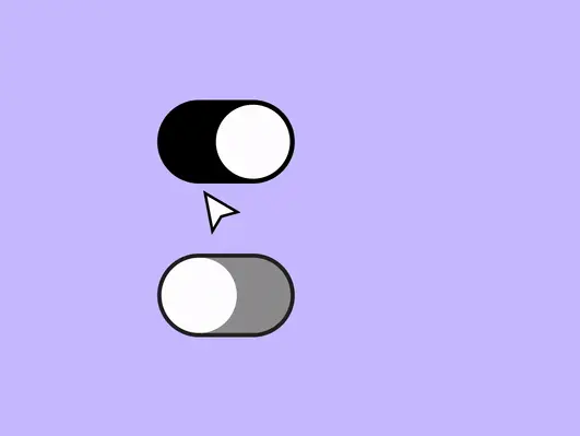
1) The animated cursor
Thanks to Javascript, you can animate objects using your mouse position. It’s a great way to add custom cursors, like circles or more complex figures.
This kind of cursor can also contain text, that appears when hovering.

Conclusions
Here you have a list of elements that are pretty common in contemporary web design, that you can use but more importantly combine in your sketches and concepts.
Obviously, not all of them work with every kind of style and message, so you have to carefully understand if it’s the case to use them.
Now it’s up to you, have you found or noticed any other trendy elements?
What's Your Reaction?