
![[PRO] Company Starter Kit](https://design.rip/uploads/cover/blog/company-starter-kit.webp)
![[VIP] Uicon V1.0 / Animated Icons](https://design.rip/uploads/cover/blog/uicon.webp)

![[VIP] Talkative Brand Book & Style Guide](https://design.rip/uploads/cover/blog/talkative-brand-book--style-guide.webp)
![[VIP] UX Stack Guru](https://design.rip/uploads/cover/blog/uxstackguru-bwikur.webp)
![[VIP] The Professional Style Guide Kit](https://design.rip/uploads/cover/blog/the-professional-style-guide-kit--indesign-format.webp)
![[LS] iPhone 14 Pro Longscroll Mockups](https://design.rip/uploads/cover/blog/iphone-14-pro-longscroll-mockups.webp)
![[LS] Acryl Abstractions](https://design.rip/uploads/cover/blog/acryl-abstractions.webp)


![[VIP] PАТАТА SCHООL: 2D to 3D Grease Pencil in Blender](https://design.rip/uploads/cover/blog/patataschool-blender-grease-pencil.webp)
![[VIP] The curious craft of demo reel titles](https://design.rip/uploads/cover/blog/the-curious-craft-of-demo-reel-titles.webp)
![[VIP] DesignCode: Build Beautiful Apps with GPT-4 and Midjourney](https://design.rip/uploads/cover/blog/designcode-gpt4.webp)
![[VIP] AppCoda: Mastering SwiftUI - Professional Packet (Updated 04.2023)](https://design.rip/uploads/cover/blog/appcoda-mastering-swiftui-professional-packet-worth.webp)
![[VIP] AppCoda: Beginning iOS Programming with Swift (Updated 04.2023)](https://design.rip/uploads/cover/blog/appcoda-beginning-ios-programming-with-swift.webp)


![[VIP] Whoooa! 156 vector Lottie animations](https://design.rip/uploads/cover/blog/whoooa-156-vector-animations.webp)
![[VIP] Design+Code: Learn to design and code React and Swift apps [2017-2023, ENG + Sub]](https://design.rip/uploads/images/202312/image_430x256_658ccc86afe53.webp)


![[VIP] Motion Sound Vol. 1](https://design.rip/uploads/cover/blog/designrip-svx.webp)
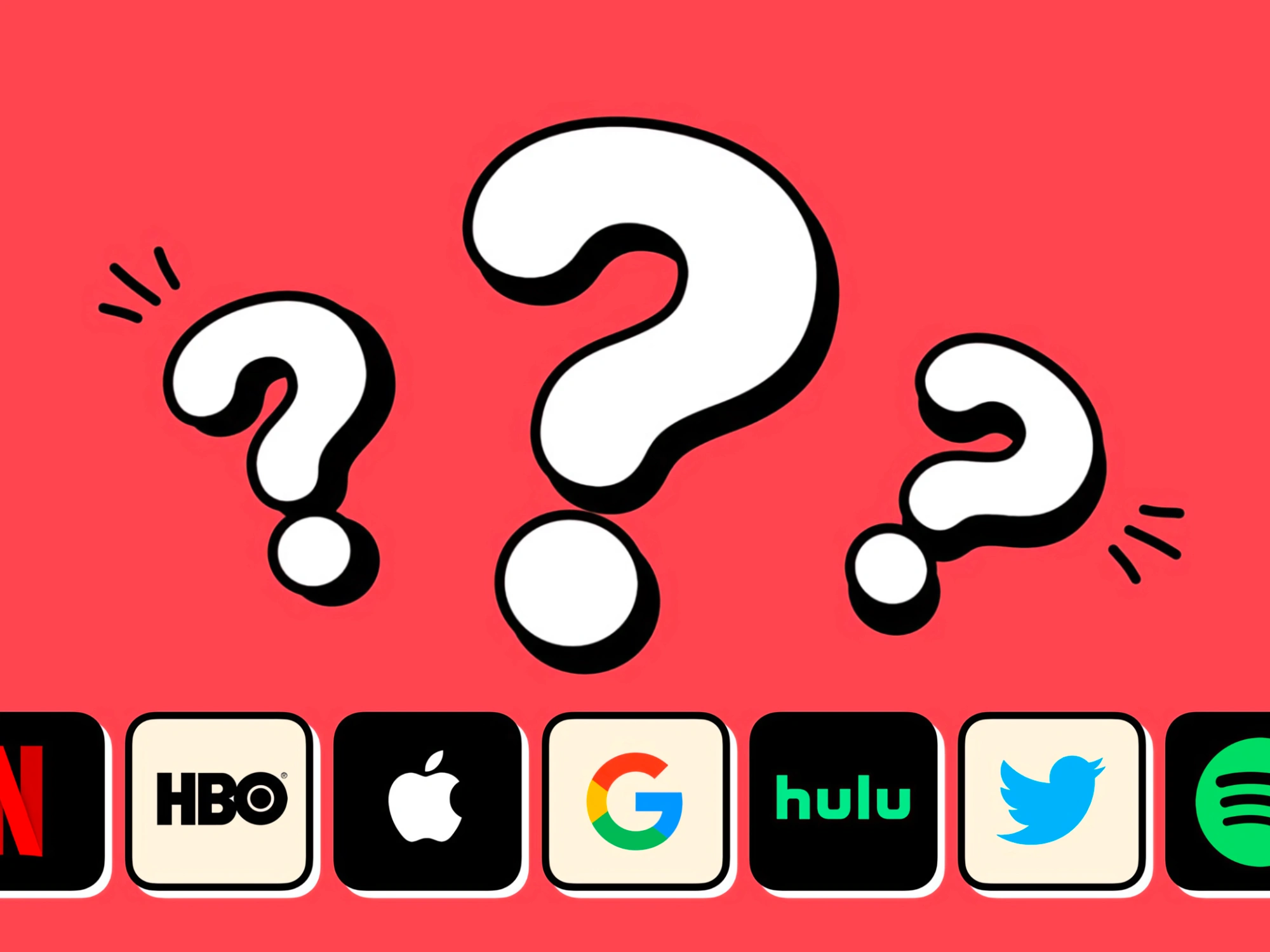
Do Netflix, HBO, Apple, Google, Hulu, Twitter and Spotify, agree with these designers?
As designers we’re often eager to share information and tips about product design. This is important for the growth of our industry and peers. I’ve learned so much from seasoned UI designers, UX designers, developers and all varieties of product design roles. I’m still learning each day and that is something powerful about our industry.
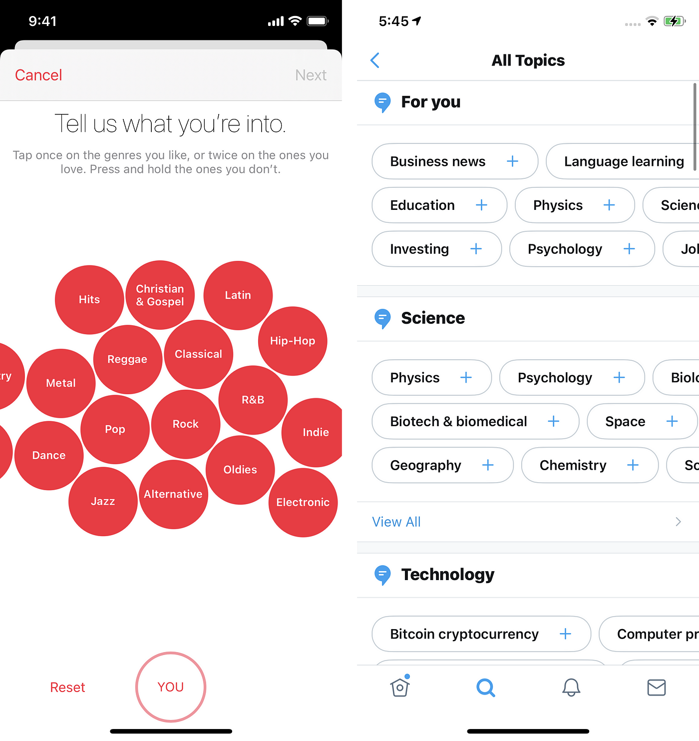
What to design vs how to design
As designers we’re often eager to share information and tips about product design. This is important for the growth of our industry and peers. I’ve learned so much from seasoned UI designers, UX designers, developers and all varieties of product design roles. I’m still learning each day and that is something powerful about our industry. There’s really no ceiling to what we can discover as a practitioner.
However, we can also easily get stuck in a singular thinking pattern of what to design versus how to design. Beginning a new project with the erroneous mindset of “this is the way to design ABC” vs “what are the business goals, customer goals, problem we want to solve, emotion & brand we want to convey, etc etc.”
Below are some examples of designers sharing “what to design” and industry giants designing something resembling the same designer’s “don’t do this” advice. I redacted the names of the designers out of respect for them.
Backgrounds and Contrast
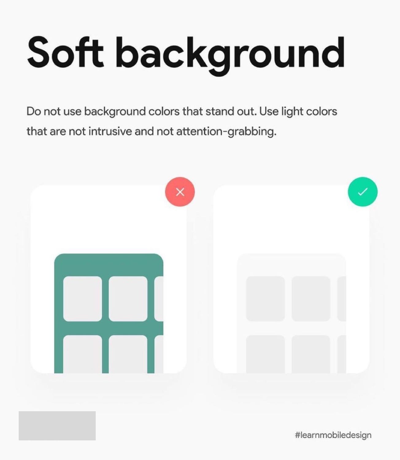
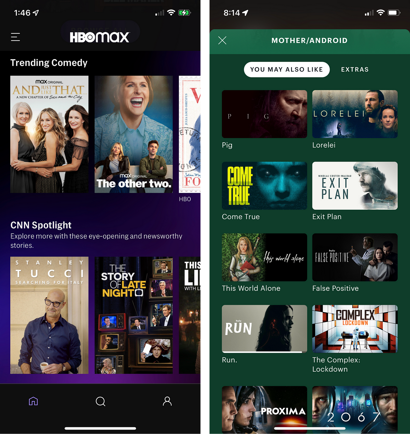
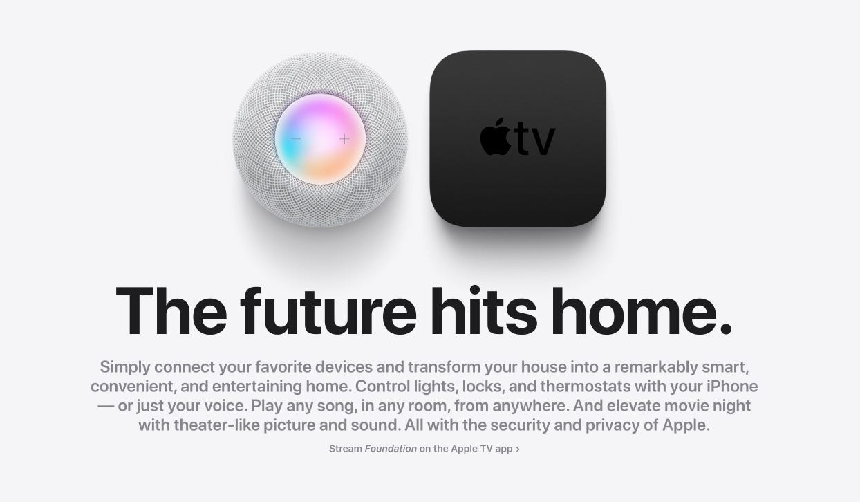
HBO Max and Hulu
HBO Max and Hulu opted for a branded background. HBO uses their new purple/violet gradient while Hulu uses their dark teal. This can create occasional contrast quirks, but this seems to be an edge-case as most content posters appear clear and readable.
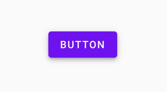
Buttons
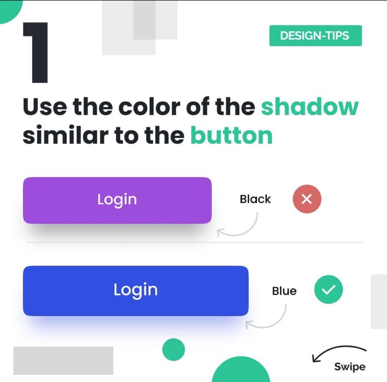
Google’s Material Design
Google’s massive team of designers have spent years creating and refining Material Design. Below is a screenshot from Google’s Material Design components library. The primary reason you’ll see Google use black shadows (contrary to the post above) is because Material Design is intended to mimic real life and as such an opaque object doesn’t create a colorful shadow. This is represented in the example shown below.
UI Layout
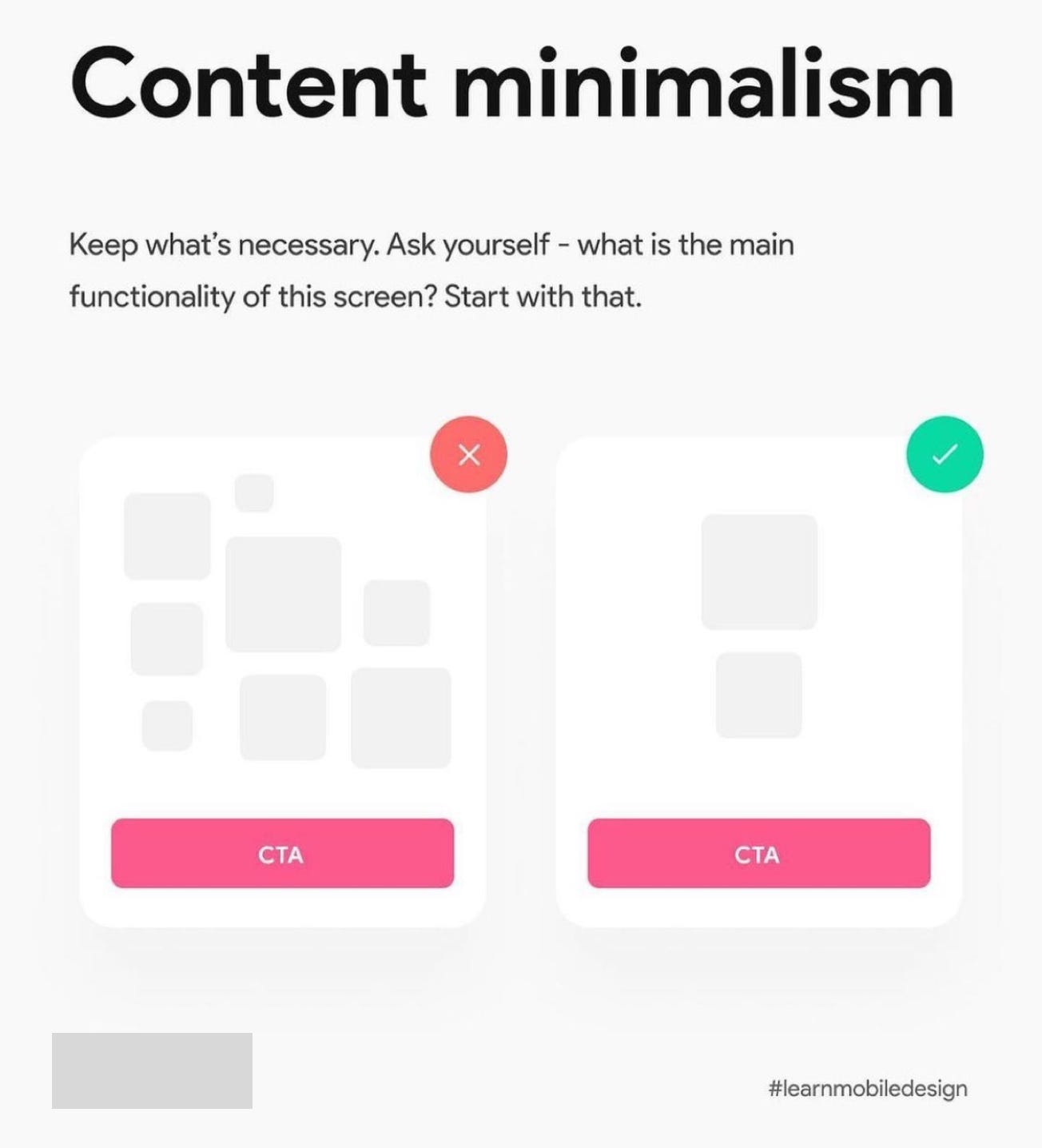
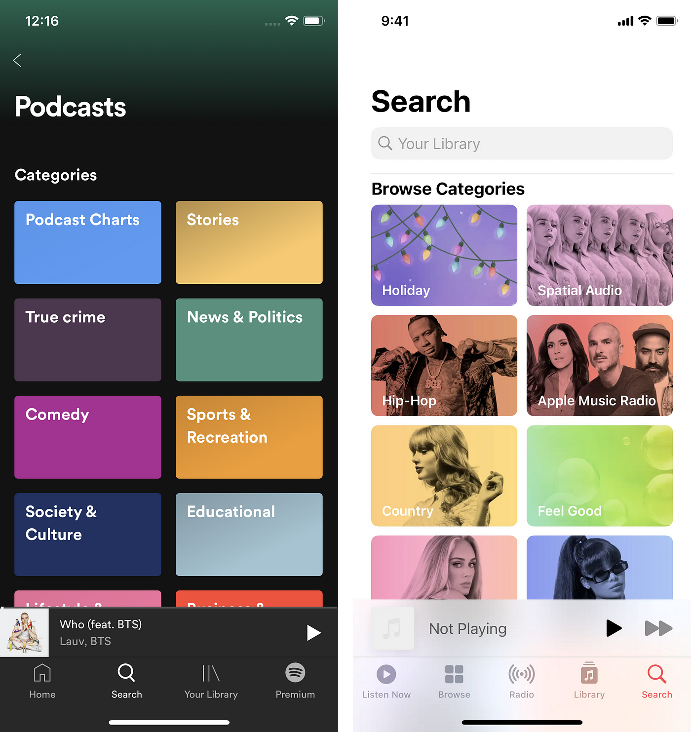
Apple Music and Twitter
This is a tricky example since “functionality” isn’t exactly clear. I think the designer meant what is the main “purpose/goal.” The challenge with the example above is that it implies views with a lot of options can be reduced without some trade off or compromise. Presenting fewer elements when possible is great, but has a cost. There are plenty of examples of views with many button elements, but I chose Apple Music and Twitter because they more closely resemble the comparison shown in the above Instagram post. In this case the cost would be the platforms’ ability to produce tailored content for the user.
Centered Text
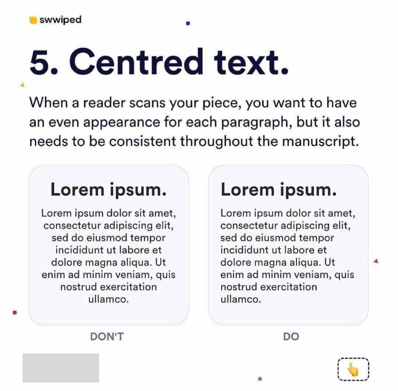
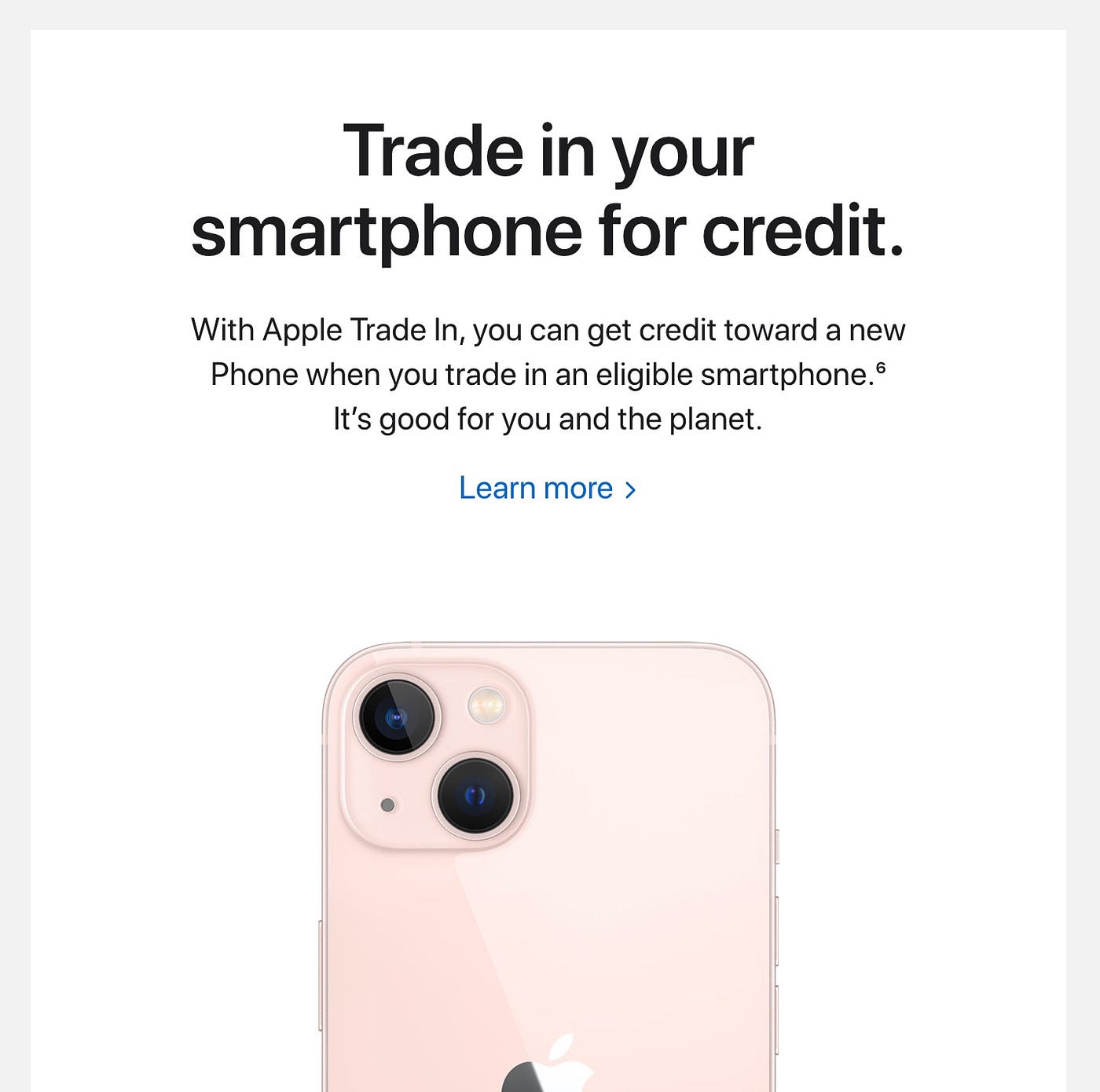
Apple’s website
It’s fairly easy to find examples of centered text bodies on almost any site. The designer above said to never center text. This isn’t entirely incorrect in that long form content certainly shouldn’t be centered and each instance of copy should be evaluated. For example, some of the hero mastheads I design are left-aligned on large devices and centered on mobile/smaller devices. The volume of text can play a large part in these decisions.
Use of Color
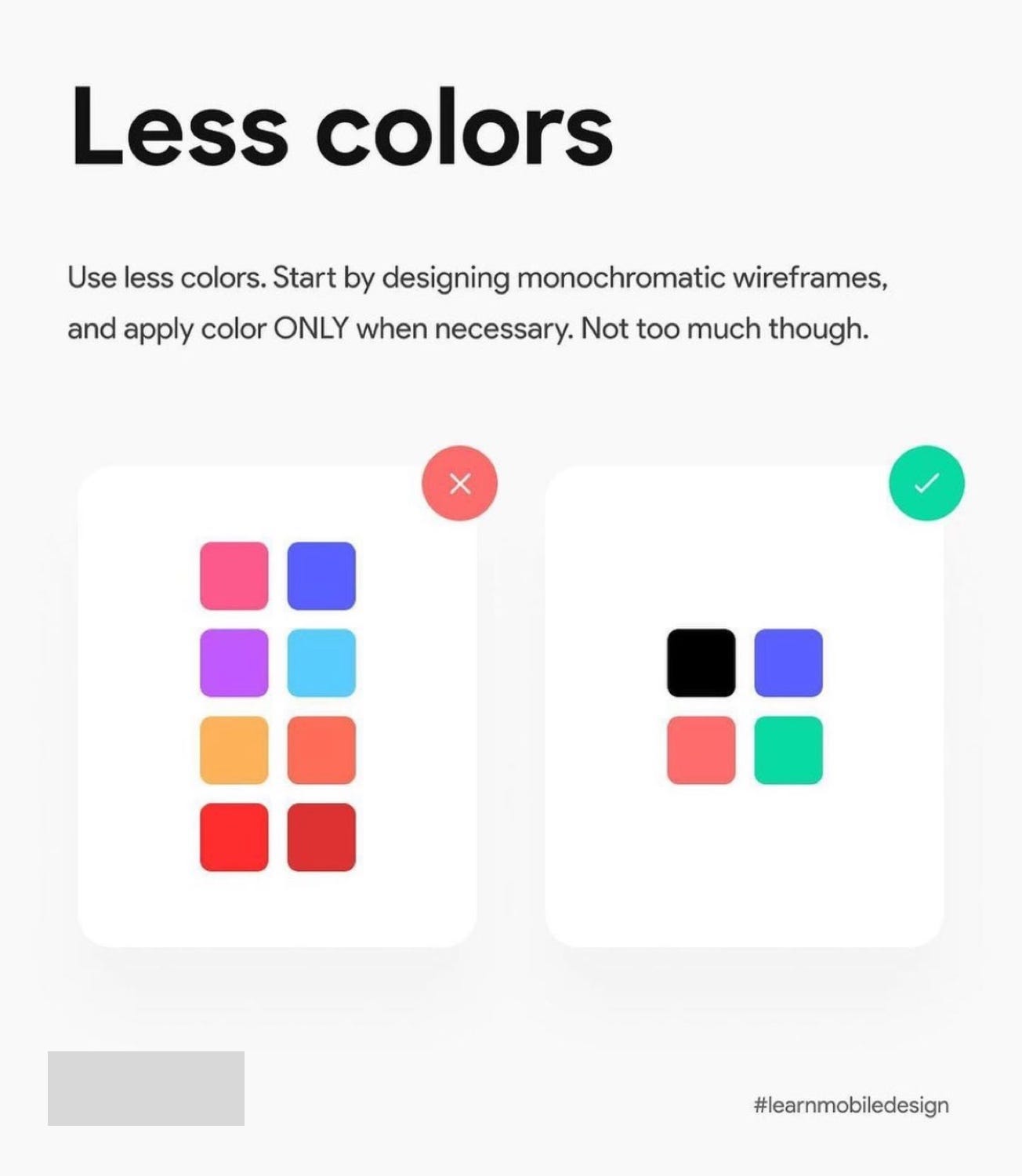
Spotify and Apple Music
This designer recommends using fewer colors. I understand they’re likely referring to underlying brand and not overwhelming the UI with too many colors. However, what’s missing here is context. Without context this advice is misleading. Fewer colors can be the right decision in the right context. But Spotify’s entire brand and UX is often centered around a spectrum of colors.
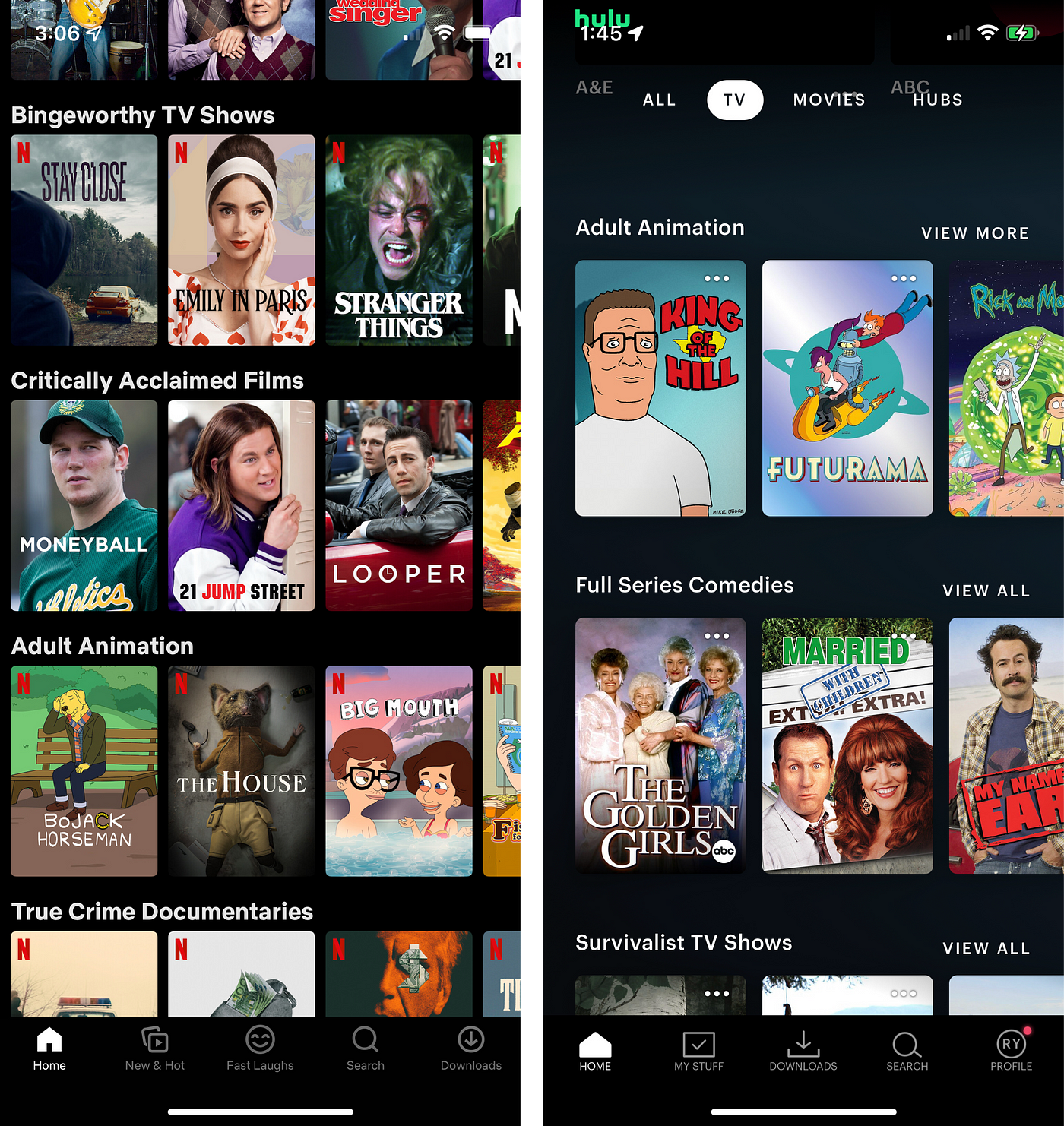
Margins and Spacing
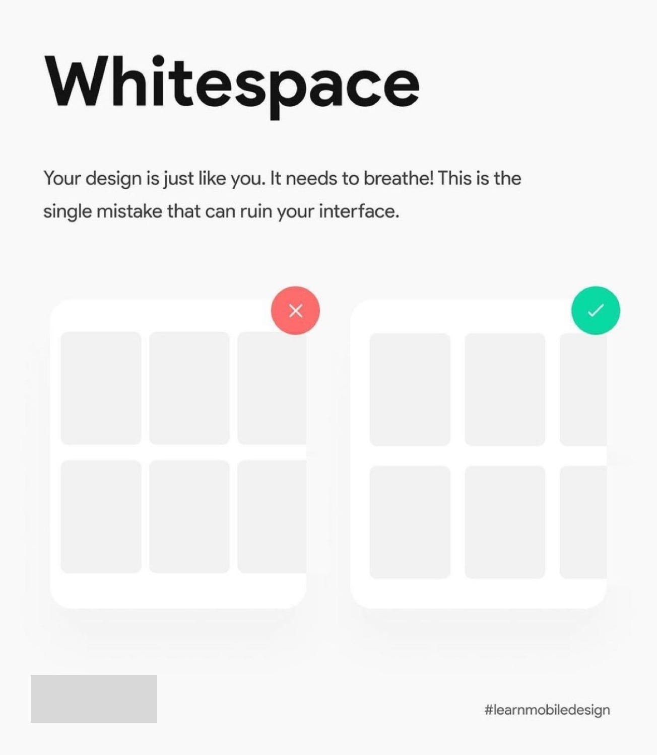
Netflix and Hulu
White space and “breathing room” are key for visual hierarchy, guiding customers to take actions and just all around balanced design. Unfortunately, the example above isn’t ideal for showing the importance of white space.
Netflix is known to be among the most effective in use of evaluating and measure their UI against customer actions/behaviors. You can see below that Netflix (and Hulu) utilize tight margins/gutters between each piece of content. Compared to above you can notice these two streaming giants resemble the “don’t” example above vs the “do” on the right.
Thank you for taking some time to read this post! It’s not my goal to disparage design posts across social platforms. It is my goal to continually push designers to provide context to their posts. I learn new things each day about design that I didn’t know before. This is because we have a strong community of designers with different experiences, cultures and perspectives all sharing helpful advice.
You might also be interested in how “do/don’t” design guides can hurt your career.
What's Your Reaction?