![[PRO] Company Starter Kit](https://design.rip/uploads/cover/blog/company-starter-kit.webp)
![[VIP] Uicon V1.0 / Animated Icons](https://design.rip/uploads/cover/blog/uicon.webp)

![[VIP] Talkative Brand Book & Style Guide](https://design.rip/uploads/cover/blog/talkative-brand-book--style-guide.webp)
![[VIP] UX Stack Guru](https://design.rip/uploads/cover/blog/uxstackguru-bwikur.webp)
![[VIP] The Professional Style Guide Kit](https://design.rip/uploads/cover/blog/the-professional-style-guide-kit--indesign-format.webp)
![[LS] iPhone 14 Pro Longscroll Mockups](https://design.rip/uploads/cover/blog/iphone-14-pro-longscroll-mockups.webp)
![[LS] Acryl Abstractions](https://design.rip/uploads/cover/blog/acryl-abstractions.webp)


![[VIP] PАТАТА SCHООL: 2D to 3D Grease Pencil in Blender](https://design.rip/uploads/cover/blog/patataschool-blender-grease-pencil.webp)
![[VIP] The curious craft of demo reel titles](https://design.rip/uploads/cover/blog/the-curious-craft-of-demo-reel-titles.webp)
![[VIP] DesignCode: Build Beautiful Apps with GPT-4 and Midjourney](https://design.rip/uploads/cover/blog/designcode-gpt4.webp)
![[VIP] AppCoda: Mastering SwiftUI - Professional Packet (Updated 04.2023)](https://design.rip/uploads/cover/blog/appcoda-mastering-swiftui-professional-packet-worth.webp)
![[VIP] AppCoda: Beginning iOS Programming with Swift (Updated 04.2023)](https://design.rip/uploads/cover/blog/appcoda-beginning-ios-programming-with-swift.webp)


![[VIP] Whoooa! 156 vector Lottie animations](https://design.rip/uploads/cover/blog/whoooa-156-vector-animations.webp)
![[VIP] Design+Code: Learn to design and code React and Swift apps [2017-2023, ENG + Sub]](https://design.rip/uploads/images/202312/image_430x256_658ccc86afe53.webp)


![[VIP] Motion Sound Vol. 1](https://design.rip/uploads/cover/blog/designrip-svx.webp)
12 Principles of Remote Work
Why and why we round the corners of design elements. 12 principles of freelancing. How to organize remote work. How to be a good art director.
Hello, dear readers!
Hold a fresh roundup of selected content for art directors and designers. In this issue, among other things:
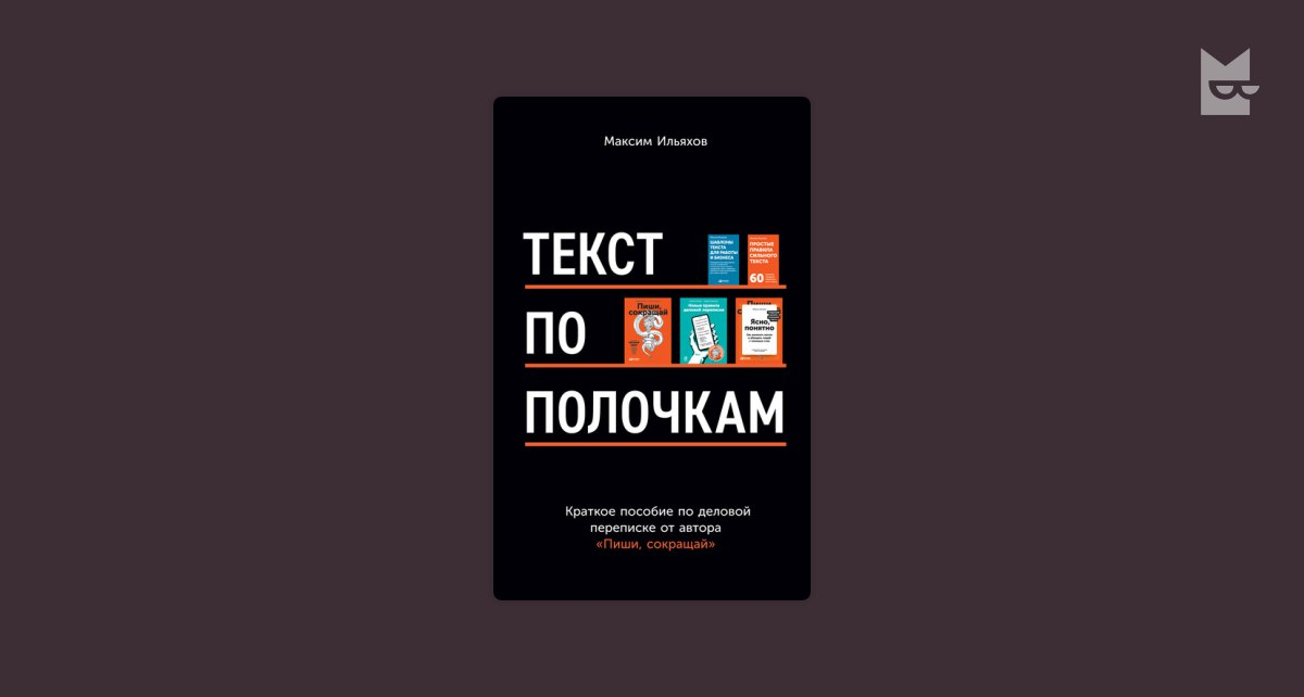
- A few important quotes from Maxim Iliakhov's new book "Text to Shelf: A Concise Guide to Business Correspondence"
- Why and why we round the corners of design elements
- 12 principles of freelancing
- How to organize remote work
- How to be a good art director
- Zoom-etiquette 2022
- How many designers want to work at Yandex and why
- Talking navigation
- Branding that explicitly calls the product a poison
- Lots of cool new tools and useful sites
- A review of new ideas from natural science
Quotes from the book
Natasha: Here are some quotes from Maxim Iliakhov's new book "Text to Shelf: A Concise Guide to Business Correspondence"
But that's the secret to shelf text: we spend our energies to make it easy for our reader.
Often people are afraid to send several letters in a row, so as not to overload someone else's mailbox. They think that one letter is fine, but five is bad. But it's not just about the number of letters, it's also about their content: If you set me five simple tasks, I quickly solved them, answered and sit satisfied, doing my own thing; and if you sent me one mega-task, I will first spend half a day procrastinating before answering, then spend half a day answering and still forget to do something of it.
In a situation of information overload, the most annoying thing is not long or even useless texts. If I immediately realized that I have nothing to read here, I will thankfully skip this text. It's annoying when I have to figure it out.
There may not be any other text on the slide, but a title is required: it states the theme of the slide, the meaning of the graphic, the main conclusion of the points presented.
According to modern standards, if a letter has more than 15 lines and is not divided into paragraphs, it is considered inadequate. It is obligatory to divide it into paragraphs. The optimal length of a paragraph is from 3 to 9 lines in a wide column and from 5 to 12 lines in a narrow column (for example, in a newspaper layout or in a messenger). Since emails are mostly written on computers and wide screens, we can safely assume that our optimal paragraph is no more than 9 lines.
The subheading should give the impression of simplicity. For this purpose, it should occupy no more than two-thirds of a line.
If you send a correspondence to another person, it is necessary to put it into context: what kind of correspondence it is, what to pay attention to, a summary of previous letters. Especially if you need to add a person to an existing correspondence: then you need to call in advance and write, "I will add you to the correspondence, the situation there is so-and-so, the solution is so-and-so". This is the number one request of all managers: "Don't just send me letters. Explain at the beginning what it is about and what you want from me.
For example, mail - for the exchange of factual information and documents. A call or meeting - for operational issues. If emotions are running high, a voice or face-to-face meeting. A meeting in the mail is a sin.
Articles and news
The 12 Principles of Freelance
An ommage to the 12 principles of Disney animation - 12 principles of the freelance business. Available and in lecture format on YouTube.
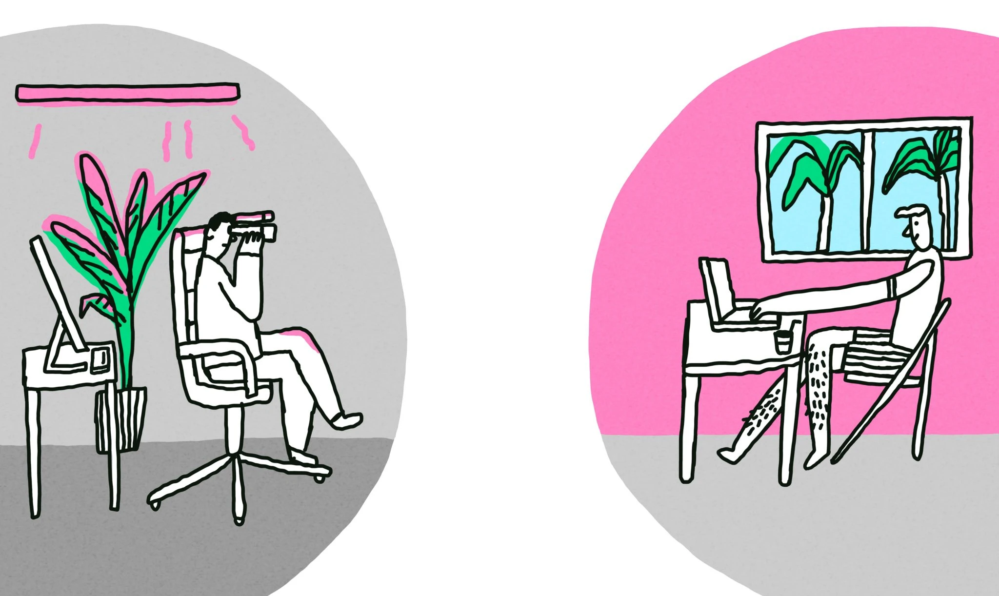
Handbook for bosses: how to organize remote work in a smart way
Dagger has published an outline of Basecamp CEO Jason Fried's webinar on organizing remote work. Advice:
- Don't distract people, because distractions are bad for productivity
- Don't yank people into meetings
- Organize a separate workplace at home
- Treat telecommuting as a distinct company skill, not as a temporary measure that will soon be canceled
Tips from type designer Jeremy Tankard on choosing fonts for a project. He encourages, on the one hand, to pay close attention and approach it carefully, and on the other hand, to be bolder in your choice.
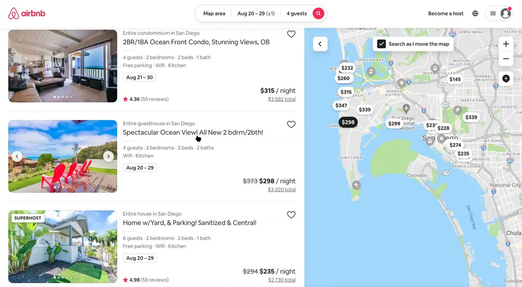
The Optimal Layout for Hotel & Property Rental Search Results & 3 Pitfalls to Avoid
Baymard Institute painstakingly breaks down how to design a good map search interface for properties and real estate and avoid common mistakes.
A translated article on the role that rounding and flowing shapes play in design elements and how to use it.
Different shapes elicit different reactions from our users, and rounded corners can cause our design to create an unintended perception and affect the overall user experience. We should also diversify shapes when designing user interfaces to guide the user to the correct action and convey hierarchy and expression.
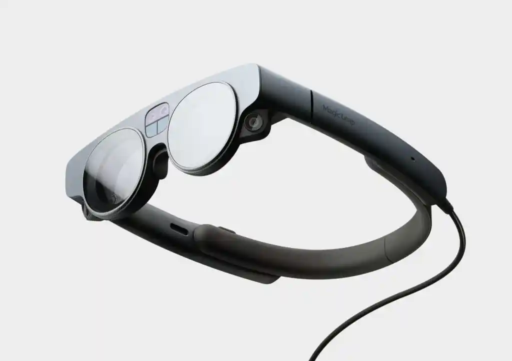
My predictions for augmented reality in 2022
Not a bad overview of current trends in augmented reality and the technology around it: glasses, engines, apps.
A short line
Therule of B&W colorization. Sergey Chikin on how to choose color for black-and-white images of color objects.
Asurvey of Russian design teams: where they would get a job and where there is something to learn. Yuri Vetrov has published the results of his annual survey. Still everyone wants to go to Yandex :-)
Building like it's 1984: A comprehensive guide to creating intuitive context menus. Smart tips on designing context menus.
How to speed up approvals if you're a freelancer working with a company.
Building an adaptive favicon. How to make a vector favicon that adapts to light and dark themes at the same time.
New technologies
Territory Studio talked about Virtual Production - a development that allows you to overlay 3D graphics right during shooting on set, reducing the resources spent on post-production. It looks cool.
Also check out Territory Studio's latest case study - AR interfaces for the sci-fi movie Swan Song. I understand that their new technology was also used there (or maybe not).
Inspiration
Corporate styles and logos
Surreal cereal's identity and packaging. Love the move with the inverted R in the logo. Simple, recognizable, helps the readability of the vertical version.
What's Your Reaction?