
![[PRO] Company Starter Kit](https://design.rip/uploads/cover/blog/company-starter-kit.webp)
![[VIP] Uicon V1.0 / Animated Icons](https://design.rip/uploads/cover/blog/uicon.webp)

![[VIP] Talkative Brand Book & Style Guide](https://design.rip/uploads/cover/blog/talkative-brand-book--style-guide.webp)
![[VIP] UX Stack Guru](https://design.rip/uploads/cover/blog/uxstackguru-bwikur.webp)
![[VIP] The Professional Style Guide Kit](https://design.rip/uploads/cover/blog/the-professional-style-guide-kit--indesign-format.webp)
![[LS] iPhone 14 Pro Longscroll Mockups](https://design.rip/uploads/cover/blog/iphone-14-pro-longscroll-mockups.webp)
![[LS] Acryl Abstractions](https://design.rip/uploads/cover/blog/acryl-abstractions.webp)


![[VIP] PАТАТА SCHООL: 2D to 3D Grease Pencil in Blender](https://design.rip/uploads/cover/blog/patataschool-blender-grease-pencil.webp)
![[VIP] The curious craft of demo reel titles](https://design.rip/uploads/cover/blog/the-curious-craft-of-demo-reel-titles.webp)
![[VIP] DesignCode: Build Beautiful Apps with GPT-4 and Midjourney](https://design.rip/uploads/cover/blog/designcode-gpt4.webp)
![[VIP] AppCoda: Mastering SwiftUI - Professional Packet (Updated 04.2023)](https://design.rip/uploads/cover/blog/appcoda-mastering-swiftui-professional-packet-worth.webp)
![[VIP] AppCoda: Beginning iOS Programming with Swift (Updated 04.2023)](https://design.rip/uploads/cover/blog/appcoda-beginning-ios-programming-with-swift.webp)


![[VIP] Whoooa! 156 vector Lottie animations](https://design.rip/uploads/cover/blog/whoooa-156-vector-animations.webp)
![[VIP] Design+Code: Learn to design and code React and Swift apps [2017-2023, ENG + Sub]](https://design.rip/uploads/images/202312/image_430x256_658ccc86afe53.webp)


![[VIP] Motion Sound Vol. 1](https://design.rip/uploads/cover/blog/designrip-svx.webp)
5 Reasons macOS Ventura Design Change Is the End of the “Sane” UI as We Know It
With the latest version of macOS Ventura, Apple has gone yet one step closer to making macOS look like iOS. macOS Ventura has a revamped System Preferences UI, and many people already hate it...

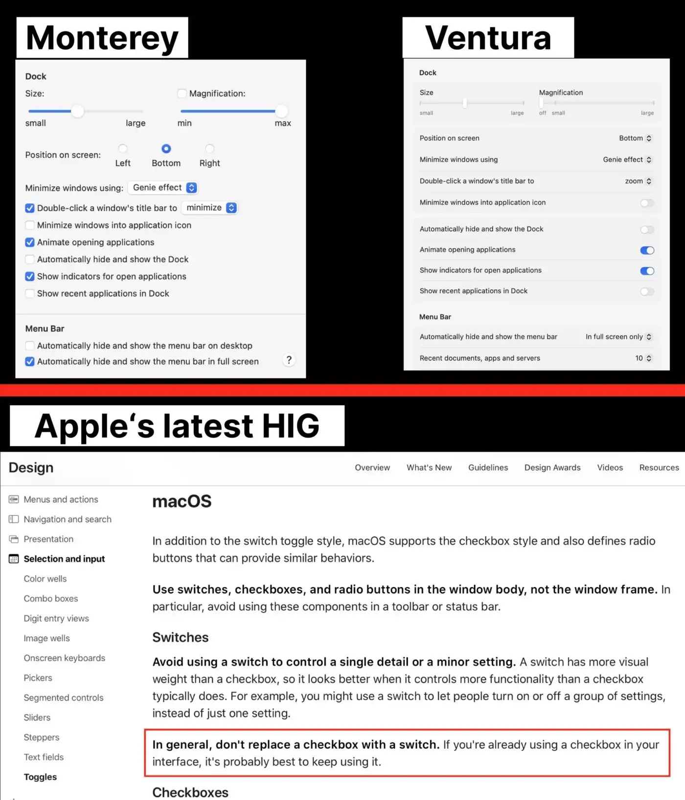
Below is a comparison between the old UI (right) and the new one (left):
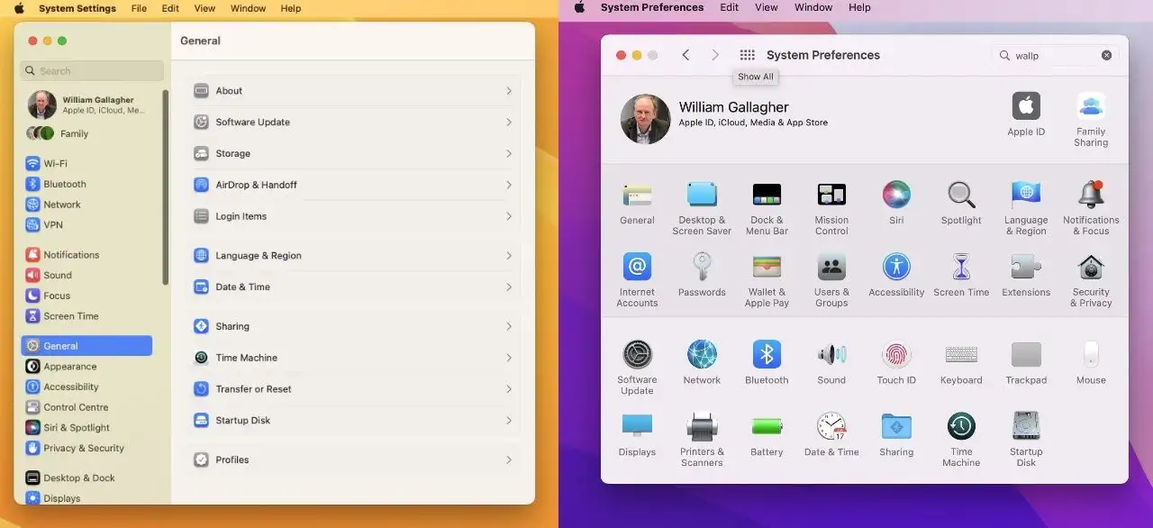
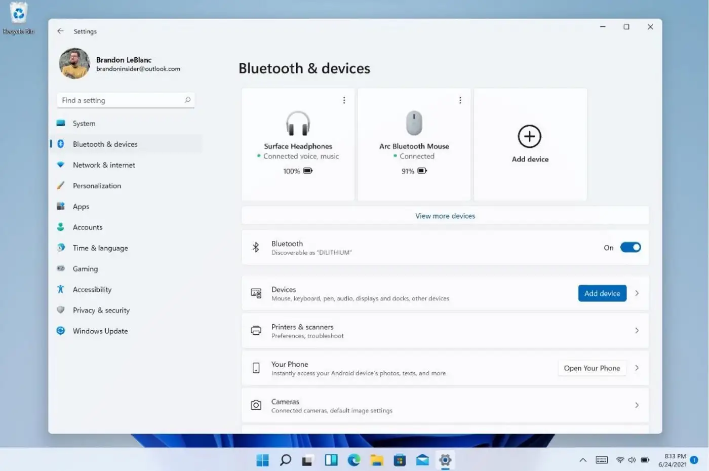
At first glance, what strikes the most is the resemblance of the new macOS UI to Windows 11’s Preferences looks:
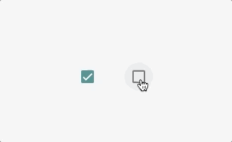
But perhaps what is obvious in both UI designs is the lack of checkboxes. Nowadays I mostly use keyboard to interact with my computers, but whenever I go back to point-and-click, checkboxes have always been really straightforward and without frills. Their meaning is crystal clear and you know what happens when you click on them:
Surprisingly, checkboxes have been around at least since Windows 3.1:

Windows 3.1 was introduced in 1992 and was already packed with a timeless UI design that has persisted even till today.
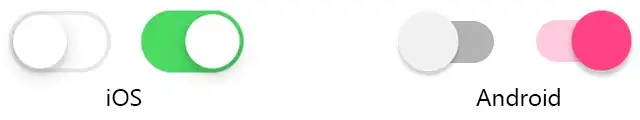
But both MS and Apple seem to have grown a disdain for checkboxes because they both have replaced them with switches. It’s easy to figure out the reason is to make desktop operating systems look more like mobile:
Interestingly, this change in design is actually against Apple’s own guidelines that discourages the use of switches instead of checkboxes:
IMO, Apple should have stuck with checkboxes on macOS, and here’s why:
- They take up less real estate on the screen, especially important when you use apps side by side. Switches are larger because they are meant to be pressed/tapped by finger touch, not clicked.
- Checkboxes only need a single mouse click, whereas switches imply that you should swipe on them. Sure, you can click on switches too, but why add additional confusion to end users if checkboxes already work outta the box (pun intended)?
- It kinda makes sense for MS to use switches because Windows is run on many touch devices (e.g., Surfaces), but Apple doesn’t produce touch-based Macs, and the choice of switches is unnecessary.
- Color-blind people may find switches more confusing because switches rely on colors to distinguish on/off states. What was Apple’s solution for this? Add yet more complexity to the mix! Look:
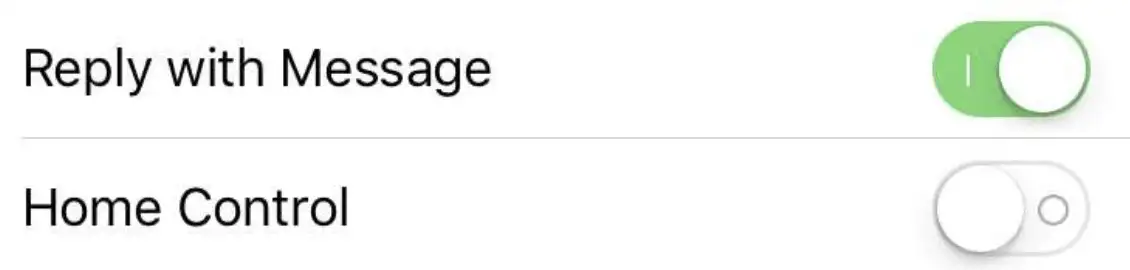
Apple’s solution for color-blind people, or people who get confused whether a switch is on or off. Add little | and O in switches to show state!
5. There’s a bigger problem at hand though: Many websites are going to start using switches instead of checkboxes in their UI. This has happened before. When Apple adopted a more flat design in iOS 7, many websites started using the new font that Apple used (Helvetica Neu) even in places that it made no sense. It took web designers a few years to realize that just because Helvetica looks nice on a small retina display doesn’t mean that it will be so on larger HD (less than retina) screens as well. We can only hope that there are still “sane” UI designers who won’t just jump on the “switches are better than checkboxes” bandwagon, but it may be too late:
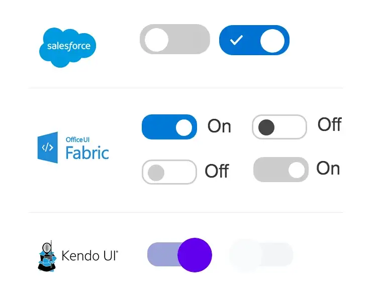
Websites have already started using toggle switches even where it doesn’t make sense.
What do you think? Do you like this new “trend” in UI design? Or does it remind you of the flat design revolution that happened a few years ago, only for Apple and MS to realize that flat icons and UI didn’t look as good as the skeuomorphic ones?
What's Your Reaction?