![[PRO] Craftwork Pass 2024.04.24](data:image/gif;base64,R0lGODlhAQABAIAAAP///wAAACH5BAEAAAAALAAAAAABAAEAAAICRAEAOw==)

![[PRO] Company Starter Kit](https://design.rip/uploads/cover/blog/company-starter-kit.webp)
![[VIP] Uicon V1.0 / Animated Icons](https://design.rip/uploads/cover/blog/uicon.webp)

![[VIP] Talkative Brand Book & Style Guide](https://design.rip/uploads/cover/blog/talkative-brand-book--style-guide.webp)
![[VIP] UX Stack Guru](https://design.rip/uploads/cover/blog/uxstackguru-bwikur.webp)
![[VIP] The Professional Style Guide Kit](https://design.rip/uploads/cover/blog/the-professional-style-guide-kit--indesign-format.webp)
![[LS] iPhone 14 Pro Longscroll Mockups](https://design.rip/uploads/cover/blog/iphone-14-pro-longscroll-mockups.webp)
![[LS] Acryl Abstractions](https://design.rip/uploads/cover/blog/acryl-abstractions.webp)


![[VIP] PАТАТА SCHООL: 2D to 3D Grease Pencil in Blender](https://design.rip/uploads/cover/blog/patataschool-blender-grease-pencil.webp)
![[VIP] The curious craft of demo reel titles](https://design.rip/uploads/cover/blog/the-curious-craft-of-demo-reel-titles.webp)
![[VIP] DesignCode: Build Beautiful Apps with GPT-4 and Midjourney](https://design.rip/uploads/cover/blog/designcode-gpt4.webp)
![[VIP] AppCoda: Mastering SwiftUI - Professional Packet (Updated 04.2023)](https://design.rip/uploads/cover/blog/appcoda-mastering-swiftui-professional-packet-worth.webp)
![[VIP] AppCoda: Beginning iOS Programming with Swift (Updated 04.2023)](https://design.rip/uploads/cover/blog/appcoda-beginning-ios-programming-with-swift.webp)


![[VIP] Whoooa! 156 vector Lottie animations](https://design.rip/uploads/cover/blog/whoooa-156-vector-animations.webp)
![[VIP] Design+Code: Learn to design and code React and Swift apps [2017-2023, ENG + Sub]](https://design.rip/uploads/images/202312/image_430x256_658ccc86afe53.webp)


![[VIP] Motion Sound Vol. 1](https://design.rip/uploads/cover/blog/designrip-svx.webp)
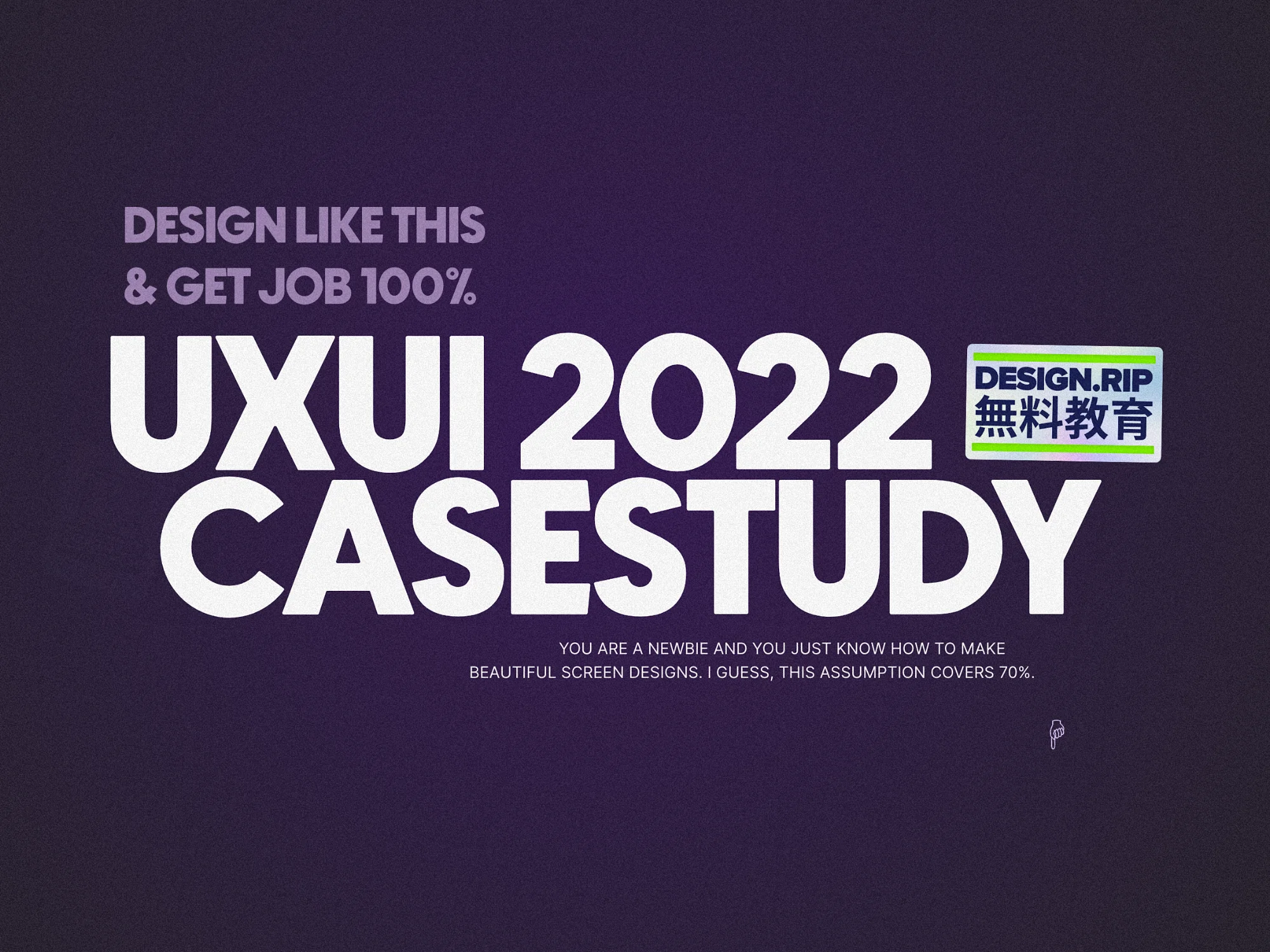
UXUI Case Study - 2022, Design like this & Get job 100%
You are a newbie and you just know how to make beautiful screen designs. I guess, this assumption covers 70% of Jr. UXUI designer.
Assumptions-
- You are a newbie and you just know how to make beautiful screen designs. I guess, this assumption covers 70% of Jr. UXUI designer.
- You wanted to change something in an app & so you redesigned one existing app or it’s feature and now you want to write a case study about it.(Practically it should be other way round, but I have been at your place so, Chill)
This is going to be concise, if you want to read lengthy articles read something else.
There are variety of tools you can use for making the case studies. I will use FIGMA. Parameters of case study are given below.
Color- Use the primary and secondary color from your app. Keep the background of Frame/ Artboard/ Canvas light primary color.
Heading- 48 px, Subheading- 40, Content- 20px, Exceptions- 144 or 96px
Structure- #Frame No. - What needs to be included- Container’s dimension (Width* Height)
1st frame- Hero Image of app, App name & Your name — ( 1440* 1024)px
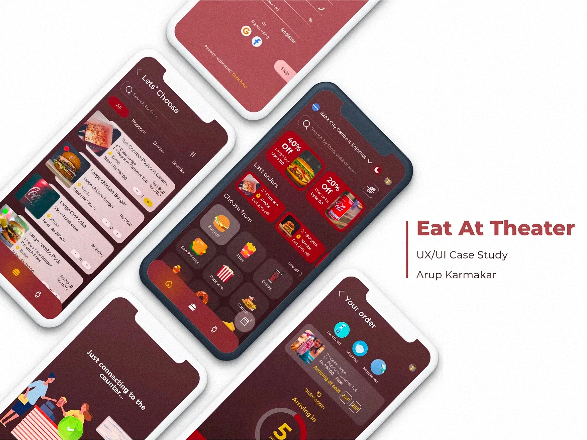
- Good quality picture of the app. 90% of the frame.
- Write in bold- “UX/UI Case study” & “App name”
2nd frame- Project Overview, Your role & project duration & Your design process — ( 1440* 1024)px
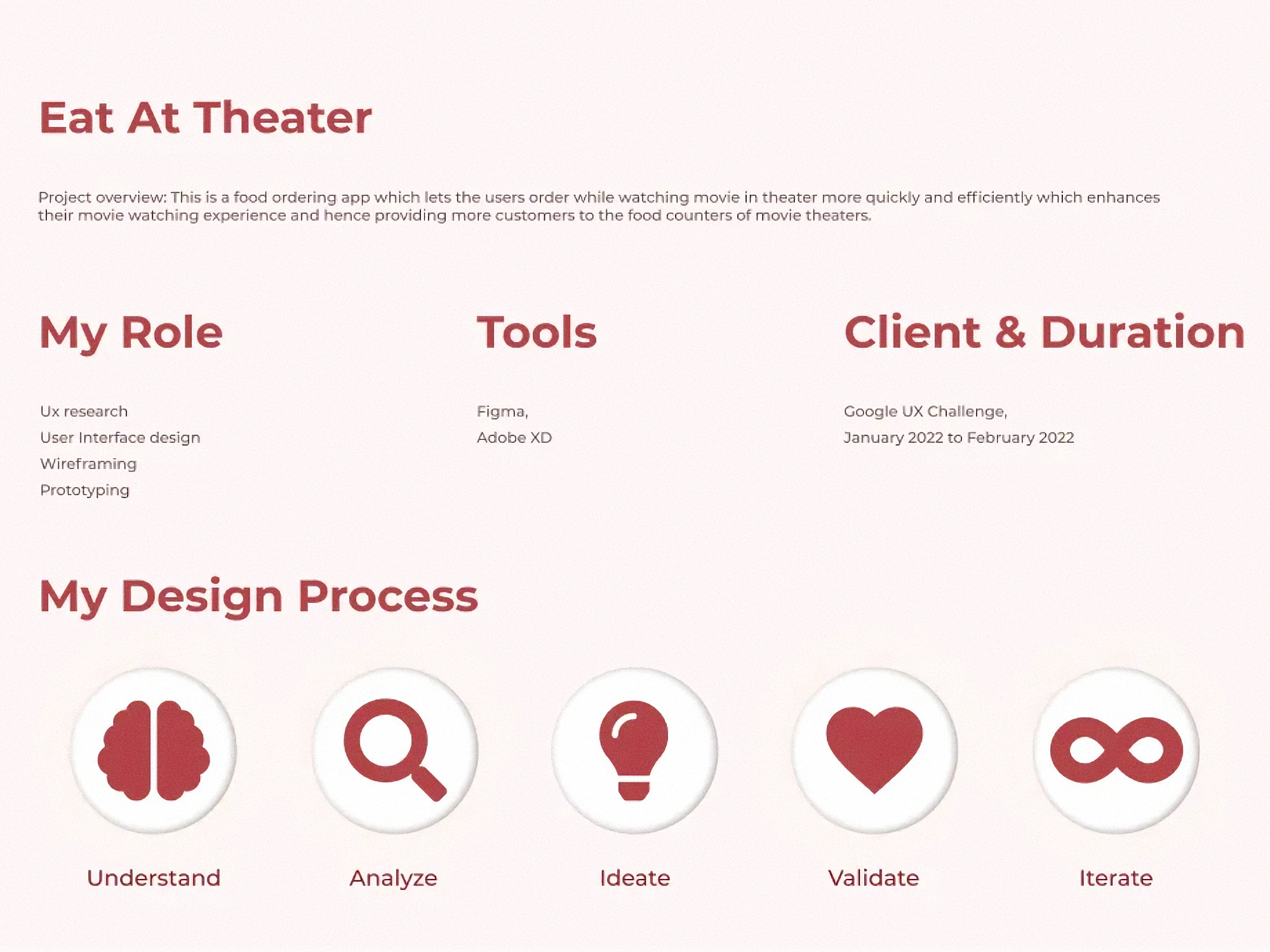
- Mention your specific role. i.e. user research, UI designing, wireframing & prototyping.
- Do not write any random design process. Follow the industry standard.
- Be creative in showing your design process.
3rd frame- The problem statement, solution or your goals & some pictures depicting it — ( 1440* 1024)px
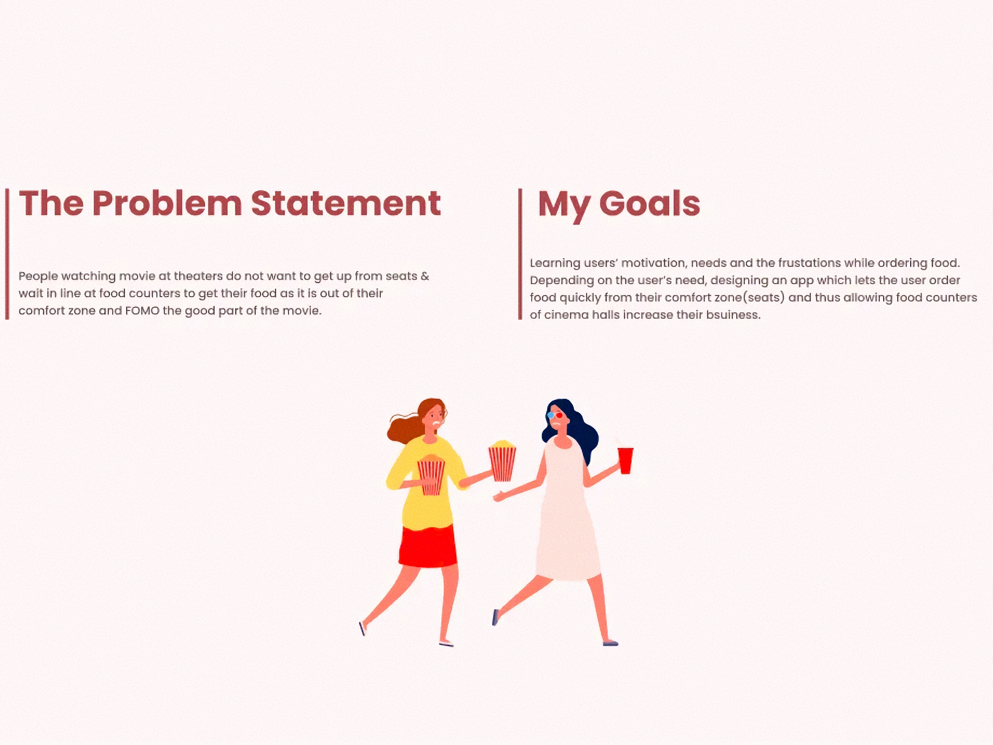
- Write the exact problem statement & how it is affecting the business
- Write two goals. One which solves the user issue & how it ultimately enhances the business.
- Do not write “I will make so and so changes in screen to achieve so and so goals”. Be precise to write what will be the ultimate result.
4th Frame- Initial survey or quantitative research — ( 1440* 1024)px. Put 70% of this frame with insights.
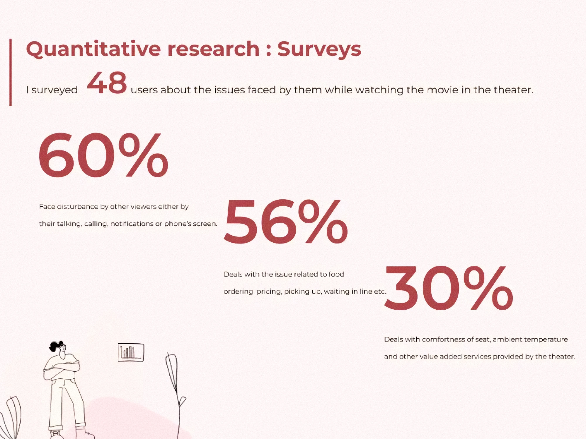
- Firstly write whom did you survey and why?
- Then take the insights from it to narrow down your research.
- Show the numeric and stats in magnified and focused views. No one likes to read your text.
- Never write what you are asking to user, rather write the insights.
5th frame- Interviews or Qualitative research-( 1440* 1024)px. Put 70% of this frame with insights.
Same as the above.
6th frame- Competitive analysis-( 1440* 1024)px. Enough for 3 competitors.
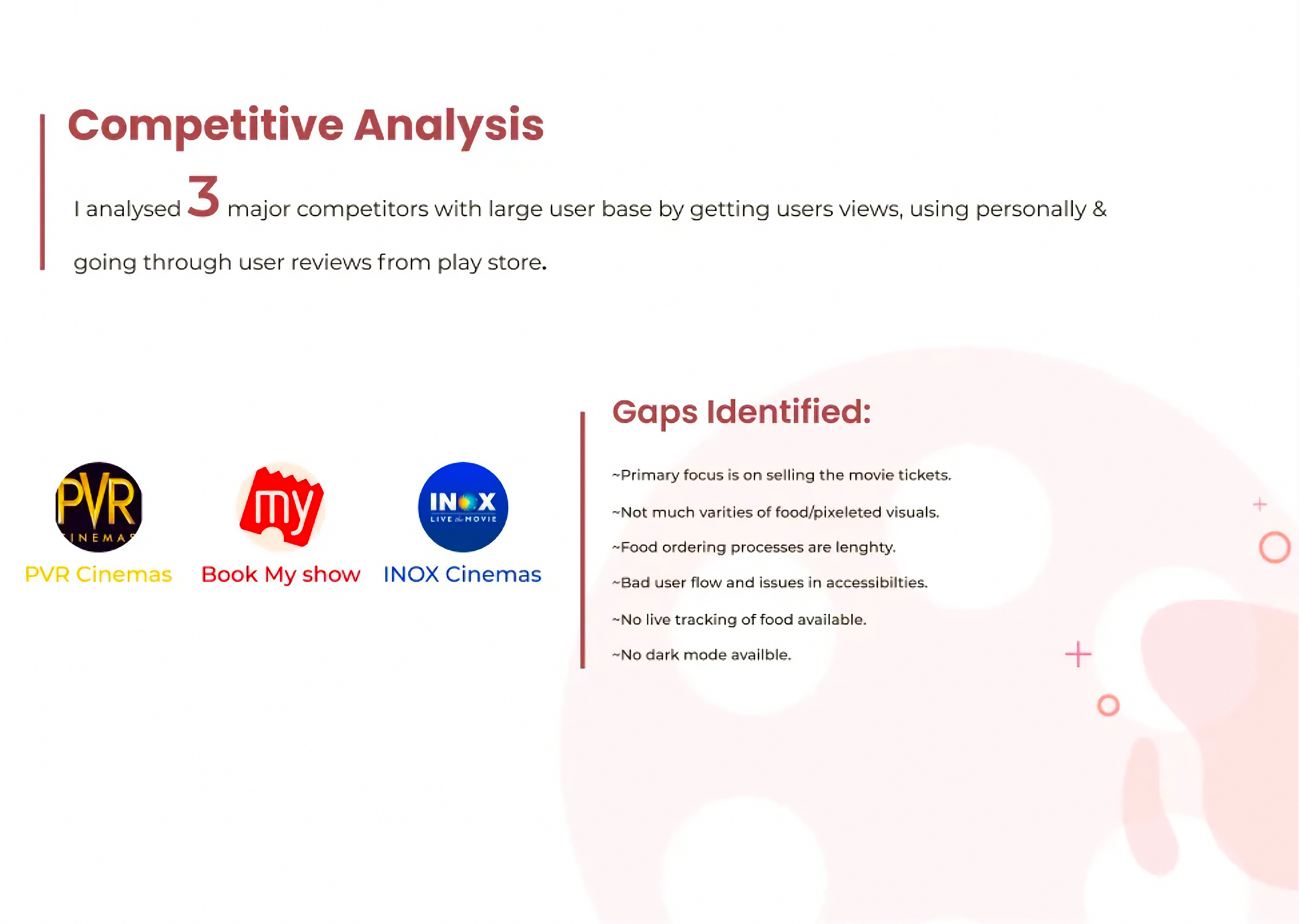
- Select 3 or more than 3 competitors. Indirect or direct both will work.
- To show feature and weakness of all those in compact form, use Axis diagram.
- Write down the major gaps identified.
7th frame- Pain Points & solutions — ( 1440* 1024)px.
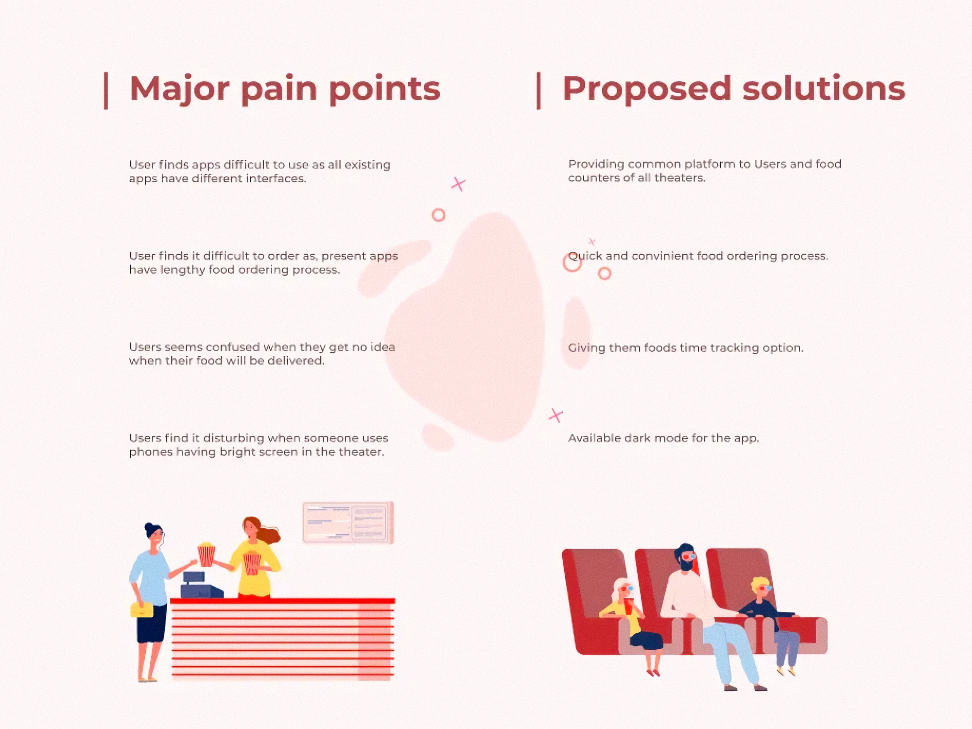
- Read gaps from the competitive analysis & interview and narrow down the pain points to those which you want to /can solve. Name it as Focused or Major Pain Points.
- Write the proposed design solution beside every Major Pain Points so that it feels like you actually want to solve the issue.
8th frame- User journey — ( 1440* 1024)px.
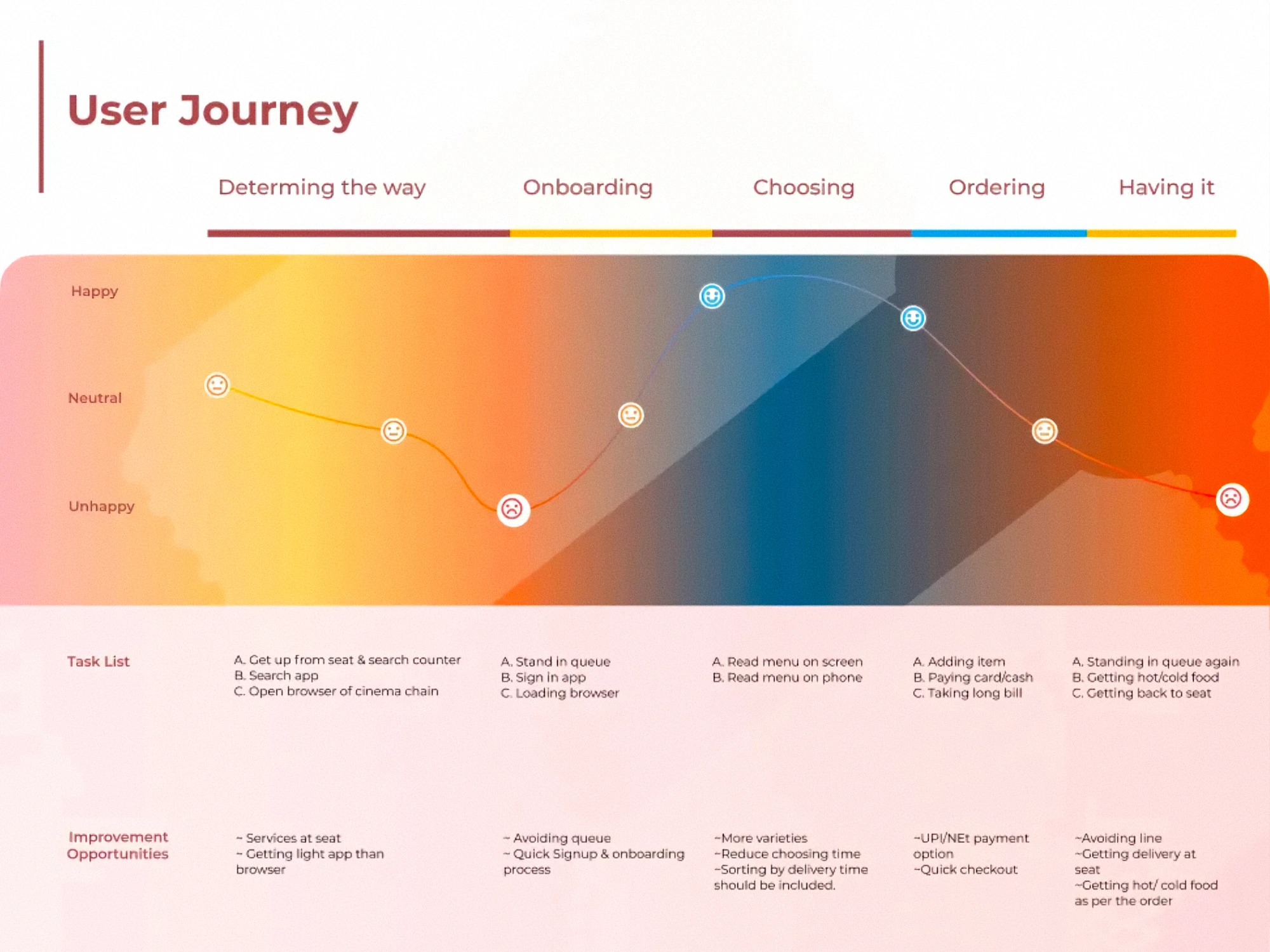
- Only have the user journey of the part of the app that you want to solve. Like just ordering food or just uploading picture or just posting something. Be specific.
- From finding app to downloading, onboarding and actually using the feature, everything can be improved. Write the improvement opportunities in each step.
9th Frame- Persona — ( 1440* 1980)px. Enough for Two personas.
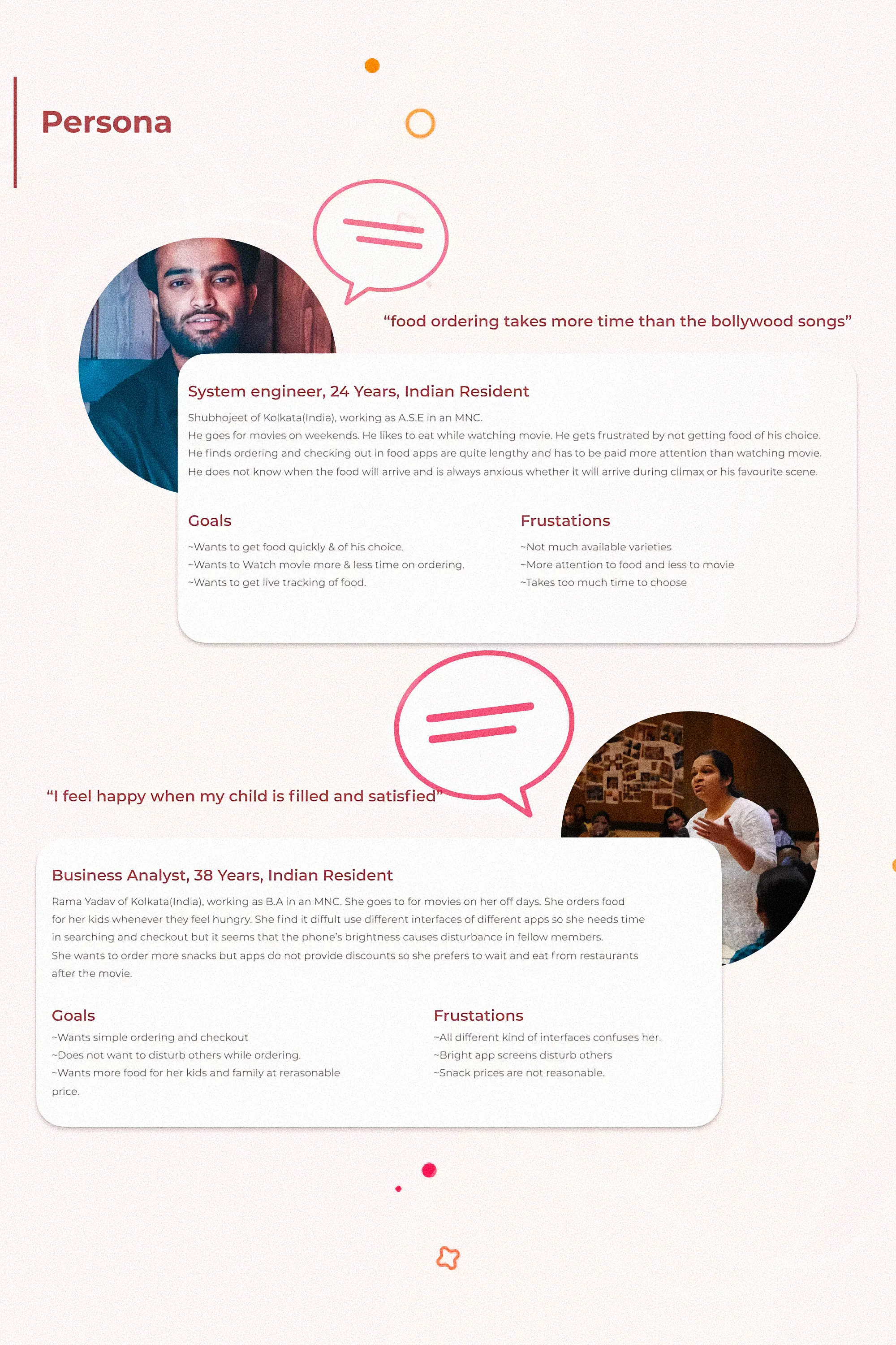
- Personas at this stage is an user that exists hypothetically and is facing the issue that you got from you research above.
- Use Unsplash picture, but if you are writing an Indian name, please use an Indian face, not American. It feels so weird when I come across such personas.
10th frame- User flow or information architecture — ( 1440* 1024)px.
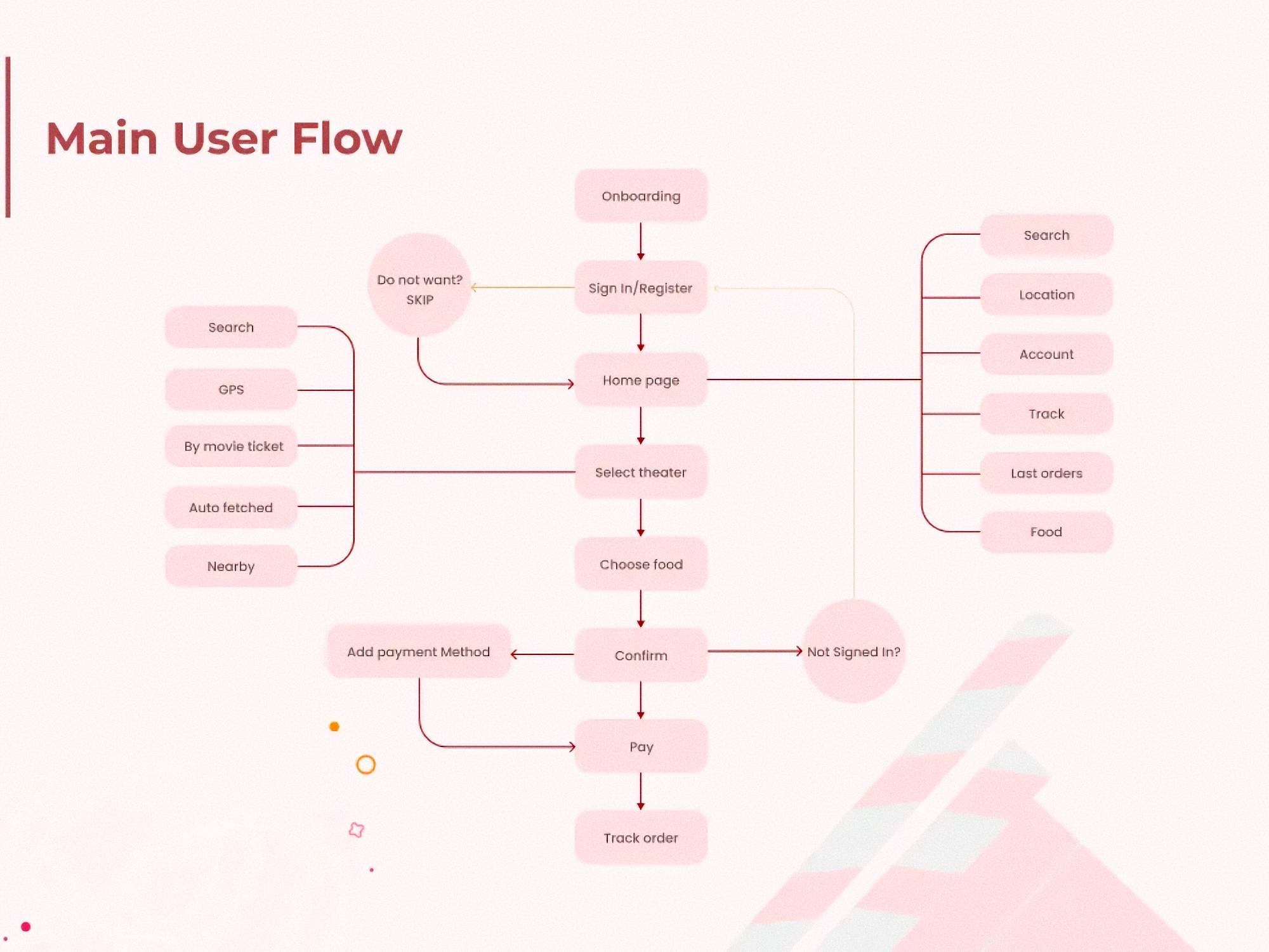
- Use proper arrows with proper direction.
- No need to connect every feature to every other feature. You can write , “Feature Focused User flow”. For the feature you are trying to solve the issue.
11th frame- Rough wireframe — ( 1440* 1600)px. Can be big, since it showcases your actual problem solving skills.
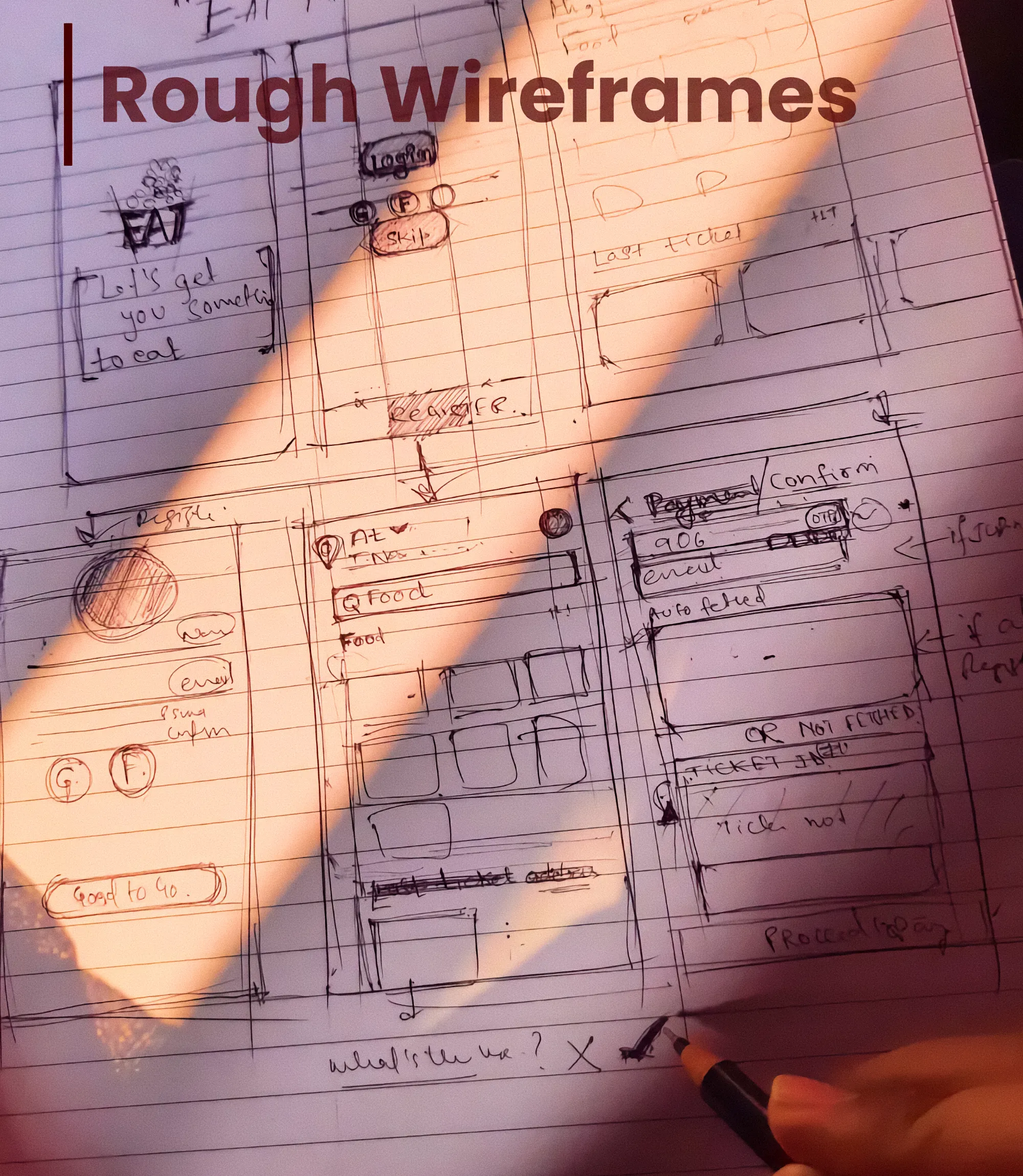
- This part showcases that you have designed something of your own. Click a nice picture of your sketch.
- So it is better to have picture of sketches that are on pen and paper and not digital wireframe.
- Do not use Low fidelity design(jr. Designer) in your case study. Just have the pen and paper sketch and High Fidelity designs.
12th frame- High Fidelity designs— ( 1440* 8400)px. Enough for 12 screen with 360*800 px of each screen & with descriptions for them of 2 lines.
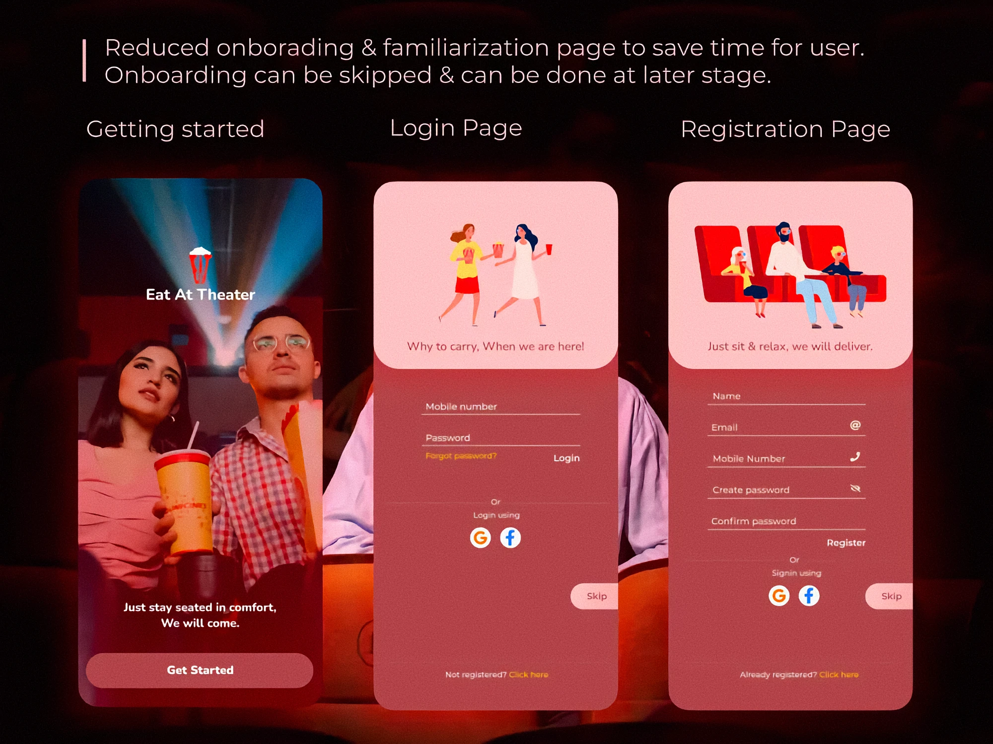
- Depict which part of your design is solving which issue.
- Write small description with arrows if possible if you do not know how to include prototype.
- Also add any components like (Food card, Any new CTA or icon) that you have created.
- Make your designs according to what is trending.
13th frame- Typography, colors, Iconography — ( 1440* 1600)px
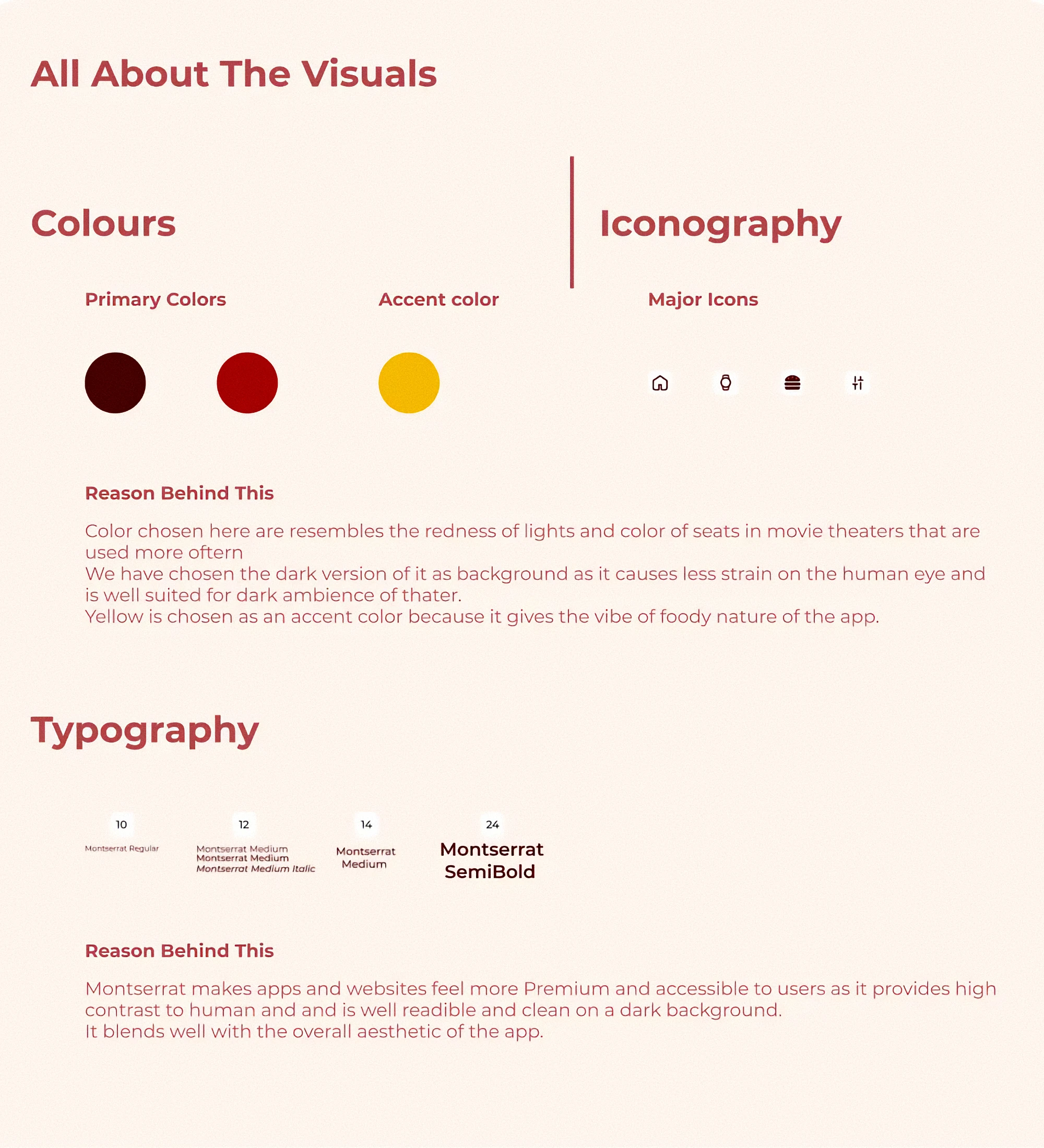
- Please, please Provide the reason for the colors you chose and typeface chose. Do not be random. Give reasons. If you do not have find the reason or cook one.
- Write the name of the color not just hex code.
14th frame- Different hero image of app — ( 1440* 1024)px
Should have all the screens subtly shown in one frame.
15th frame- Your name, contact and thanking you section— ( 1440* 700)px
![]()
What's Your Reaction?


![[LS] ls.graphics Pass 2023.12.16](data:image/png;base64,iVBORw0KGgoAAAANSUhEUgAAAcIAAAEYAQMAAAD1c2RPAAAAA1BMVEUAAACnej3aAAAAAXRSTlMAQObYZgAAACVJREFUaN7twQEBAAAAgqD+r26IwAAAAAAAAAAAAAAAAAAAACDoP3AAASZRMyIAAAAASUVORK5CYII=)