![[PRO] Craftwork Pass 2024.04.24](data:image/gif;base64,R0lGODlhAQABAIAAAP///wAAACH5BAEAAAAALAAAAAABAAEAAAICRAEAOw==)
![[PRO] Company Starter Kit](https://design.rip/uploads/cover/blog/company-starter-kit.webp)
![[VIP] Uicon V1.0 / Animated Icons](https://design.rip/uploads/cover/blog/uicon.webp)

![[VIP] Talkative Brand Book & Style Guide](https://design.rip/uploads/cover/blog/talkative-brand-book--style-guide.webp)
![[VIP] UX Stack Guru](https://design.rip/uploads/cover/blog/uxstackguru-bwikur.webp)
![[VIP] The Professional Style Guide Kit](https://design.rip/uploads/cover/blog/the-professional-style-guide-kit--indesign-format.webp)
![[LS] iPhone 14 Pro Longscroll Mockups](https://design.rip/uploads/cover/blog/iphone-14-pro-longscroll-mockups.webp)
![[LS] Acryl Abstractions](https://design.rip/uploads/cover/blog/acryl-abstractions.webp)


![[VIP] PАТАТА SCHООL: 2D to 3D Grease Pencil in Blender](https://design.rip/uploads/cover/blog/patataschool-blender-grease-pencil.webp)
![[VIP] The curious craft of demo reel titles](https://design.rip/uploads/cover/blog/the-curious-craft-of-demo-reel-titles.webp)
![[VIP] DesignCode: Build Beautiful Apps with GPT-4 and Midjourney](https://design.rip/uploads/cover/blog/designcode-gpt4.webp)
![[VIP] AppCoda: Mastering SwiftUI - Professional Packet (Updated 04.2023)](https://design.rip/uploads/cover/blog/appcoda-mastering-swiftui-professional-packet-worth.webp)
![[VIP] AppCoda: Beginning iOS Programming with Swift (Updated 04.2023)](https://design.rip/uploads/cover/blog/appcoda-beginning-ios-programming-with-swift.webp)


![[VIP] Whoooa! 156 vector Lottie animations](https://design.rip/uploads/cover/blog/whoooa-156-vector-animations.webp)
![[VIP] Design+Code: Learn to design and code React and Swift apps [2017-2023, ENG + Sub]](https://design.rip/uploads/images/202312/image_430x256_658ccc86afe53.webp)


![[VIP] Motion Sound Vol. 1](https://design.rip/uploads/cover/blog/designrip-svx.webp)
Designers’ Pick: Best Google Fonts
Typography is a craft that, being charged with artistic, aesthetic and technical values, deserves more attention than the general public usually gives it. We are so used to seeing text everywhere we hardly ever stop to actually look at those letters, the way they are crafted and arranged within their environment, and, what’s particularly important, how they fit and interact with the graphic context they’re placed in.
Typography is a craft that, being charged with artistic, aesthetic and technical values, deserves more attention than the general public usually gives it. We are so used to seeing text everywhere we hardly ever stop to actually look at those letters, the way they are crafted and arranged within their environment, and, what’s particularly important, how they fit and interact with the graphic context they’re placed in.
At Qode Interactive, we believe typography should be approached with equal focus and care as any other design element. It’s not just that the fonts “carry” the text, they also imbue the design with particular psychological values and convey specific messages, just like images and colors do. Certain typefaces communicate energy and optimism, others give the design an elegant or sophisticated feel, others yet are romantic, and there are, of course, tons of them that are professional and quite rigid. The right choice of typeface ensures the consistency of a design and is also extremely important in terms of branding and creating an aesthetic personality.
While there are so many amazing indie type foundries out there creating all sorts of innovative and classic typefaces, designers often opt for free fonts that can be downloaded from the web, available in all the required varieties for web use. There are tons of places these days where a designer can download a font but today we want to talk about our (and everyone’s) favorite — Google Fonts.
There are a lot of reasons why Google Fonts reigns supreme over other free font sources. For one, it’s Google, and you know they take things extremely seriously. With Google Fonts, a designer can be sure the technicalities such as licensing are taken care of, and they are also very easy to add to any website thanks to the Google Fonts API. In addition, Google Fonts represent a curated collection of typefaces that have been audited, tried and tested before being put up for download. We’re talking about high-quality fonts designed to work great on all sorts of screens, from big to small. The only trouble is that there are so, so many of them to choose from. In fact, there are more than 1,200 font families available for free from this font repository (and the number keeps growing as Google is adding new fonts on a regular basis), so finding your way around them can be a tough chore.
Because of this, and also because we’re really just so enthusiastic about typography, we’ve decided to share a selection of what we believe are the most exciting Google Fonts out there right now:
Krona One

We’re kicking off our list with the excellent Krona One font, created by the talented typographer Yvonne Schüttler. It’s a low contrast sans serif typeface and one of the few true semi-extended styles (although here at Qode Interactive we see it as a fully extended style) in the Google Fonts repository. Inspired by the handwritten Swedish poster type from the early 20th century, Krona One bears a distinct Scandinavian retro vibe but can actually fit a wide array of different styles and aesthetics. Highly readable, spacious and with a strong personality, Krona One makes an excellent choice for titles or any text you want to make bold and distinctive. Still, that doesn’t mean it can’t be used for smaller text, too. In fact, you can use it for both, as we did in our Gracey theme, where Krona One is used for hero typography, as well as for the header menu. We also found this font to be a great choice for the Art Festival demo in the Stockholm theme, where we used both smaller and larger Krona One styles.
Syne

Another font that has found ample use in our themes, Syne was first developed in 2017 as the custom typeface for the Saint-Denis art festival Synesthésie. The concept for the font came from the French design studio Bonjour Monde, and it was designed by Lucas Descroix with the help of Arman Mohtadji. Syne comes in five different styles — regular, medium, semi-bold, bold and extra bold. The family started, of course, with the regular style, a lovely geometric sans serif, convenient and suitable for the widest possible use, from titles to small bits of text. However, for those looking to make a bolder statement with their titles, the studio commissioned additional styles, each heavier than the previous one and crowned with the fun, wide extra bold style. Micdrop is one of our themes where the bolder Syne styles are used to instill a particularly recognizable character with just a hint of retro aesthetics. Some of the theme homepages, like the Label Showcase, use just Syne, without combining it with other fonts, which goes to show how versatile and practical this typeface is, despite its rather loud character. We also opted for Syne for our Laurits theme, where we explored the gentler, softer side of this typeface, which also worked very well with the geometric, sectioned layout.
Italianae
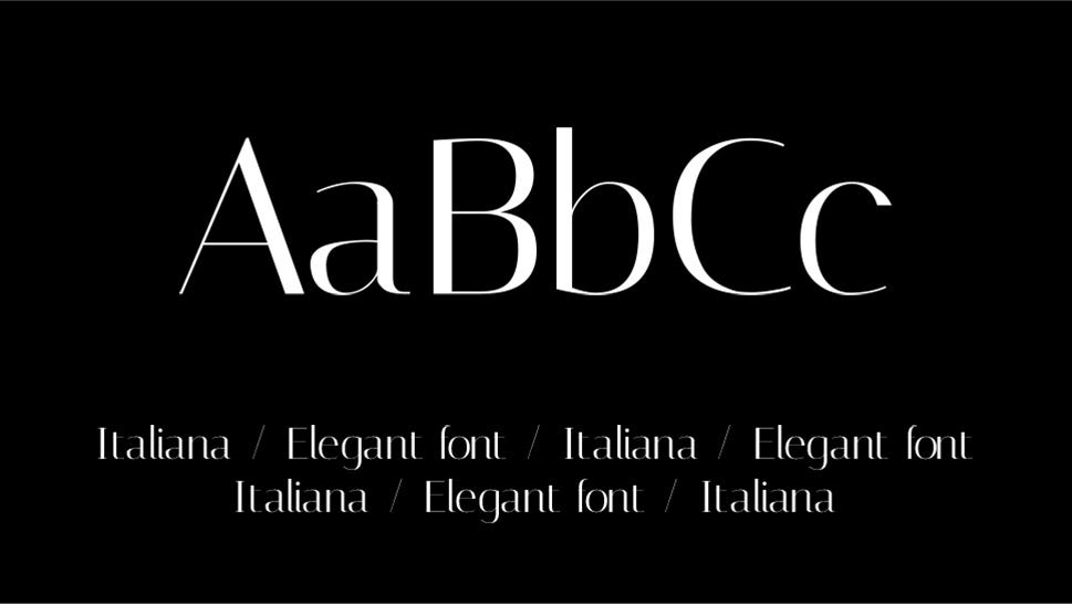
Just like its name suggests, Italiana is a sans-serif heavily inspired by the Italian typographic tradition, most notably the handwritten styles. Conceptualized by its designer, Santiago Orozco, as an elegant, sophisticated typeface with a tiny bit of the dolce vita aesthetics, Italiana was primarily designed for headlines and titles, reminiscing the lettering used for early 20th century newspapers and magazines. Italiana is currently available only in regular style, but the family is in progress so we hope new additions will be available soon. It is a clean, airy and proportional typeface, and its elegant character makes it particularly suitable for fashion and creative projects. Unlike so many other design creations inspired by Italy, this font is not the least bit derivative and avoids the usual aesthetic commonplaces. It’s highly adaptable and fits well in a variety of styles and contexts, and we just loved how it fit the vibe of our Oráiste theme. Its interplay of hairline-thin bars and thicker stems and strokes, as well as careful kerning and white-spacing, make Italiana an airy yet distinctive font, which was a great fit for the mood we wanted to set with our theme.
Bellezza
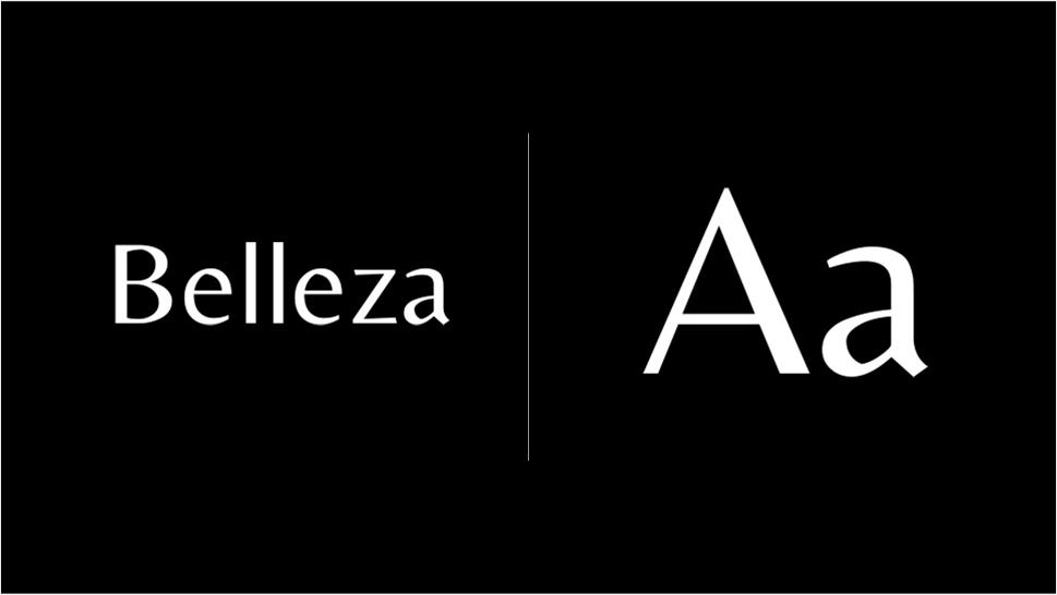
Similarly to the Italiana font, Bellezza draws inspiration from Italian culture, this time from its fashion. This lovely, sophisticated, femminine sans-serif belongs to the group of humanist fonts, derived from old Latin types. With a bit more contrast between the thin and the wide strokes, Bellezza adds a personal touch to the humanist style, and its classical proportions add to the readability and usability. When we were working on our Töbel theme, Bellezza came as a natural, obvious choice. Being a font that bears a particularly elegant character, it was a great means to provide an additional touch of sophistication and uniquely Italian chic to the layouts.
Space Grotesk
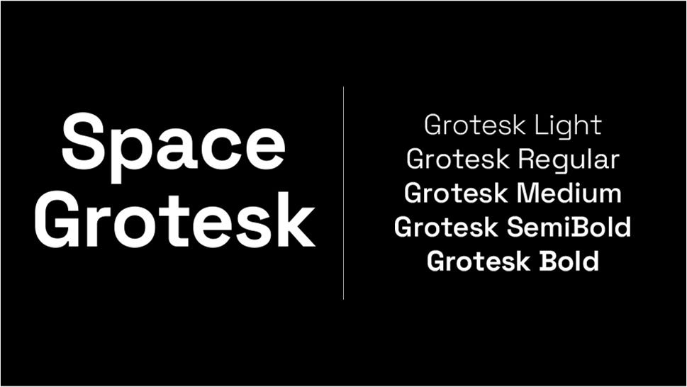
Space Grotesk is a typeface developed by the Czech designer Florian Karsten, based on the Colophon Foundry’s Space Mono fixed-width font (also a Google font) from 2017. When designing this proportional sans-serif, Karsten wanted to keep some of the quirkiness of the Space Mono type but to also “clean it up” a bit, so to speak — to make it more readable at non-display size. This versatile, adaptable type is available in five styles: light, regular, medium, semi-bold and bold and pairs very well with its older serif brother, Space Mono.
Federo
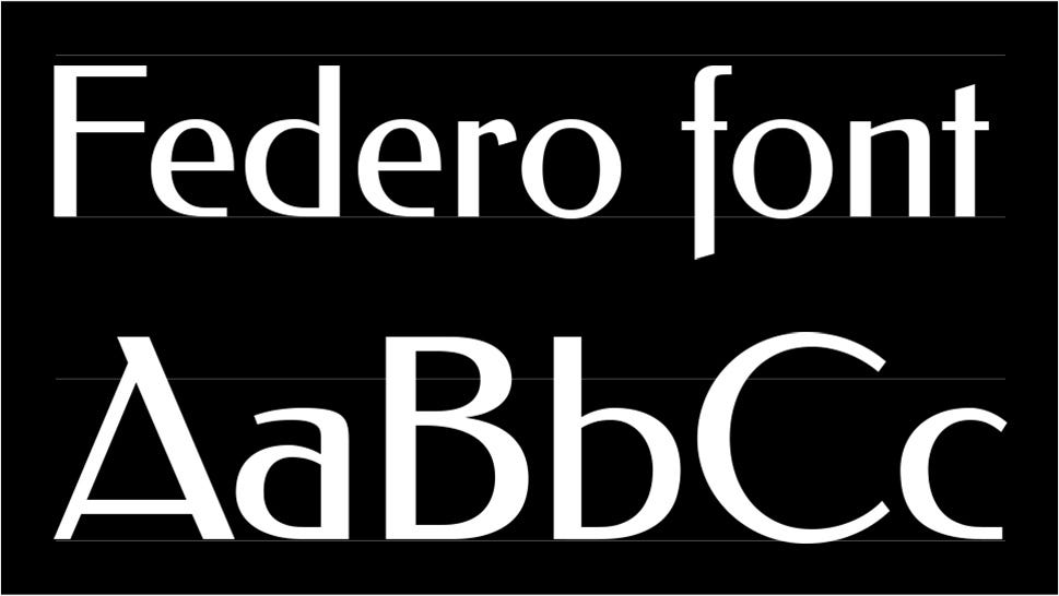
In 1909, the famous pioneer of sans-serif typography Jakob Erbar designed the Feder-Grotesk type which was first cast in 1910 by the Ludwig & Mayer Typefoundry in Frankfurt. In 2011, Olexa Volochay designed for Cyreal a digital interpretation of this classic typeface, a display webfont named Federo. The idea was to keep the type close to the original — a stressed sans-serif with noticeably uneven thickness of the strokes, resembling hand lettering using a broad-nibbed pen, in a distinctive Art-Nouveau style — but to refine it, make it a bit more consistent. The contrast was slightly reduced, proportions were fixed and counters were increased, improving the font’s readability. The result is a lovely, web-ready font with a distinct personality and style. We loved it for Stockholm’s Animated Showcase demo, where we set out to create a moodthat combines creativity and professionalism.
DM Sans
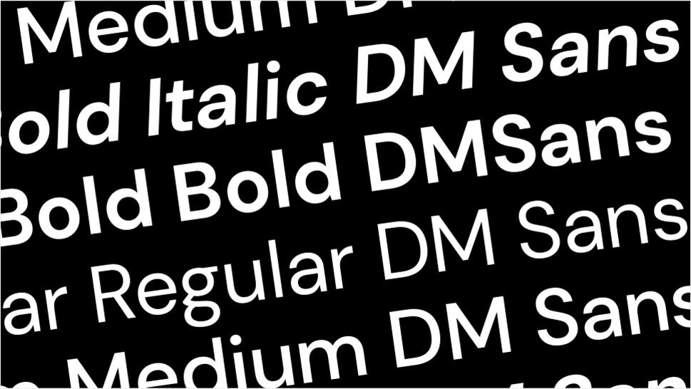
A lot of the fonts you can find in the Google Fonts repository were actually commissioned by Google itself, as was the case with DM Sans. Commissioned from the Colophon Foundry and designed by Jonny Pinhorn, with creative direction from DeepMind and MultiAdaptor, the font was released in 2019 and was derived particularly from Pinhorn’s Poppins typeface. DM Sans is a low-contrast, geometric sans-serif, the kind that Google really likes, and is generally intended for smaller text sizes. DM Sans pairs well with DM Mono, which is a related font, and also with Baskerville, Roboto and Noe. It comes in a number of styles — regular, medium and bold, with italics to match. It supports a Latin Extended set, which means it is suitable for English and most other Western languages.
DM Sans is definitely one of our all-time favorites that we used for a number of themes, such as Zermatt, where it clicked well with the combination of brutalist and Swiss design hints. We also used DM Sans on our multi-concept theme Stockholm, and, most recently, for the Qi Theme, our first-ever free WordPress theme. DM Sans was our choice for our Qi Addons for Elementor plugin, as well. Our choice was dictated by the fact it is a clean, very legible font with a distinctly modern character, perhaps more so than some other high-quality fonts in wide use on the web. With a lot of design shifting towards the accessibility standards with larger fonts, the DM Sans typeface, simple, low-contrast and wide as it is, fits those standards particularly well.
Caudex
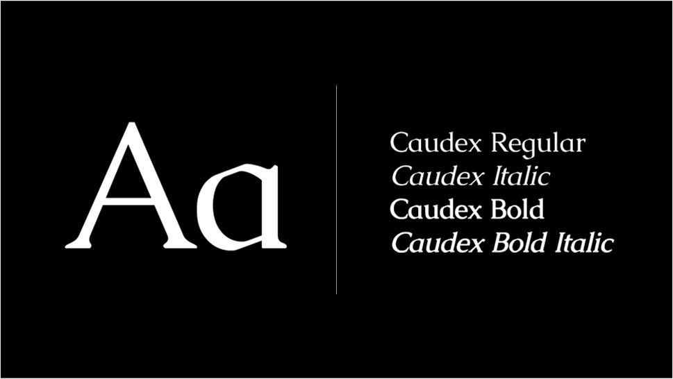
Originally made in the late 1990’s, Caudex is a serif font that was later adapted for the web using FontForge. Originally created using the ISO 8859–1 standard and following the Medieval Unicode Font Initiative 3.0 recommendations, Caudex was developed with the purpose of printing old handwritten text. In fact, its style represents a contemporary take on the lettering from Medieval scripts, and its personality is a combination of modern functionality and classical ornamentation. It comes in two weights — regular and bold, and matching italics. In addition to Latin glyphs, it also includes Greek letters. Caudex is a typeface that works well with many other fonts, both serif and sans. For instance, for our Gaspard theme, we used it for text and titles and combined it with Italiana for the large hero typography and with Catamaran for navigation links, creating an elegant, balanced mix.
Cinzel Decorative
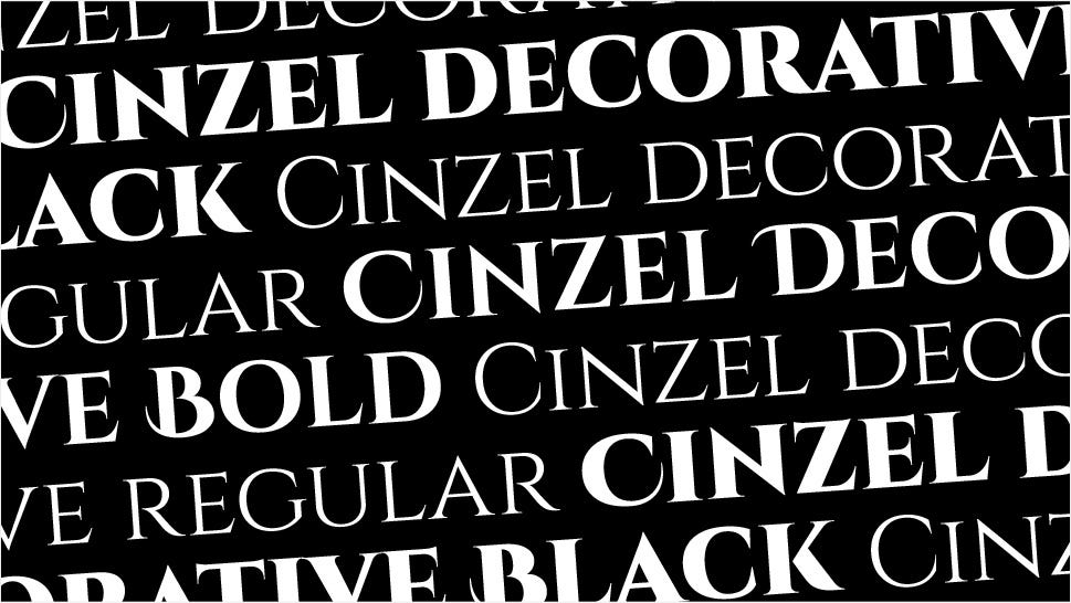
Part of a very popular Cinzel web font family, Cinzel Decorative makes a great choice for designs that want to communicate a sense of elegance and class. Created by Natanael Gama, this all-caps font follows the classical proportions and is characterized by elegant flourishes and extended strokes that give it a calligraphic appearance. The font family was based on early Roman inscriptions but in a distinctly modern interpretation. Because of its classical character, Cinzel Decorative is a lovely font for designs related to literature, art and culture. It comes in several styles, including extra bold and black for a particularly striking effect. A more toned down member of this font family is Cinzel, with the same classic proportions and style but without the swashes. Because of its elegant character, Cinzel was the perfect choice for titles in our Belletrist theme created for writers, publishers and libraries, where we paired it with the equally sophisticated Cormorant Garamond for paragraphs and Open Sans for navigation links.
Viaoda Libre

Inspired by Vietnamese cultural heritage, symbolism and script, Viaoda Libre is a display family that combines tradition with modernity, bringing a delightful twist to elegant serif typography. Created by the Germany-based Vietnamese designer Gydient (Tra Giang Nguyen) with the help of Vietanh Nguyen, Viaoda Libre is intended for personal and commercial use and works equally well for titles and for smaller text. The name “Viaoda” is a combination of “Vietnamese” and “Ao Dai,” the term used for the traditional garment worn by both women and men. The strokes of the font evoke the soft, smooth lines of Ao Dai and their overall character is slender and refined. This inspiration is also visible in the highly distinctive ligatures between characters, such as “st” and “ft,” rendering the font so striking and recognizable. Being a relatively new font family, Viaoda Libre is being further developed and the designer hopes it will add new and significant value to Vietnamese culture around the globe.
Final Words
This is by no means an exhaustive list of our favorite Google fonts right now. In fact, our designers had a hard time narrowing down their choice, since there are so many incredibly well-crafted typefaces and font families in the Google repository, each bearing their own distinctive character and practical implications. The choice of the font for a design, as always, depends on a multitude of factors — its purpose, intended use and aesthetic character being just some of the most important ones. When picking a font, it’s also important to be able to see it in action, which is where resources like Fonts in Use can be of help, especially for more idiosyncratic types. We hope that our list inspired you to take a deeper dive into the Google Fonts repository, past the usual Open Sans, Roboto and Oswald. A wealth of wonderful, functional, superbly designed fonts await you and your next project. Make sure you give us a shout with your typographic discovery and let us know what your own favorites are.
What's Your Reaction?