![[PRO] Craftwork Pass 2024.04.24](data:image/gif;base64,R0lGODlhAQABAIAAAP///wAAACH5BAEAAAAALAAAAAABAAEAAAICRAEAOw==)

![[PRO] Company Starter Kit](https://design.rip/uploads/cover/blog/company-starter-kit.webp)
![[VIP] Uicon V1.0 / Animated Icons](https://design.rip/uploads/cover/blog/uicon.webp)

![[VIP] Talkative Brand Book & Style Guide](https://design.rip/uploads/cover/blog/talkative-brand-book--style-guide.webp)
![[VIP] UX Stack Guru](https://design.rip/uploads/cover/blog/uxstackguru-bwikur.webp)
![[VIP] The Professional Style Guide Kit](https://design.rip/uploads/cover/blog/the-professional-style-guide-kit--indesign-format.webp)
![[LS] iPhone 14 Pro Longscroll Mockups](https://design.rip/uploads/cover/blog/iphone-14-pro-longscroll-mockups.webp)
![[LS] Acryl Abstractions](https://design.rip/uploads/cover/blog/acryl-abstractions.webp)


![[VIP] PАТАТА SCHООL: 2D to 3D Grease Pencil in Blender](https://design.rip/uploads/cover/blog/patataschool-blender-grease-pencil.webp)
![[VIP] The curious craft of demo reel titles](https://design.rip/uploads/cover/blog/the-curious-craft-of-demo-reel-titles.webp)
![[VIP] DesignCode: Build Beautiful Apps with GPT-4 and Midjourney](https://design.rip/uploads/cover/blog/designcode-gpt4.webp)
![[VIP] AppCoda: Mastering SwiftUI - Professional Packet (Updated 04.2023)](https://design.rip/uploads/cover/blog/appcoda-mastering-swiftui-professional-packet-worth.webp)
![[VIP] AppCoda: Beginning iOS Programming with Swift (Updated 04.2023)](https://design.rip/uploads/cover/blog/appcoda-beginning-ios-programming-with-swift.webp)


![[VIP] Whoooa! 156 vector Lottie animations](https://design.rip/uploads/cover/blog/whoooa-156-vector-animations.webp)
![[VIP] Design+Code: Learn to design and code React and Swift apps [2017-2023, ENG + Sub]](https://design.rip/uploads/images/202312/image_430x256_658ccc86afe53.webp)


![[VIP] Motion Sound Vol. 1](https://design.rip/uploads/cover/blog/designrip-svx.webp)
Creating component libraries in Figma: Set of elements
Component libraries allow you to define interfaces using individual building blocks that can be combined into a single entity. The result is an adaptable visual language that provides greater consistency, efficiency, and scalability. In this article, I will describe my process for creating the basic elements that make up a component library, which can grow and evolve to meet the needs of any interface.
Component libraries allow you to define interfaces using individual building blocks that can be combined into a single entity. The result is an adaptable visual language that provides greater consistency, efficiency, and scalability. In this article, I will describe my process for creating the basic elements that make up a component library, which can grow and evolve to meet the needs of any interface.
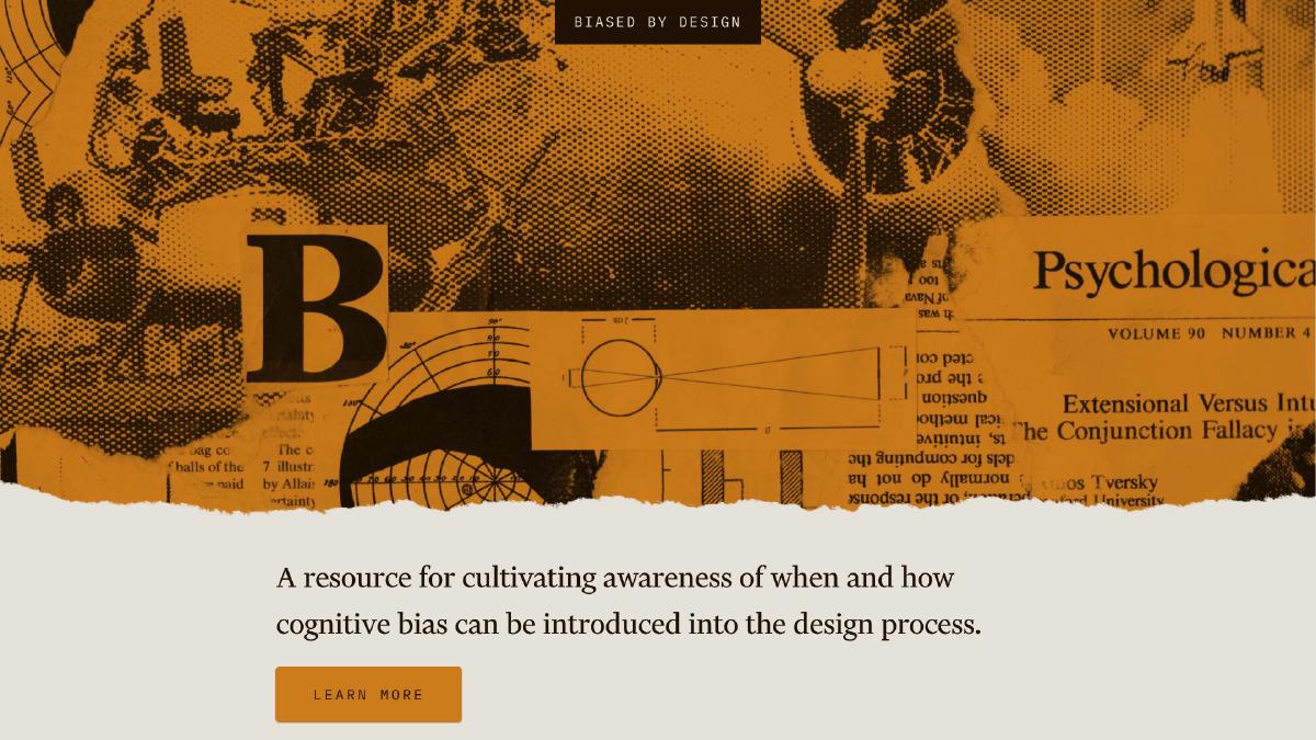
We'll look at the workflow I followed in creating the component library for the Biased by Design project. Although the project itself is relatively small, the process I'll show you can be used to create component libraries in projects of any size. I used Figma and, if you're not already familiar with the tool, I recommend watching this playlist for a quick introduction to the key concepts and features.
Typography and scale
Let's start by defining the two basic elements of any component library: typography and modular scale. Written language plays a fundamental role in design-it makes up most of the content we consume and is a vital communication mechanism. For this reason, it makes sense to start with typeface when starting any component library. The modular scale is also an important part of the library because it affects the size and spatial relationships between all the elements in the library.
Typography
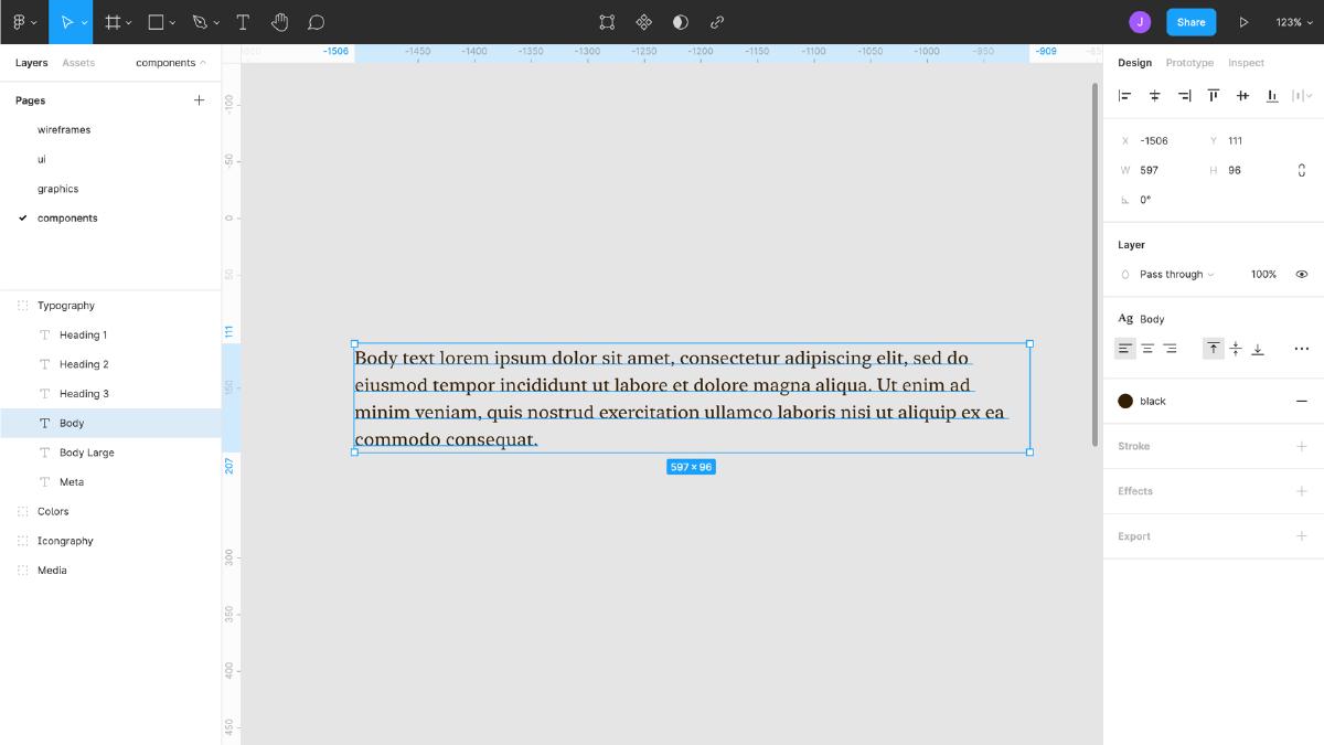
I start any component library with a font, because the values obtained for this base element directly affect many other elements in the library. The style and size we choose for the base text is the lowest common denominator - it is the base element that is common to all the others by default. So it's important to start designing the library with it.
The first step is to choose a suitable font (preferably with multiple weights) and apply it to a block of text. The default font size on the web is 16px (1 em), and this is usually a great starting point for the main text. Next, you need to determine the default line height, which will vary depending on the font chosen for the main text. You can experiment with different line heights until you find a value that provides enough space between lines of text without losing continuity.
The rest of the elements in your typography scale will come from this base size plus a scale multiplier, which we'll define later.
Scale
Once I've selected the main text, it's time to define the modular scale. The scale we use will be the logic of the values throughout the library, so it's helpful to set it early on. We start by multiplying the base text value by the scale factor (1.333, 1.25, 1.5) to get the next value, and we repeat this process to get additional values. For example, if the base font size is 16px and the scaling factor is 1.5, I multiply 16 × 1.5 to get 24px. Then I could multiply 24 × 1.5 to get 36px, and so on. You can also get values smaller than the base (16px) by dividing the base font size by the scale unit (e.g., 16px ÷ 1.5 = 10.667px). Continue this process until there are 8-10 sizes left of the scale (including the base value).
There is no need to do all the math manually - there is a handy tool for quickly testing and determining modular scale values called Modular Scale.
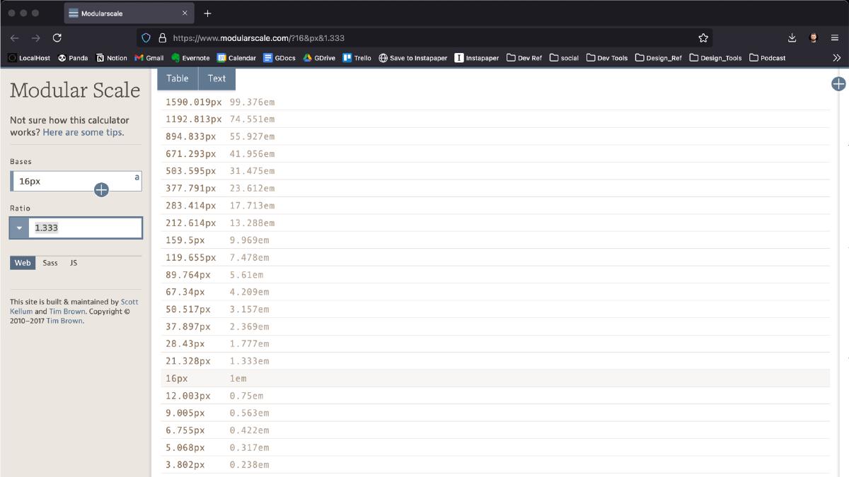
The scale you choose will determine how many units you have available. For example, the rarer the scale, the greater the difference between the values. This will affect the degree of flexibility, so keep this in mind when determining the scale.
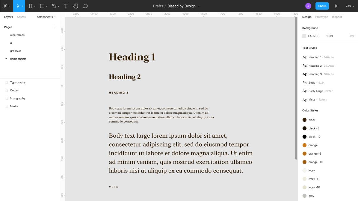
Once we've set the modular scale, let's go back and define the remaining elements in our typography scale. Don't forget to also set the line height value for headings, which will vary depending on the font. I'll choose 1.3 times the font size (rounded to the nearest whole pixel) for the headers. Once I've set the rest of the elements in the font scale, it's time to save those values for reuse later by saving them as text styles.
Keep in mind that we're just defining some basic font styles. These styles will and should evolve as you begin to work on your projects.
Grid system
Continuing to define the basic elements of the library, it's time to establish a grid system. Grid systems are invaluable not only for establishing rhythm and alignment, but also for ensuring consistency. To define the grid system, create a new set of large-sized frames, e.g. 1920×1080 pixels. Then use the grid settings to create a grid of 12 columns, taking the spacing value from the modular scale (16, 24, etc.).
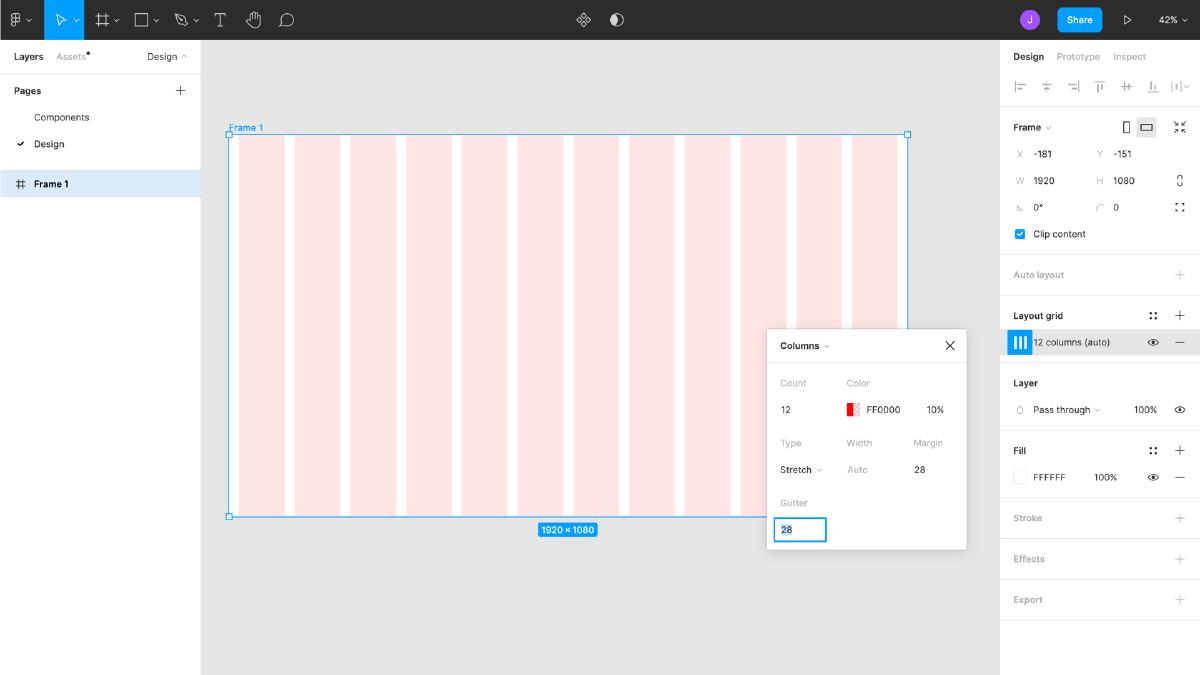
The 12-column grid system provides more flexibility in component placement because 12 without a remainder divides into 2, 3, 4, and 6, but you can also experiment with a different number of columns. The number of columns you choose will depend on the complexity and scale of the design, and the extra columns provide more control and layout flexibility. Once you have created a grid system, it is recommended that you save it as a grid style for reuse in all projects.
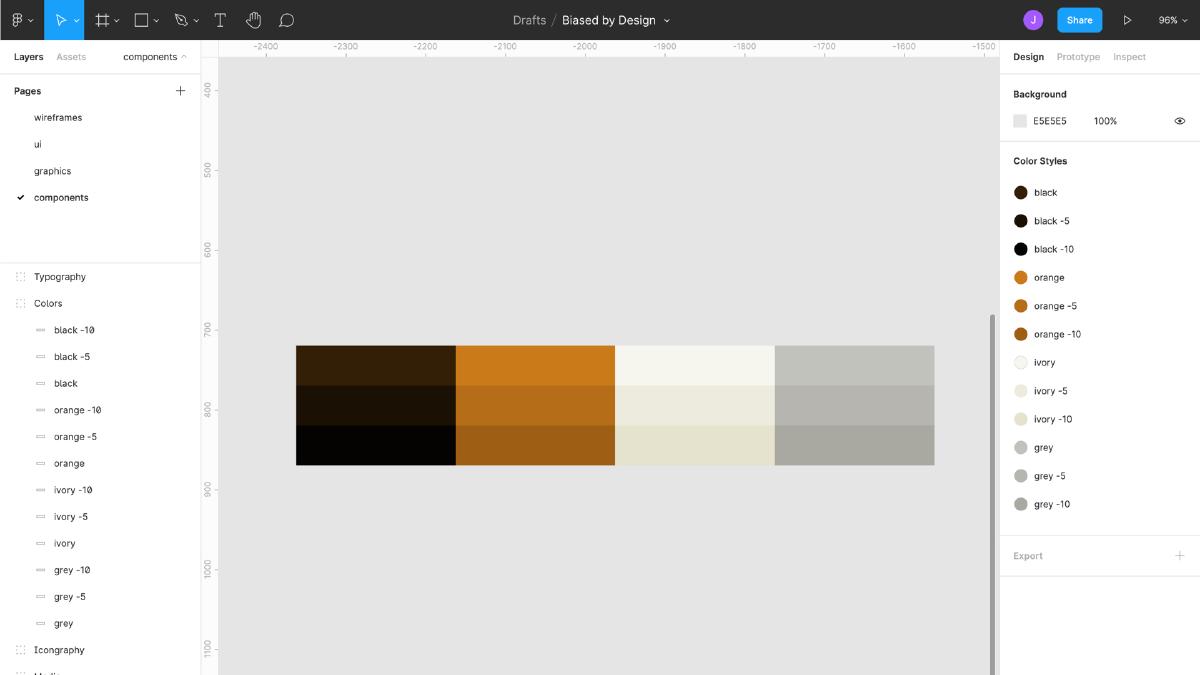
Colors
Colors are another foundational design element that will be determined early on. I like to start by defining 1-4 basic colors, and then move on to lighter (tints) and darker (shades) variations of each color (if necessary). Tints and shades are useful for making more precise adjustments while still matching the base color value. My favorite color format for this purpose is HSL, because tints and shades can easily be determined by simply adjusting the "L" or lightness value of the base color. Using this method, I will create variations of the tints of each primary color and indicate the differences in values in the color name when saved in the design tools.
I prefer to limit the color systems, i.e., I define only the colors (plus tints and/or shades) that I will need. Not only does this make the system easier to manage, but it also helps ensure greater consistency of colors throughout the design.
Once the colors are defined, it's time to save them as reusable styles so they can be referenced throughout the component library. The first step in saving the colors is to give each color an appropriate name (adding a difference in lightness value to the end of the primary color name). After that, I do the same steps to save the colors as styles as I did for text. Finally, I double check that the colors and their names are correct using the Color Styles panel on the right side of the Figma window.
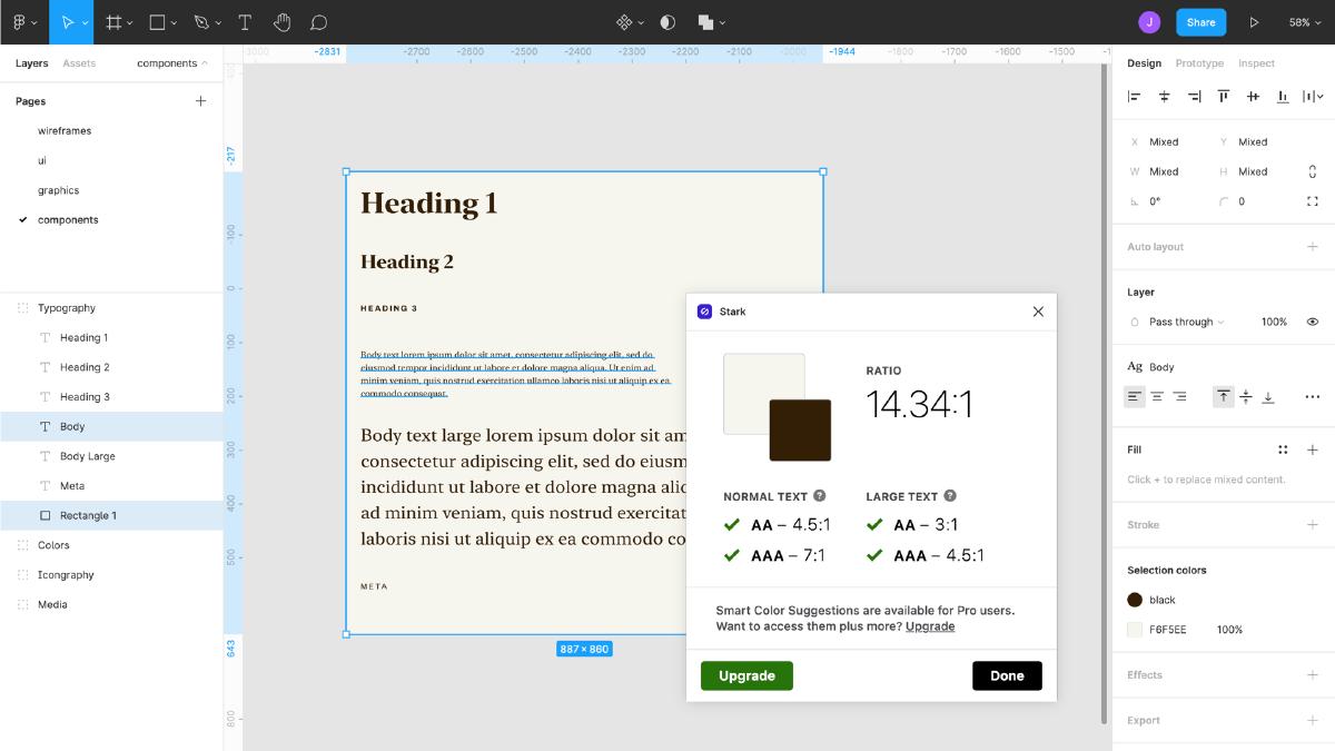
Color contrast
It is better to check colors as early as possible for proper color contrast, especially with respect to text. Adequate color contrast not only makes the interface more accessible, but also improves readability for all users. Start checking for color contrast as soon as you've decided on typography and colors. There are lots of great tools to help you do this. I like using Stark. It provides a set of built-in special features tools and can be easily installed in Figma as a plugin. You can quickly check the color contrast of the text layer and the background layer by first selecting them and then running the "Color Contrast" test. The goal is that the contrast between the text and the background is greater than or equal to 4.5:1 for the main text and 3:1 for the large text.
Iconography and Media
The last fundamental design elements that need to be defined are iconography and images. Iconography usually plays a fundamental role in any component library. Many, if not most, components include icons, so making them flexible is critical to the library. Related to iconography are multimedia elements, such as images and videos, which provide users with rich content and interaction, and also play a fundamental role in any design language. Consequently, we must define them with flexibility in mind.
Icons
I like to start by defining what sizes of icons will be supported, in T-shirt sizes (S for small, M for medium, L for large). Defining a size according to t-shirt size limits the number of default items, but that's usually exactly what you need: a specific set of values that work well in the context of the system as a whole, rather than every conceivable option with names that are not relevant to the actual design (like "size-1", "size-2", "size-3", etc.).
As with the main text, it's helpful to start with the lowest common denominator when determining icon size. Once again, back to our modular scale. Choose a unit from the scale that works well for the size of the icon in conjunction with the main text. This will require experimentation, so it's helpful to have a separate page, analogous to a sketch pad, to experiment with as you build your library. Once you've settled on a suitable basic icon size, the next step is to create additional sizes. This is a great reason to use Figma's variants feature, which allows you to group and organize similar components into a single container.
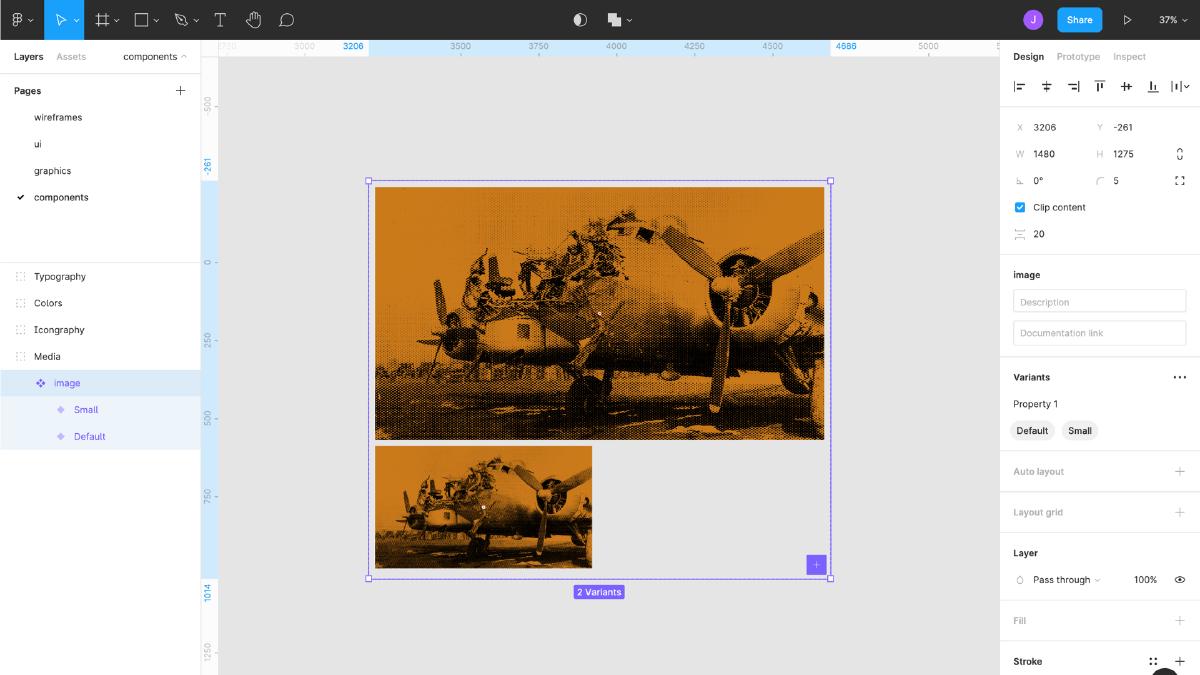
Media
Next come the multimedia elements, such as images and videos. The grid system we set up earlier will be our guide as we determine the different image sizes needed. Once again, using the T-shirt size limitation, I usually create a basic small, medium and large version of the image based on the width derived from the grid and the height determined by a constant aspect ratio (e.g. 16: 9 at 1920×1080, etc.). I also make sure to create a "no margin" image variant when I want the image to take up the full width of the design, as well as smaller variants - "thumbnails" that may not have the same aspect ratio as the content images.
We've broken down, step by step, the process of creating interface component libraries that can grow and evolve to meet the needs of any interface. These basic elements will form the basis for components and patterns that will appear in the future. In the next article, we'll look at how to define these reusable components. Stay tuned for updates.
What's Your Reaction?